
Zip Is A/B Testing a 1-Field Signup Form for Business Accounts
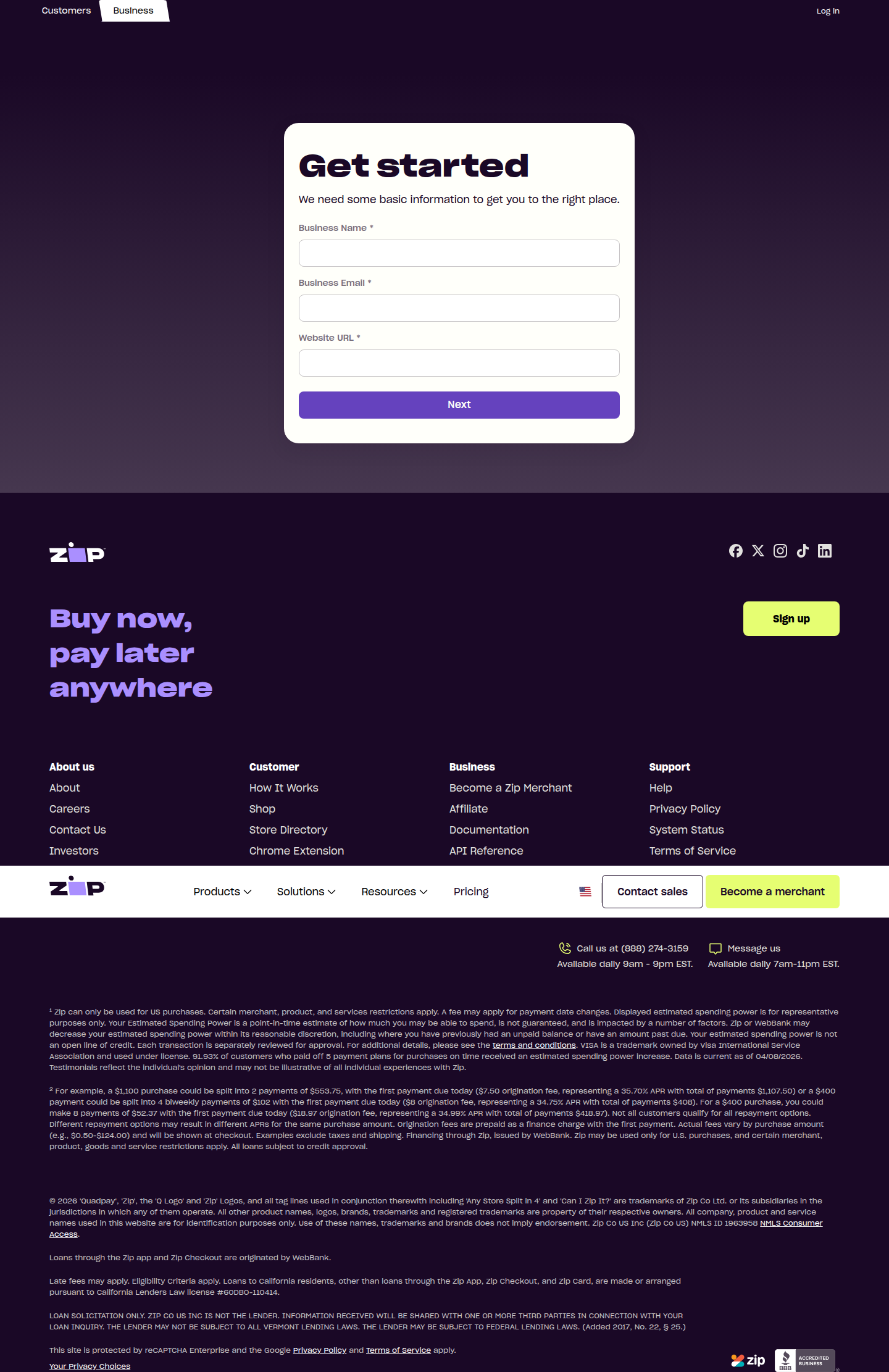
ABWatcher caught Zip running two live signup variants on zip.co/us/for-business — a 3-field form vs. a 1-field email-only form. Here's the math on what that friction cut could mean.
Sam Lee
Data Analyst · · Updated
TL;DR
- Detected 80% confidence, live A/B test on zip.co/us/for-business/sign-up, flagged via same-run-variance across multiple browser engines.
- Variant A: 3-field "Get started" form (Business Name, Business Email, Website URL), generic Zip logo/nav, "Sign up" / "Become a merchant" CTAs.
- Variant B: 1-field form (Business Email only), "Zip For Business" logo/nav, "Get started" CTA.
- Hypothesis: cutting form fields from 3 to 1 lifts top-of-funnel signup conversion for business accounts.
- Detection method flagged two consistent variants across engines — not a single odd-engine rendering glitch, which is why confidence sits at 80% rather than higher or lower.
- No public lift numbers disclosed yet; this is a live, in-flight test as of this writing.
What exactly did ABWatcher catch on Zip's business signup page?
Zip is running two structurally different signup forms on the same URL, one collecting three fields and one collecting a single email address. Our vision-AI analyser flagged this via same_run_variance — meaning the two variants showed up consistently across multiple browser engines in the same crawl run, not as an isolated rendering artifact tied to one engine. That pattern is a stronger signal of a genuine live experiment than a single-engine anomaly, which is why we're logging this at 80% analyst confidence rather than treating it as noise.
Variant A pairs a 3-field "Get started" form (Business Name, Business Email, Website URL) with generic Zip branding and dual CTAs — "Sign up" and "Become a merchant." Variant B strips the form down to Business Email only, swaps in "Zip For Business" branding, and uses a single "Get started" CTA. This isn't a copy tweak or a button-color test; it's a full form-and-brand-shell divergence, which usually means both engineering and design resourced the build — a signal the team expects a real answer, not a cosmetic one.
Why would removing two fields move the needle on conversion?
Every additional required field on a signup form is a fresh decision point where a visitor can bounce, and abandonment compounds multiplicatively across fields, not additively. If each of the two extra fields (Business Name, Website URL) costs even 8-12% of remaining visitors — a plausible range for B2B forms per Zuko's form conversion research — the compounded effect of a 3-field form versus a 1-field form isn't trivial. Rough math: if a 1-field form converts at 100% relative completion, a 3-field form at 90% per-field completion nets out around 81% (0.9 × 0.9), an ~19-point relative gap before anyone even reaches Zip's actual approval funnel.
That's the top-of-funnel story. The catch: fewer fields at signup usually just moves the qualification burden downstream. Zip still needs Business Name and Website URL to underwrite a merchant account, so Variant B likely defers that collection to a second step, email verification, or account setup post-signup. The real question isn't "does the form convert more clicks" — it's whether the qualified merchant signups per visitor improve, or whether Zip is just trading top-of-funnel volume for more drop-off in step two. Without visibility into Zip's step-2 completion rate, a raw signup-form lift is not yet a business win.
What would a credible read on this test actually require?
A defensible verdict needs a stated baseline conversion rate, a minimum detectable effect, and a large enough sample to detect it at 95% confidence — the same framework MarketingProfs lays out for CRO testing. If Zip's baseline business-signup conversion sits around 5%, and they're powering to detect a 10% relative lift (5% → 5.5%), standard two-proportion sample size math puts them in the range of ~30,000 visitors per arm for 80% power — a nontrivial traffic requirement for a B2B signup page that likely sees far less volume than a consumer checkout flow.
That matters because B2B signup pages are lower-traffic than consumer landing pages by an order of magnitude or more, which means this test likely needs weeks, not days, to reach significance. A same-run-variance detection tells us the test is live; it says nothing about sample size, run duration, or whether Zip has actually hit power. Anyone citing this as a "fewer fields wins" case study before Zip reports a confidence interval is over-indexing on a single in-flight variant.
How does this compare with other signup-friction tests we track?
Here's how the two variants stack up on the dimensions that matter for a lift calculation:
| Dimension | Variant A (control?) | Variant B (test?) |
|---|---|---|
| Form fields | 3 (Business Name, Business Email, Website URL) | 1 (Business Email only) |
| Branding/nav | Generic Zip logo | "Zip For Business" logo |
| Primary CTA | "Sign up" / "Become a merchant" | "Get started" |
| Likely funnel stage deferred | None — qualifies upfront | Name/URL likely collected post-signup |
| Hypothesis under test | Qualify early, lower volume, higher intent | Reduce friction, higher volume, defer qualification |
Notice we can't yet label which is "control" — the detection doesn't tell us which variant is incumbent. That distinction changes the interpretation: if the 1-field form is new, Zip is testing a friction-reduction hypothesis. If the 3-field form is new, Zip may be testing whether more upfront qualification improves downstream merchant quality and reduces sales-team triage cost. Both are legitimate CRO hypotheses, and Unbounce's A/B testing guide is right to note that test direction assumptions are one of the most common places analysts get burned.
Common questions
Is Zip's 1-field form definitely the winning variant?
No. We only have a live detection, not a result. Zuko's own checkout A/B test cited a 56% conversion lift for a reduced-friction variant, but that's a different form, different audience, and different baseline — it's illustrative, not predictive of Zip's outcome.
Could this be a novelty effect rather than a durable lift?
Yes, and it's the first thing to rule out. Early lift on a friction-reduction test often decays as returning visitors and bots adjust; a credible read requires the test to run past at least one full weekly cycle to separate novelty from steady-state lift.
Why does same-run-variance detection matter for confidence level?
It rules out a single-browser rendering bug as the explanation, since the two variants appeared consistently across multiple engines in one crawl. That's why this sits at 80% confidence rather than higher (no confirmed traffic split data) or lower (single-engine artifacts).
What sample size would Zip need to trust a result here?
Assuming a ~5% baseline signup conversion and a 10% relative minimum detectable effect, standard power calculations suggest roughly 30,000 visitors per arm for 95% significance at 80% power — a multi-week test for most B2B signup pages.
What should teams take from this before Zip publishes any result?
Treat form-field reduction as a hypothesis worth testing, not a guaranteed lift, and always pair it with downstream funnel tracking.
Your move this sprint
If you're running a B2B or fintech signup flow, don't just count fields — instrument the next step. Before you cut a form from 3 fields to 1, define your minimum detectable effect, calculate required sample size at your actual baseline conversion rate, and instrument step-2 completion so a top-of-funnel win can't mask a downstream qualification loss. Ship the test, but hold the "friction reduction works" conclusion until you've got a confidence interval on the metric that actually pays your bills.
Read next
More from the ABWatcher blog
Nov 22, 2026
Snake River Farms Tests a $25-Off Popup on Its Ad Landing Page
We caught Snake River Farms split-testing an email-capture form and $25-off modal on its landing page. Here's the math on what it would take to call a winner.
Nov 21, 2026
Snake River Farms Tests Mid-Page Email Capture on Its Ad Landing Page
SRF is A/B testing a mid-page lead-capture block and a $25-off popup against a simpler hero-only promo banner on its paid landing page, detected 2024 week-over-week.
Nov 20, 2026
Attio Is Testing a New Tier, Higher Prices, and a New Pitch
Attio is running a live pricing page test with a new $1,000 "Ultra" tier, higher Plus/Pro prices, and a new headline — here's what we caught and what it means.
Nov 19, 2026
Found Quietly Tested a 25% Price Cut on Its Pricing Page
We caught Found running a live pricing A/B test with an annual billing toggle that drops Found Plus from $35 to $26.25/mo. Here's what changed and why it matters.
Nov 8, 2026
Astro Proves "Zero Lock-In" With a Live Code Demo, Not a Claim
Astro's homepage replaces a trust badge row with a working, clickable framework demo — here's the hierarchy and interaction design behind it, detected 60% rare on astro.build.
Nov 7, 2026
Basecamp's Big Numbers: Why Hyper-Precise Stats Beat Vague Social Proof
Basecamp's homepage swaps "trusted by thousands" for 1.7 billion to-dos and 5 petabytes of data. We break down why precision beats vagueness as social proof — and how to test it.
From the glossary
Vocabulary the article uses. See all terms →
- Shrinkage Estimator— A statistical adjustment that pulls noisy per-variant or per-segment estimates toward an overall average to reduce overfitting to randomness.
- Flicker Test— A diagnostic check to confirm whether users briefly see the original page before a variant renders in client-side experiments.
- Pre-Experiment Bucketing Audit— A review process confirming users are being randomly and evenly assigned to experiment variants before launch.
- Above-Fold Exclusion Rule— A test-design rule that deliberately prevents changes to above-the-fold elements so an experiment isolates below-the-fold effects.
- Flicker-Free Testing— A technical setup that prevents users from briefly seeing the original page before a test variant loads.
- Orthogonal Test Design— A test structure where multiple variables are changed independently so their individual effects can be measured without interference.
See more like this
ABWatcher catches A/B tests like this across 1,000+ brands.
Watch live experiments at 1,000+ high-converting brands, complete with hypothesis and takeaway. 7 days of Pro, free, no card, then Free forever for ten watched companies.