
Vendr's Approval Gate UI Makes AI Agents Feel Safe to Trust
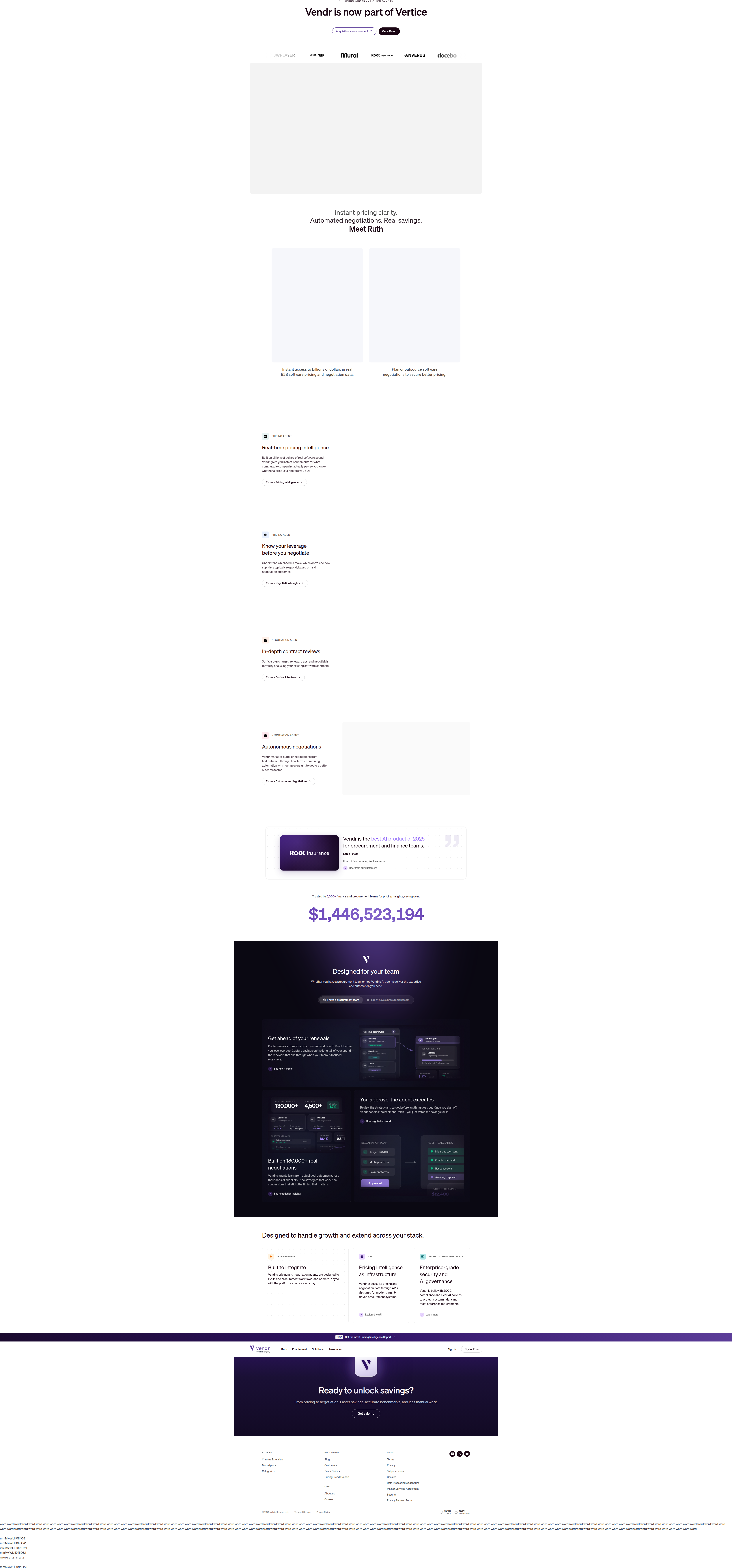
Vendr's homepage demo (via Blissfully.com) uses a live negotiation dashboard with an explicit approval gate to make AI automation feel trustworthy, not like a black box.
Aiko Tanaka
Design Director · · Updated
TL;DR
- Detected on blissfully.com (Vendr) homepage, layout surface, interactive demo category.
- Rarity score: 65% — an uncommon pattern across the 1,000+ sites ABWatcher monitors daily.
- Importance score: 60%, reflecting high trust-signal value for AI-agent products.
- The demo shows three live agent states: "Initial outreach sent," "Counter received," "Awaiting response."
- Core copy hook: "You approve, the agent executes — Review the strategy and target before anything goes out."
- Pattern logged as a rare CRO gem, not a confirmed A/B test — this is a live design choice worth studying.
What is the actual UI pattern Vendr is running?
It's a homepage product preview that simulates a live AI negotiation in progress, gated by a human approval step before the agent acts. Instead of a static screenshot or a generic "AI-powered" badge, the hero area renders what looks like an active session: a negotiation plan with a visible state machine running underneath it. The eye lands first on the status labels — "Initial outreach sent," "Counter received," "Awaiting response" — because they're the only elements on the panel using motion-adjacent affordances (dots, pills, timestamps) that read as alive rather than decorative. That's the hook. Everything else in the module is scaffolding built to support it.
Why does the approval-gate copy do so much work?
The line "You approve, the agent executes" resolves the single biggest objection to AI automation — loss of control — in six words, placed directly inside the interactive element it describes. Most SaaS AI demos separate value prop from UI: headline above, screenshot below, and the visitor has to do the translation work themselves. Vendr collapses that gap. The copy sits inline with the dashboard, functioning almost like a caption on a diagram. This follows a principle Unbounce's CRO guide hits on with test hypotheses — copy and interface need to argue the same point, not two adjacent points. Here, the interface is the argument: you can see the gate, not just read about it.
From a hierarchy standpoint, the sequence is:
- Status pills (highest contrast, smallest text, first fixation)
- The approval-gate headline (largest type, centered attention)
- Supporting line — "Once you sign off, Vendr handles the back-and-forth—you just watch the savings roll in."
That third line is doing outcome-framing, not feature-framing. It's the payoff sentence, placed last in an F-pattern scan, which is exactly where users expect the "so what" after they've already absorbed the mechanism above it.
How does this compare to typical AI product demos?
Most AI landing pages default to abstraction — chat bubbles, generic "agent thinking" spinners, or marketing illustrations — while Vendr renders an operational-looking control panel. The difference is specificity versus vibes.
| Pattern | What it shows | Trust mechanism |
|---|---|---|
| Generic AI hero (common) | Abstract illustration or chatbot mockup | Implied capability |
| Status-only demo | Progress bar or "processing" state | Implied activity |
| Vendr's approval-gate demo | Named negotiation states + explicit human checkpoint | Demonstrated control |
The rarity score of 65% suggests this level of procedural specificity — naming actual negotiation states rather than a generic loading state — is uncommon even among AI-forward SaaS homepages. Most teams are still testing whether to show a live demo at all, not how granular the states inside it should be.
Does showing the human checkpoint actually reduce friction?
Yes — by converting "black box automation" into a visible, reversible-feeling process, the design reduces the perceived risk cost of adopting an AI agent for a high-stakes task like vendor negotiation. Negotiation is inherently anxiety-inducing to delegate; money and vendor relationships are on the line. By foregrounding the gate rather than hiding it in settings or a secondary screen, Vendr is applying a version of the single-goal clarity principle from Campaign Creators' landing page guide — the page isn't trying to sell "AI negotiation" and "human oversight" as two separate value props fighting for attention. It fuses them into one visual unit so the visitor's one job is to understand: agent does the work, you keep the veto.
The spacing choices support this too. The approval-gate card appears to get more breathing room than the surrounding states — consistent with Gestalt's law of proximity, where isolating an element from its neighbors signals it deserves separate cognitive processing. If the gate card were packed edge-to-edge with the status list, it would read as "just another step" instead of "the step that matters."
What should design and growth teams test from this?
If your product automates something with financial or relational stakes — vendor contracts, ad spend, pricing, outreach — a static "AI-powered" badge is leaving trust on the table. The testable hypothesis for your roadmap this sprint: does naming your system's actual intermediate states (not generic "processing...") and visually isolating the human-approval moment increase demo engagement or trial starts compared to your current hero treatment? This is directly testable as an A/B split on your homepage hero module, and it's a low-build-cost change if you already have the real product states to pull from — you're mostly doing information architecture and visual hierarchy work, not new functionality.
Common questions
What company is this detection from?
The detection is from Blissfully, published under the domain blissfully.com, and the product being demoed is Vendr's AI negotiation agent. The pattern was logged on the homepage layout surface as an interactive demo category entry.
Is this confirmed as an A/B test?
No. ABWatcher logged this as a rare CRO gem with a 65% rarity score and 60% importance score, meaning it's a notable live design pattern worth studying, not a confirmed split test with measured variants.
Why does the approval-gate messaging matter for conversion?
It directly addresses the core objection to AI automation — fear of losing control — inline with the UI that would otherwise trigger that fear. Resolving objections at the point of hesitation, rather than in a separate FAQ or trust section, shortens the path to conversion.
Can smaller SaaS teams replicate this pattern without a full AI agent product?
Yes. The underlying principle — show real process states, isolate the human-decision moment visually, and pair outcome copy with the interface rather than above or below it — applies to any multi-step automation, not just AI agents. Any workflow tool with sequential states can borrow this structure.
How does this connect to broader CRO best practices?
It reflects the principle that landing page copy and interface should argue the same point without requiring translation by the visitor, a theme echoed in FullStory's CRO best practices around keeping copy and page content tightly aligned to reduce bounce risk.
Read next
More from the ABWatcher blog
Nov 22, 2026
Snake River Farms Tests a $25-Off Popup on Its Ad Landing Page
We caught Snake River Farms split-testing an email-capture form and $25-off modal on its landing page. Here's the math on what it would take to call a winner.
Nov 21, 2026
Snake River Farms Tests Mid-Page Email Capture on Its Ad Landing Page
SRF is A/B testing a mid-page lead-capture block and a $25-off popup against a simpler hero-only promo banner on its paid landing page, detected 2024 week-over-week.
Nov 20, 2026
Attio Is Testing a New Tier, Higher Prices, and a New Pitch
Attio is running a live pricing page test with a new $1,000 "Ultra" tier, higher Plus/Pro prices, and a new headline — here's what we caught and what it means.
Nov 19, 2026
Found Quietly Tested a 25% Price Cut on Its Pricing Page
We caught Found running a live pricing A/B test with an annual billing toggle that drops Found Plus from $35 to $26.25/mo. Here's what changed and why it matters.
Nov 8, 2026
Astro Proves "Zero Lock-In" With a Live Code Demo, Not a Claim
Astro's homepage replaces a trust badge row with a working, clickable framework demo — here's the hierarchy and interaction design behind it, detected 60% rare on astro.build.
Nov 7, 2026
Basecamp's Big Numbers: Why Hyper-Precise Stats Beat Vague Social Proof
Basecamp's homepage swaps "trusted by thousands" for 1.7 billion to-dos and 5 petabytes of data. We break down why precision beats vagueness as social proof — and how to test it.
From the glossary
Vocabulary the article uses. See all terms →
- Shrinkage Estimator— A statistical adjustment that pulls noisy per-variant or per-segment estimates toward an overall average to reduce overfitting to randomness.
- Flicker Test— A diagnostic check to confirm whether users briefly see the original page before a variant renders in client-side experiments.
- Pre-Experiment Bucketing Audit— A review process confirming users are being randomly and evenly assigned to experiment variants before launch.
- Above-Fold Exclusion Rule— A test-design rule that deliberately prevents changes to above-the-fold elements so an experiment isolates below-the-fold effects.
- Flicker-Free Testing— A technical setup that prevents users from briefly seeing the original page before a test variant loads.
- Orthogonal Test Design— A test structure where multiple variables are changed independently so their individual effects can be measured without interference.
See more like this
ABWatcher catches A/B tests like this across 1,000+ brands.
Watch live experiments at 1,000+ high-converting brands, complete with hypothesis and takeaway. 7 days of Pro, free, no card, then Free forever for ten watched companies.