
Upwork Is A/B Testing Its Own Identity Crisis on the Homepage
Upwork is running a hero test that pits "AI-productivity" positioning against classic marketplace framing — and the pricing section changes with it. Here's what we caught.
Diego Hernandez
Growth Marketer · Jul 17, 2026
Upwork's homepage is having an identity crisis. And they're A/B testing it live, right now, on upwork.com.
We caught it through same-run variance — same crawl session, same day, two different hero sections served to different visits. One visitor sees an AI-productivity pitch. Another sees a straight-up freelancer marketplace pitch. Different UUIDs, different bucket assignments. This isn't a caching glitch. It's a real experiment.
The Two Heroes, Side by Side
Control (4 out of 5 visits): "Work at the speed of your ambition." AI-amplifier subhead. A toggle for "I want to hire / I want to work." Fuller pricing section underneath.
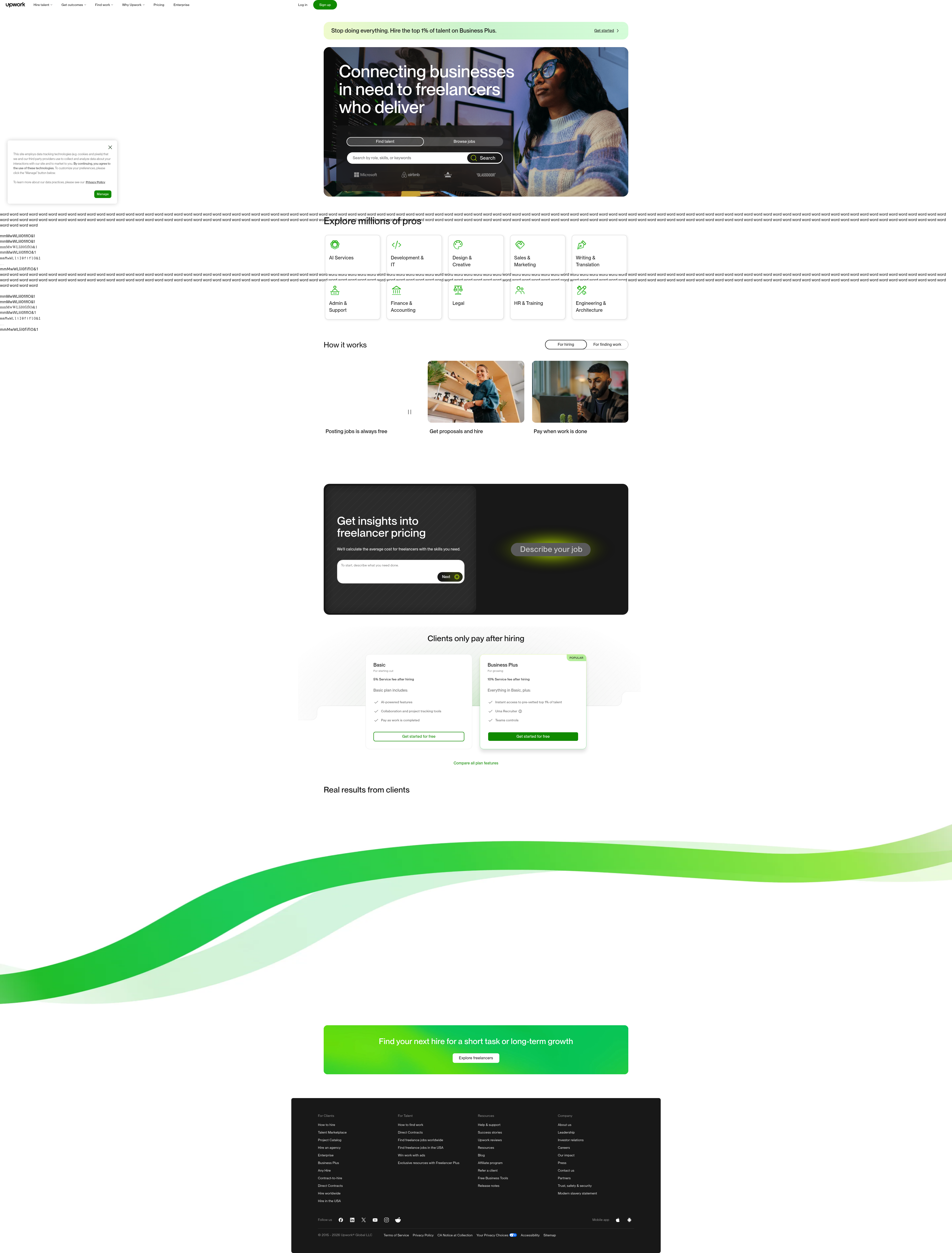
Variant (1 out of 5 visits): "Connecting businesses in need to freelancers who deliver." Different hero image — a woman with glasses instead of whatever the control uses. Different CTAs: "Find talent" and "Browse jobs" instead of the toggle. Different search bar placeholder. Different logo strip. And a stripped-down pricing section labeled "Clients only pay after hiring," with fewer feature bullets.
Every surface element moved together. Headline, image, CTA, search bar, logos, pricing depth. That's not a copy tweak — that's two entirely different homepage philosophies running in parallel.
Takeaway: when you test a hero headline, check what else has to move with it. Upwork didn't isolate the variable. They shipped a whole narrative shift as one variant. That's a bigger swing than most teams have the guts to test.
Why This Test Actually Matters
Here's the tension. Upwork has spent the last two years pushing an AI-forward brand story — "speed of your ambition," AI matching, AI proposals, the whole modernization push. That's the control experience most visitors get.
But the variant reverts to something older and blunter: supply and demand. Businesses need work done. Freelancers deliver. No AI framing at all. Just "Find talent" and "Browse jobs" — two clear paths, no ambiguity about who you are or what you're here to do.
That's a fundamentally different bet on what converts a first-time visitor. AI-productivity messaging aims for aspiration and differentiation. Marketplace messaging aims for clarity and trust. One tells you what Upwork believes in. The other tells you what Upwork does.
Takeaway: your hero copy is making a bet on whether visitors need to be inspired or need to be oriented. Know which one your traffic actually needs before you write it.
The Pricing Section Tells You Where the Real Test Is
The pricing section change is the tell here. Control shows a fuller pricing breakdown with more feature bullets. Variant simplifies to one line: "Clients only pay after hiring."
That's not a cosmetic difference — that's a friction-reduction bet. Fewer bullets, fewer decisions, one reassurance statement instead of a feature list. If you've ever run a pricing-page test, you know the instinct: simpler pricing sections often win on click-through, especially for first-time visitors who haven't decided if they're serious yet. Fuller pricing sections tend to win with visitors closer to a buying decision who want the details before they commit.
Upwork is essentially testing top-of-funnel simplicity against mid-funnel completeness, on the same page, at the same time. That's a smart split to run — but it only works if they're tracking downstream, not just click-through on the hero CTA. As Upwork's own guide to A/B testing points out, the whole point of the exercise is eliminating guesswork about what actually drives the metric you care about — not just the one you can see immediately.
Takeaway: if you simplify a pricing section for a test, make sure your success metric is signup-to-activation, not just clicks. Simpler almost always wins clicks. It doesn't always win revenue.
The CTA Swap Is the Real Signal
Control: one toggle, "I want to hire / I want to work." Binary, but soft — it asks the visitor to self-identify before acting.
Variant: two separate buttons, "Find talent" and "Browse jobs." No self-identification step. Just pick your action.
This is a classic UX fork. Toggles ask visitors to categorize themselves first, then act. Separate CTAs let visitors act immediately without the extra cognitive step. Toggles are cleaner visually but add friction. Separate buttons are noisier but faster.
Given that Upwork serves two totally different audiences (clients and freelancers) from one homepage, this is worth watching closely. If "Find talent" and "Browse jobs" wins, it says something bigger: visitors don't want to think about which side of the marketplace they're on — they want to see the action verb and go. That's consistent with broader research on conversion rate optimization that treats every extra decision point as a place visitors drop off.
Takeaway: audit every place your homepage asks visitors to self-identify before acting. Each one is a fork where you lose people.
What We'd Watch If We Were Upwork
Three things determine which variant wins here, and none of them are click-through rate on the hero button:
- Job post completion rate for the marketplace variant vs. sign-up completion for the AI variant.
- Time-to-first-hire — does the simpler pricing section attract lower-intent clients who bounce before hiring, inflating top-of-funnel numbers but hurting activation?
- Logo strip impact — different social proof logos were shown per variant. That's an easy variable to under-track but it moves trust perception fast, especially for first-time B2B visitors.
Homepage tests at this scale rarely resolve in one cycle. Expect Upwork to iterate on messaging within whichever variant wins, not declare a permanent winner in one shot.
The Takeaway for Your Roadmap This Sprint
You don't need Upwork's traffic to learn from this test. Pick one thing this week: audit whether your hero is selling a feeling (ambition, speed, innovation) or a function (find, browse, hire). Then check if your pricing section length matches the funnel stage of the traffic actually hitting your hero — new visitors want simple, warm visitors want detail. Mismatch there is where conversion quietly leaks. Ship a test that isolates just one of those variables, not five at once like Upwork did — you'll actually know why you won.
See more like this
ABWatcher catches A/B tests like this every day.
Watch live experiments at 1,000+ high-converting brands, complete with hypothesis and takeaway. Free forever for ten watched companies.