
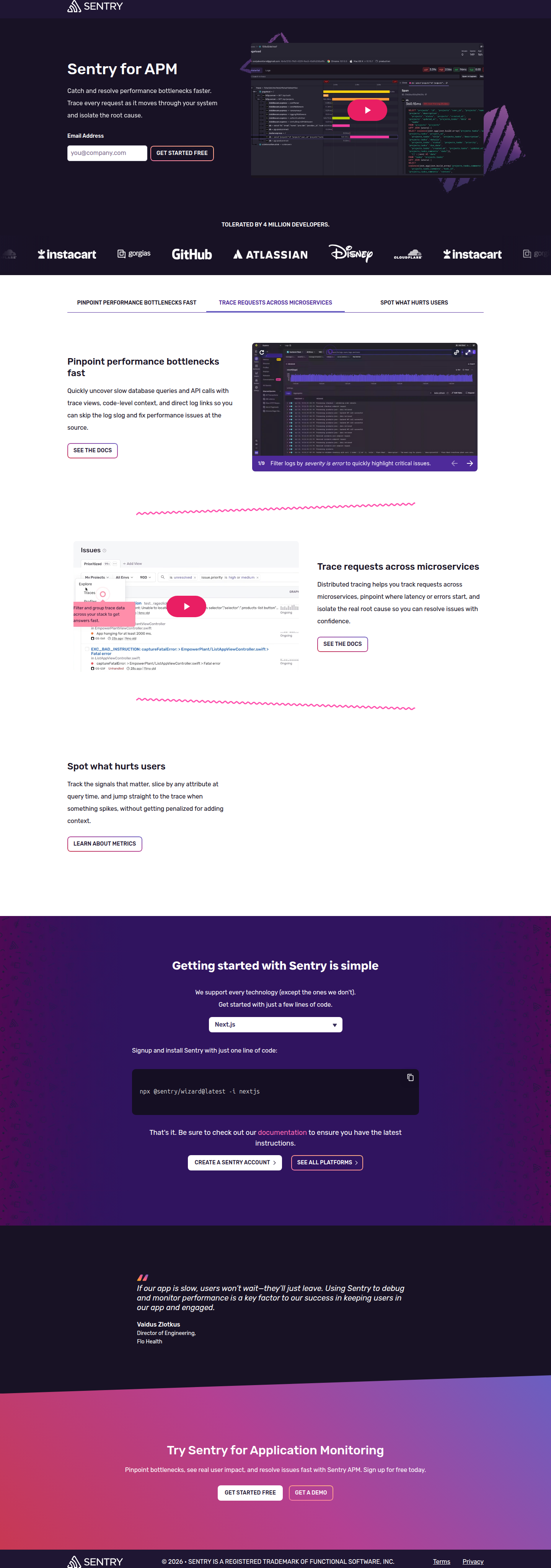
Sentry's APM Landing Page Tests Tabs vs. Accordion for Feature Discovery
Sentry is A/B testing a horizontal tab navigation against a vertical accordion on its APM landing page — a classic scan-vs-explore tradeoff worth studying before your next layout test.
Maya Patel
Senior CRO Strategist · Jul 19, 2026
Sentry's application performance monitoring landing page is running a live layout test on the section that matters most for mid-funnel conversion: the feature explainer block. This is where visitors decide whether Sentry's APM actually solves their problem, so the layout choice here has real weight on scroll depth, time-on-page, and ultimately demo requests.
We caught this one through a week-over-week diff at 92% confidence, and the two variants aren't a minor copy tweak — they're structurally different approaches to the same content.
What We Saw in the Wild
Visit 1 uses a horizontal tab navigation with three labels: "Pinpoint Performance Bottlenecks Fast," "Trace Requests Across Microservices," and "Spot What Hurts Users." Each tab expands into a full content panel shown sequentially as the user clicks through — a pattern common on developer-tool landing pages where the audience expects to self-select the use case that applies to them.
Visit 2 replaces this with a vertical accordion on the right side of the section, paired with a decorative illustration on the left and an overarching headline: "Diagnose issues quickly, resolve faster, and drive better user outcomes." The feature cards are collapsible, meaning most content is hidden by default until a user clicks to expand.
Same underlying content, two very different information architectures. That's the kind of test worth dissecting because it isolates a single variable — layout and content-disclosure pattern — while holding the copy's substance constant.
The Core Tradeoff: Scannability vs. Depth
This test maps to a well-known CRO tension: horizontal tabs reward users who already know what they're looking for, while vertical accordions reward users who are browsing and want a quick overview before committing to depth.
Tabs have an advantage in that all three options are visible at once — no hidden content, lower cognitive load to discover what exists. The tradeoff is that only one panel is open at a time, and users can miss the other two entirely if the first tab satisfies their curiosity.
Accordions solve the discovery problem differently. The headline does the summarizing work ("diagnose issues quickly, resolve faster, drive better outcomes") and the cards let a user drill into specifics without a jarring navigation click. But collapsed-by-default content has a documented cost: anything not expanded is content most visitors never see, which matters when the feature detail is actually the thing doing the convincing.
This is a case where thinking beyond a single A/B metric matters — conversion rate is the scoreboard, but scroll depth, tab-click rate, and accordion-expand rate are the diagnostic signals that tell you why one variant wins.
Why This Section, Specifically
Sentry didn't test this on a low-stakes element like button color or hero image — they tested the section that carries the technical proof points a developer or engineering lead needs before trusting an APM tool with production traffic. That's a deliberate choice.
For technical B2B SaaS, the middle-of-page feature explainer often functions as the objection-handling layer: "does this actually trace requests across my microservices, or is this marketing fluff?" A tabbed interface signals "pick your scenario," which works well when the audience segments cleanly into distinct use cases (bottleneck diagnosis vs. distributed tracing vs. user-impact analysis). An accordion under one aspirational headline signals "here's the full picture, dig in where you want," which works better when most visitors care about the same outcome and just need proof points in sequence.
Neither is inherently correct — this is a content-strategy decision disguised as a layout decision, and Sentry testing it live suggests their internal data didn't give a clean answer either.
Applying ICE and PIE to This Kind of Test
If you're running a similar test on your own product pages, don't just eyeball which layout "feels more modern." Score it:
- Impact: How much of your conversion funnel actually depends on this section being understood? If it's a proof-layer section right before a CTA, impact is high.
- Confidence: Do you have prior data (heatmaps, session recordings) showing users skip past this section already? Low engagement today raises confidence that a change will move the needle.
- Ease: Tabs vs. accordion is a moderate build — not copy-only, but not a full redesign either.
Running this through an ICE or PIE framework before committing engineering time is the difference between a test that generates a decision and one that generates a debate. Optimizely's field notes on test ideation are a useful reference point for prioritizing which page sections deserve this level of scrutiny versus which don't.
What to Watch For in the Results
If Sentry's tab variant wins, expect it's because their audience is segmenting cleanly by use case and self-selecting into the panel most relevant to them — a signal that persona-based navigation outperforms generalized summaries for technical buyers.
If the accordion variant wins, it likely means the headline is doing more conversion work than any individual feature card, and users are satisfied skimming rather than deep-diving — useful evidence that your section headline copy deserves as much testing rigor as the layout itself.
Either outcome should also get cross-checked against down-funnel metrics, not just section-level engagement. A tab click isn't a conversion event; a demo request is.
The Takeaway for Your Roadmap
Before you copy either pattern, audit your own middle-of-page feature sections this sprint: pull scroll-depth and click-heatmap data to see whether visitors are actually engaging with tabs, accordions, or neither. If engagement is already low, the layout isn't your bottleneck — the headline and content hierarchy above it probably are. Test the summarizing headline first, then layer in a layout test once you know what claim is actually pulling people in.
See more like this
ABWatcher catches A/B tests like this every day.
Watch live experiments at 1,000+ high-converting brands, complete with hypothesis and takeaway. Free forever for ten watched companies.