
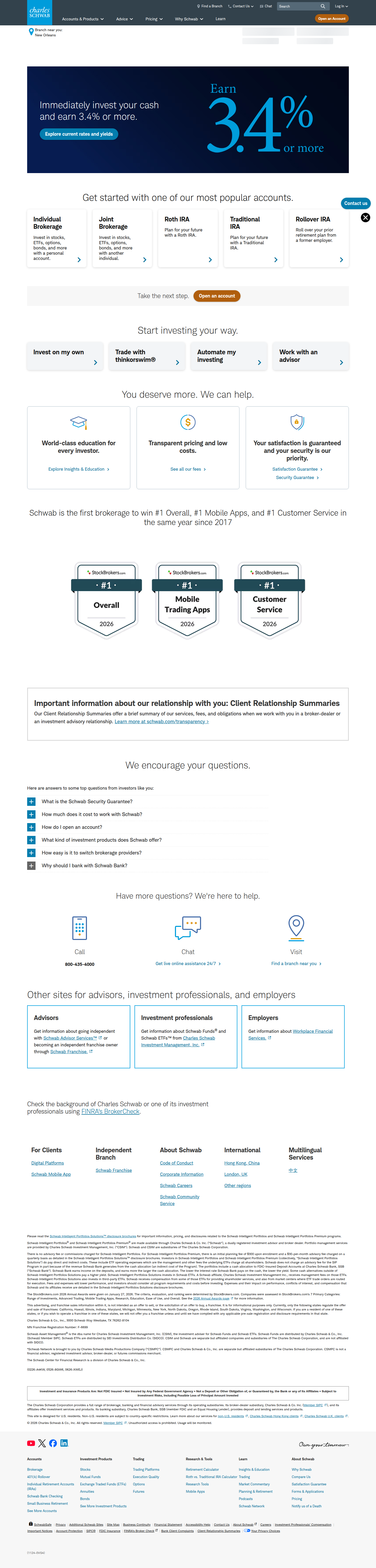
Schwab Is A/B Testing Tabs vs. Flat Cards on Its Homepage Account Finder
Charles Schwab is running a live homepage test on how it presents account types—flat popular-account cards vs. a tabbed, goal-based navigator. Here's what the layout choice signals.
Aiko Tanaka
Design Director · Jul 31, 2026
The Fold Just Above the Fold Is Splitting in Two
We caught Charles Schwab running a same-run variance test on schwab.com's homepage — the exact real estate where a visitor decides whether this bank is "for people like me." Three visits (Safari, Chrome, Firefox) rendered a section headlined "Get started with one of our most popular accounts," a flat grid of account cards. Two visits (Edge, Chrome) rendered "Find the Right Account for You," with a tab bar — Popular Accounts, Brokerage & Trading, Retirement, Education & Custodial, Banking — sitting above the same category of cards. Same real estate, same intent, structurally different interface. That's a layout test, not a copy tweak, and it's the kind of change that reshapes how the eye scans the page before a single word is read.
What the Eye Does First in Each Version
In the flat-list version, there's no navigational chrome to parse — the eye lands directly on the headline, drops down in an F-pattern to the first row of cards, and scans left to right by proximity. Gestalt's law of similarity does the heavy lifting: cards that look alike (same size, same icon treatment, same button style) get grouped as "equivalent options," and the visitor's job is simply to pick one. It's a low-friction, low-authority pattern. You're handing the user a short menu and trusting they already know what a brokerage account is versus a Roth IRA.
The tabbed version changes the entry point entirely. The eye now lands on a horizontal row of labeled categories before it ever reaches a card. That's a classic hierarchy insertion — Schwab is adding a decision layer above the decision layer. Tabs create what Gestalt calls common region: everything under "Retirement" reads as one bounded set, distinct from "Banking," even though the cards themselves may look identical across tabs. The visual weight of that nav bar — likely underlined or pill-styled on the active tab — becomes the first fixation point, ahead of the cards. Whether that's good depends entirely on whether new visitors know which tab they belong in.
The Bet Behind the Tabs
This is a legibility-versus-guidance trade-off, and it's a smart one to formalize as a test rather than a redesign edict. The flat list assumes visitors self-sort quickly from a short set of well-known options — fast, but it caps how many account types you can surface before the grid gets noisy. Cap it at five or six cards and you're implicitly deciding which products get homepage real estate and which don't.
The tabbed version trades a chunk of instant scannability for taxonomy. It lets Schwab expose far more account types (Education & Custodial, for instance, would never make a flat "most popular" cut) without overwhelming first-time visitors, because the categorical filter absorbs that complexity. It's a bet that guided navigation reduces decision paralysis rather than adding a click-tax before the real decision — the same logic e-commerce category pages lean on when they use faceted filters instead of dumping every SKU into one grid.
The risk sits in that same insight: tabs only reduce paralysis if the labels map cleanly onto how a visitor already thinks about their own goal. "Retirement" is unambiguous. "Popular Accounts" as a tab inside a page also titled around finding "the right account" is a little redundant — it's both the default state and a category, which muddies the mental model at the exact moment you're asking someone to self-classify.
Motion, Fold Weight, and What's Not in the Screenshot
Static screenshots don't show us the transition state, but it matters more than the resting layout does. If switching tabs triggers a hard reload or a jarring reflow, the interaction cost eats into the benefit of the taxonomy — you've asked the visitor to make a categorization decision and then punished them with a layout jump. The versions that win these tests are usually the ones with a subtle crossfade or height-matched card swap, so the tab click feels like filtering, not navigating. Given Schwab's account-opening funnel is already multi-step and compliance-heavy, any added friction at the very top of the funnel compounds downstream.
Fold weight is the other variable worth watching. A tab bar adds vertical height before the cards even render, which pushes the actual account options further from the top of the viewport — a cost the flat-card version doesn't pay. On a homepage engineered for a wide range of devices and connection speeds, that's not trivial. If Schwab is running this as a true experiment rather than a phased rollout, they're almost certainly watching scroll depth and time-to-first-card-click as leading indicators before conversion data even matures.
Why This Test Structure Matters
What makes this detection interesting isn't just the visual delta — it's that Schwab chose an A/B test over a redesign mandate, which tells you they're genuinely unsure whether more structure helps or hurts at this specific decision point. Categorical navigation is a bigger structural bet than most homepage tests — it's closer to an information-architecture change wearing a UI skin — and that's exactly the kind of change worth testing with real traffic rather than assuming from a heuristic review, because self-sorting behavior on financial products is notoriously hard to predict from a wireframe alone.
The Takeaway for Your Roadmap
If your homepage or landing page offers more than four or five distinct product paths, don't just ask "flat list or tabs" as a design preference — test it. The variable that actually decides the winner isn't aesthetic, it's whether your audience already knows which bucket they belong in before they land. If they do, tabs add a layer of friction disguised as guidance. If they don't, a flat list forces a guess your best-converting visitors were never equipped to make. This sprint, audit your own "choose your path" module against that one question before you touch the visual layer.
See more like this
ABWatcher catches A/B tests like this every day.
Watch live experiments at 1,000+ high-converting brands, complete with hypothesis and takeaway. Free forever for ten watched companies.