
Resume.io's Job-URL Paste Trick: Turning a Checker Into a Calculator
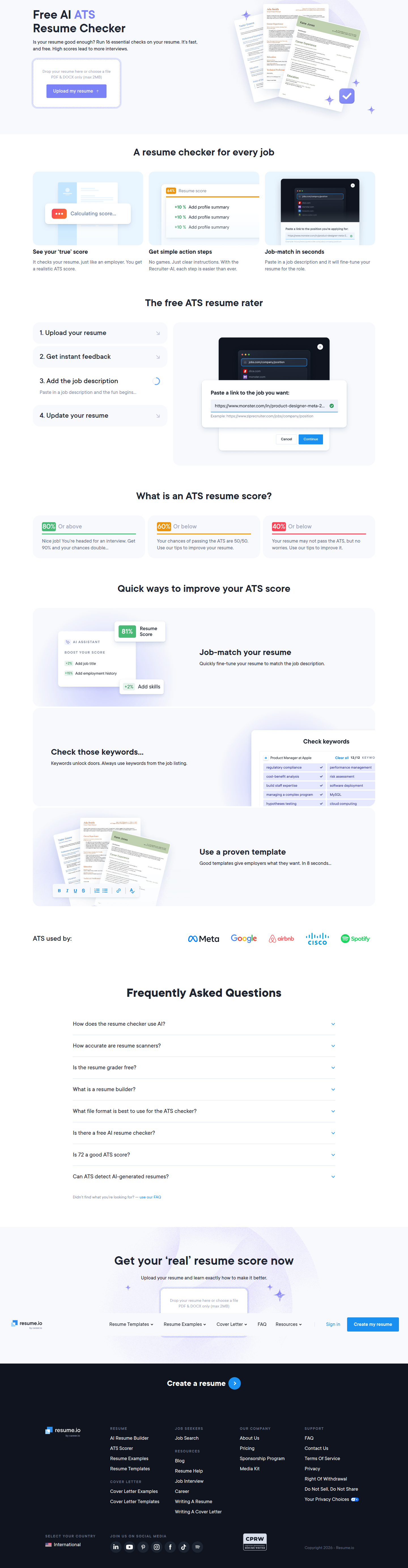
Resume.io lets users paste a job posting link to personalize resume feedback — a rare calculator-style twist on static checkers, detected on their product layout.
Jordan Reeves
Founder & Operator · · Updated
TL;DR
- Detected on Resume.io's product page, layout surface, 2026.
- Feature: users paste a live job posting URL (e.g. a Monster.com listing) to fine-tune AI resume feedback.
- Rarity score: 60% — uncommon pattern among the 1,000+ brands we monitor.
- Importance score: 65% — meaningful conversion lever, not a cosmetic tweak.
- Category: calculator — static checker reframed as a personalized, input-driven tool.
- Core mechanic: one URL paste replaces manual job-description copy/paste, cutting friction to a single action.
What did Resume.io actually change?
Resume.io added a field where users paste a job posting URL and get resume feedback tailored to that specific role. The evidence we pulled shows the actual prompt copy: "Paste a link to the job you want: https://www.monster.com/in/product-designer-meta-2..." Instead of asking users to manually copy and paste a full job description into a text box — the old, clunky standard for "tailored resume" tools — Resume.io accepts a raw URL and does the extraction work itself. The static resume checker becomes something closer to a calculator: you give it one input, it computes a personalized output.
I've shipped versions of this pattern before, just never this clean. Years ago on a hiring-tools product, we had a "paste the job description" box that technically worked but converted like garbage. Users would bail rather than go find the full text, copy it, and paste it back. The friction wasn't the value prop — it was the clipboard round-trip. Resume.io's version skips that round-trip entirely. One link, not one essay.
Why does a URL paste field matter more than it looks?
It matters because it collapses a multi-step task into a single low-effort action, which is the actual lever behind most personalization wins. Personalized landing experiences consistently outperform generic ones because they close the gap between what a visitor wants and what the page shows them — a well-documented CRO pattern. The trap is that most teams implement "personalization" as a content problem: write three versions of the hero copy, run a multivariate test, declare victory. Resume.io instead solved it as an input-design problem. Same personalization payoff, radically lower cost of entry for the user.
This is the part growth teams underrate. You don't need an AI breakthrough to feel personalized — you need to ask for less from the user while promising more in return. A URL is something people already have open in another tab. A job description is something they have to go hunt for, select, and copy without missing the requirements section at the bottom.
How does this fit the "calculator" pattern we track?
Calculator-style UI works because it gives visitors a reason to interact before they're asked to commit, which naturally increases engagement signals like time on page. Tracking engagement metrics like time on page and scroll depth matters precisely because they're leading indicators — someone who pastes a job URL and watches feedback populate is a warmer lead than someone who skims a static checklist and leaves. The calculator pattern isn't really about math. It's about creating a moment where the product proves itself using the visitor's own data, in real time, before any account creation or paywall.
Here's how this detection stacks up against the broader pattern set we log:
| Attribute | This detection |
|---|---|
| Brand | Resume.io |
| Page type | Product |
| Surface | Layout |
| Category | Calculator |
| Rarity | 60% |
| Importance | 65% |
| Input required | 1 URL paste |
| Legacy pattern replaced | Manual job-description copy/paste |
A 60% rarity score tells you this isn't a common move yet — most competitors are still asking users to paste full text blocks or fill out multi-field forms. A 65% importance score says it's worth testing on your own roadmap, not just admiring.
What should a small team steal from this without copying it outright?
Steal the principle — minimize the user's input cost while maximizing the perceived personalization payoff — not the literal feature. If you're a small team, you don't need a URL-parsing pipeline to apply this. Look at every form field on your highest-traffic landing or product page and ask: is this asking the user to do retrieval work we could do for them? A pasted URL, a connected account, an email domain, a referrer parameter — any of these can replace a manual field without losing the data you need.
One hypothesis I'd write for a sprint, following the "change X, improve Y because Z" structure that actually keeps experiments honest — a format Unbounce pushes for exactly this reason — would read: "Replacing our 'paste job description' textarea with a 'paste job URL' field will increase completion rate because it removes a manual copy step that causes drop-off before users see personalized value." That's testable in a sprint, measurable in a week, and it doesn't require new AI capability if you're already extracting structured data from other inputs.
Common questions
What exactly did Resume.io change on their product page?
They added a field accepting a job posting URL instead of requiring users to manually paste the full job description text. The tool fetches the posting and fine-tunes resume feedback to that specific role, turning a static checker into an interactive, input-driven calculator experience.
Why is this classified as a "calculator" pattern?
Calculator patterns ask for one or two inputs and return a personalized computed output in real time. Resume.io's URL-paste-to-feedback flow fits this because it mimics a calculator's input-output loop rather than a static, one-size-fits-all checklist page.
Is a 60% rarity score high or low?
It's mid-to-high relative to most patterns ABWatcher logs across 1,000+ monitored brands. It signals an emerging tactic that hasn't saturated the market yet, making it a reasonable candidate for differentiation if you test it before competitors catch up.
Does this require building AI or URL-parsing infrastructure to copy?
No — the transferable lesson is reducing user input cost, not the specific technology. Teams can apply the same principle with simpler mechanisms like account connections, autofill from existing data, or single-field inputs that replace multi-step manual entry.
How would I test something like this on my own site this sprint?
Pick your highest-friction input field, write a one-sentence hypothesis in the "change X, improve Y because Z" format, and ship a single-variable test against it. Measure completion rate and time-to-value, not just final conversion, since the friction drop shows up earliest there.
What I would actually do next
If I were running growth on a product with any kind of "personalize this for me" feature, I'd skip the roadmap debate about AI capability and go straight to auditing my highest-traffic input field for one thing: am I asking the user to retrieve information I could fetch myself? Ship the lowest-effort version of that swap as an A/B test this sprint, measure completion rate before you even look at downstream conversion, and only invest in the fancier extraction logic once the input-friction hypothesis proves out.
Read next
More from the ABWatcher blog
Nov 22, 2026
Snake River Farms Tests a $25-Off Popup on Its Ad Landing Page
We caught Snake River Farms split-testing an email-capture form and $25-off modal on its landing page. Here's the math on what it would take to call a winner.
Nov 21, 2026
Snake River Farms Tests Mid-Page Email Capture on Its Ad Landing Page
SRF is A/B testing a mid-page lead-capture block and a $25-off popup against a simpler hero-only promo banner on its paid landing page, detected 2024 week-over-week.
Nov 20, 2026
Attio Is Testing a New Tier, Higher Prices, and a New Pitch
Attio is running a live pricing page test with a new $1,000 "Ultra" tier, higher Plus/Pro prices, and a new headline — here's what we caught and what it means.
Nov 19, 2026
Found Quietly Tested a 25% Price Cut on Its Pricing Page
We caught Found running a live pricing A/B test with an annual billing toggle that drops Found Plus from $35 to $26.25/mo. Here's what changed and why it matters.
Nov 8, 2026
Astro Proves "Zero Lock-In" With a Live Code Demo, Not a Claim
Astro's homepage replaces a trust badge row with a working, clickable framework demo — here's the hierarchy and interaction design behind it, detected 60% rare on astro.build.
Nov 7, 2026
Basecamp's Big Numbers: Why Hyper-Precise Stats Beat Vague Social Proof
Basecamp's homepage swaps "trusted by thousands" for 1.7 billion to-dos and 5 petabytes of data. We break down why precision beats vagueness as social proof — and how to test it.
From the glossary
Vocabulary the article uses. See all terms →
- Shrinkage Estimator— A statistical adjustment that pulls noisy per-variant or per-segment estimates toward an overall average to reduce overfitting to randomness.
- Flicker Test— A diagnostic check to confirm whether users briefly see the original page before a variant renders in client-side experiments.
- Pre-Experiment Bucketing Audit— A review process confirming users are being randomly and evenly assigned to experiment variants before launch.
- Above-Fold Exclusion Rule— A test-design rule that deliberately prevents changes to above-the-fold elements so an experiment isolates below-the-fold effects.
- Flicker-Free Testing— A technical setup that prevents users from briefly seeing the original page before a test variant loads.
- Orthogonal Test Design— A test structure where multiple variables are changed independently so their individual effects can be measured without interference.
See more like this
ABWatcher catches A/B tests like this across 1,000+ brands.
Watch live experiments at 1,000+ high-converting brands, complete with hypothesis and takeaway. 7 days of Pro, free, no card, then Free forever for ten watched companies.