
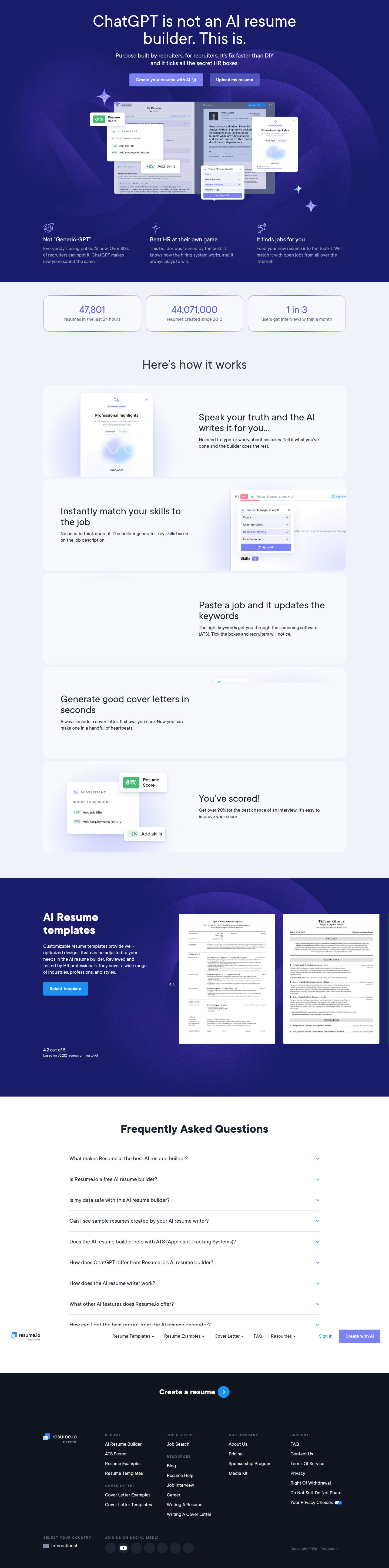
Resume.io's Hero Headline Picks a Fight With ChatGPT
Resume.io tested a contrarian hero headline naming ChatGPT directly. Here's the design breakdown of why calling out the competitor by name works at the top of the fold.
Aiko Tanaka
Design Director · · Updated
TL;DR
- Detected on resume.io's product hero, logged as a contrarian pattern with 75% rarity and 65% importance.
- Headline copy: "ChatGPT is not an AI resume builder. This is."
- The line names a specific, dominant competitor directly in the primary hero slot — rare on public landing pages.
- Surface: hero section, above the fold, first element the eye contacts on page load.
- Pattern type suggests this is a live test variant, not a permanent fixture — worth monitoring for how long it holds.
What does the Resume.io hero actually say?
The headline reads "ChatGPT is not an AI resume builder. This is." — a two-sentence structure that names a competitor before naming itself. Most hero copy opens with a benefit or an identity statement about the product. This one opens with a negation. The first clause is 100% about someone else's product. The second clause is four words, no subject stated, pointing at whatever sits below it on the page. That's a deliberate hierarchy choice: the reader's eye has to travel down to resolve "this," which means the layout is doing semantic work that copy alone can't finish.
Why does naming the competitor change the visual hierarchy?
Naming ChatGPT directly turns the headline into a contrast statement, and contrast is the first thing the eye reads in an F-pattern scan. In a standard F-pattern read, users scan the top line fully, then drop down and scan less of each subsequent line. A generic headline like "Build your resume with AI" gives the eye nothing to snag on beyond the first three words. "ChatGPT" as a proper noun is a pattern interrupt — it's a brand name sitting inside what the visitor expects to be generic marketing language. That's a classic figure-ground flip: the known object (ChatGPT) becomes the ground, and Resume.io's unstated product becomes the figure the reader has to resolve. The eye doesn't skim past a named competitor the way it skims past adjectives like "fast" or "easy."
The second sentence, "This is," is doing a different job: it's a closure cue. Gestalt closure says the brain will complete an incomplete pattern if given enough surrounding context — the visitor's eye is primed to look for what "this" refers to, which should be the product screenshot, the form, or the CTA sitting adjacent. If that visual anchor isn't tight to the headline, the whole bit falls apart. The craft question here isn't the words, it's whether the layout answers "this" within the same glance.
Does calling out a competitor by name actually convert?
There's no universal answer, but the mechanism lines up with established copy-testing guidance: match the page to the intent the visitor already walked in with. Optimizely's landing page guidance stresses that the fastest-converting pages articulate a value proposition quickly and in the visitor's own language — and by late 2024, "I asked ChatGPT to write my resume" is genuinely the language a huge share of Resume.io's traffic is already using internally before they land. The headline isn't educating a cold visitor on what a resume builder is. It's meeting a visitor mid-objection, the same way a sales rep would if a prospect said "can't I just use ChatGPT for this?"
That mid-objection framing also matters for segmentation. One CRO practitioner's breakdown on LinkedIn on fixing intent-mismatched landing pages describes re-optimizing headlines to match buyer intent directly — turning a generic "what is X" framing into language that speaks to the exact comparison already happening in the visitor's head. Resume.io's variant is effectively pre-answering a comparison search before the visitor has to type it.
What's the risk in a contrarian hero headline?
The risk is that naming a dominant tool validates it as the default before dismissing it, and weak visual subordination of the dismissal can backfire. If "ChatGPT" is rendered in the same weight, size, and color as the rest of the headline, the eye has no cue that it's the thing being argued against rather than the thing being recommended. Good execution of this pattern depends on type hierarchy doing the heavy lifting — de-emphasizing the named competitor (lighter weight, muted color, maybe strikethrough-adjacent treatment) while the "this" and whatever visual sits beneath it carries full contrast and weight. Whether Resume.io's live variant nails that subordination is the real test-worthy question; the copy alone is only half the mechanism.
Where contrarian positioning fits against standard CRO practice
Most hero-copy testing advice pushes toward simplicity and one-variable-at-a-time changes, which makes this pattern notable rather than standard.
| Approach | Typical hero copy | Resume.io variant |
|---|---|---|
| Benefit-led | "Build a resume that gets interviews" | Not used here |
| Feature-led | "AI-powered resume builder" | Rejected implicitly |
| Contrarian/comparative | Rare on public pages | "ChatGPT is not an AI resume builder. This is." |
| Testing discipline | Isolate one variable per Unbounce's CRO guidance | Headline-only swap, consistent with single-variable testing |
The simplicity principle still holds inside the variant — it's four words plus six words, nothing else crammed into the line. The contrarian move is in word choice, not in added complexity.
Common questions
What makes a hero headline "contrarian" in CRO terms?
A contrarian headline explicitly names and dismisses a competitor or dominant default rather than describing the product's own benefits in isolation. It's rare because it carries brand risk — it assumes the audience already knows and considers the named competitor, which only works when that assumption is almost certainly true.
Why would Resume.io test against ChatGPT specifically instead of other resume tools?
ChatGPT is the realistic default behavior for most job seekers before they search for a dedicated resume builder, so it's the actual competing action, not just a competing brand. Testing copy against the thing visitors are already doing tends to outperform testing against other resume-builder brands visitors may not know.
How should design teams visually treat a named competitor in a headline?
Subordinate it with weight, size, or color so the eye reads it as the premise being rejected, not the recommendation. If both halves of the sentence render with equal visual weight, the hierarchy fails and the competitor gets free validation instead of a dismissal.
Is this likely a permanent headline or an active A/B test?
Pattern was logged as a detection on a live monitored page, which typically means it's a running or recent variant rather than a settled, long-term page element. Teams should expect this kind of copy to rotate faster than structural layout changes.
What's the quickest way to test a similar contrarian angle on my own hero?
Identify the free or generic tool your buyers already default to before finding you, write one headline variant that names it directly, and test it as a single-variable swap against your current control. Keep every other hero element — layout, CTA, imagery — identical so the headline is the only variable in play.
Takeaway for your roadmap this sprint
Pull your own support tickets or sales call notes for the generic alternative your buyers mention unprompted — "I was just using a spreadsheet," "I tried the free version first" — and test a headline that names it directly instead of staying generic. The craft work isn't in the bravery of naming a competitor; it's in making sure your layout resolves the comparison in the same glance the headline creates.
Read next
More from the ABWatcher blog
Nov 22, 2026
Snake River Farms Tests a $25-Off Popup on Its Ad Landing Page
We caught Snake River Farms split-testing an email-capture form and $25-off modal on its landing page. Here's the math on what it would take to call a winner.
Nov 21, 2026
Snake River Farms Tests Mid-Page Email Capture on Its Ad Landing Page
SRF is A/B testing a mid-page lead-capture block and a $25-off popup against a simpler hero-only promo banner on its paid landing page, detected 2024 week-over-week.
Nov 20, 2026
Attio Is Testing a New Tier, Higher Prices, and a New Pitch
Attio is running a live pricing page test with a new $1,000 "Ultra" tier, higher Plus/Pro prices, and a new headline — here's what we caught and what it means.
Nov 19, 2026
Found Quietly Tested a 25% Price Cut on Its Pricing Page
We caught Found running a live pricing A/B test with an annual billing toggle that drops Found Plus from $35 to $26.25/mo. Here's what changed and why it matters.
Nov 8, 2026
Astro Proves "Zero Lock-In" With a Live Code Demo, Not a Claim
Astro's homepage replaces a trust badge row with a working, clickable framework demo — here's the hierarchy and interaction design behind it, detected 60% rare on astro.build.
Nov 7, 2026
Basecamp's Big Numbers: Why Hyper-Precise Stats Beat Vague Social Proof
Basecamp's homepage swaps "trusted by thousands" for 1.7 billion to-dos and 5 petabytes of data. We break down why precision beats vagueness as social proof — and how to test it.
From the glossary
Vocabulary the article uses. See all terms →
- Shrinkage Estimator— A statistical adjustment that pulls noisy per-variant or per-segment estimates toward an overall average to reduce overfitting to randomness.
- Flicker Test— A diagnostic check to confirm whether users briefly see the original page before a variant renders in client-side experiments.
- Pre-Experiment Bucketing Audit— A review process confirming users are being randomly and evenly assigned to experiment variants before launch.
- Above-Fold Exclusion Rule— A test-design rule that deliberately prevents changes to above-the-fold elements so an experiment isolates below-the-fold effects.
- Flicker-Free Testing— A technical setup that prevents users from briefly seeing the original page before a test variant loads.
- Orthogonal Test Design— A test structure where multiple variables are changed independently so their individual effects can be measured without interference.
See more like this
ABWatcher catches A/B tests like this across 1,000+ brands.
Watch live experiments at 1,000+ high-converting brands, complete with hypothesis and takeaway. 7 days of Pro, free, no card, then Free forever for ten watched companies.