
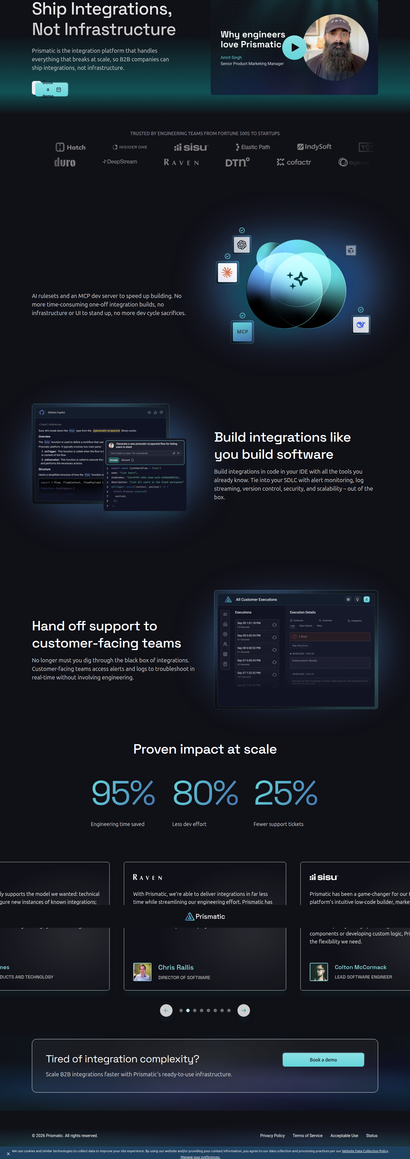
Prismatic's Hero Test: One-Click Demo vs. Email-Gated CTA
Prismatic is A/B testing its engineering landing page hero: a single 'Book a demo' button versus an email-gated lead form. Here's the design breakdown.
Aiko Tanaka
Design Director · · Updated
TL;DR
- Brand: Prismatic (prismatic.io), tested on its engineering landing page at
/lp/engineering/ - Surface: Hero CTA — control shows one "Book a demo" button
- Variant: Adds an "Email *" input field next to the button, converting it into a lead-capture form
- Detection method: vendor SDK activity, confirmed live across both Chrome and Firefox
- Analyst confidence: 80%
- Detected via: ABWatcher's continuous monitoring of live tests at 1,000+ high-converting sites
What did the hero actually look like in each state?
The control hero is a single, uncluttered CTA: one button, one action, zero cognitive tax. The variant inserts an email field directly beside it, asking for a name-and-address-shaped commitment before the click even happens.
That's the entire delta. No headline change, no repositioning, no new imagery — just the CTA cluster. When a test is this surgical, it tells you the team already trusts everything else on the page and is isolating one variable: how much friction to put between "interested" and "identified."
Why does adding one field change the whole hierarchy?
A single button reads as an object; a button-plus-input reads as a task, and tasks slow the eye down before it commits.
In the control, the button is a terminal node — high contrast, one shape, nothing to parse. Your eye lands on it, and the affordance is unambiguous: click equals action. This is the classic single-CTA pattern most SaaS hero sections converge on because it removes decision friction entirely, in line with what Contentful's CRO guide flags as one of the highest-leverage elements to isolate in testing — button copy, color, and placement all compound on a single decision point.
The variant changes that read completely. Now there are two elements competing for primary attention: an input with a label ("Email *") and a button. Gestalt's law of proximity means Prismatic is betting users will parse these as one unit — a mini-form — rather than two separate asks. But a labeled required field also introduces a micro-commitment before the primary action fires. The asterisk alone is a small but real signal: this is not optional, this is a form now. That's a meaningfully different psychological contract than a bare button promises.
Is this a volume play or a quality play?
It's almost certainly a lead-quality test — Prismatic is trading top-of-funnel volume for better-qualified demo requests.
Engineering-focused landing pages tend to attract a mix of curious browsers and actual technical evaluators. A single "Book a demo" button lets both segments through equally; adding an email field upfront pre-filters for people willing to type something before they even see a calendar. This is a textbook low-friction gating pattern — you're not asking for a phone number or company size, just an email, which keeps the barrier low enough that it might not tank conversion volume but high enough to start segmenting intent.
The tradeoff is measurable and well understood in CRO literature: Quantum Metric's guide to CTA testing notes that even small copy and structural changes to CTAs materially shift both click-through and downstream engagement — which is exactly the kind of signal a form-vs-button test is designed to surface. Prismatic can now compare raw click rate against actual booked-and-attended demo rate between the two arms.
What's the interaction cost of the variant, and did they manage it?
The visible cost is one extra input and one required-field marker — small on desktop, potentially larger on mobile where thumb reach and keyboard triggering add friction.
On a landing page, every additional field has a documented tax. DigitalApplied's 2026 CRO guide points out that form friction issues — like autocomplete failures — can spike abandonment by 30-50% on mobile alone, and while an email field is about as low-cost as form friction gets, it still shifts the interaction from a single tap to tap-type-tap. Whether Prismatic's variant collapses gracefully into a stacked, thumb-friendly layout on smaller viewports — or whether the input and button fight for space in the same row — will matter more than the copy does. That's the part a static screenshot review can't fully confirm, but it's the first thing I'd check in their variant's responsive breakpoints.
Test surface summary
| Element | Control | Variant |
|---|---|---|
| Primary CTA | "Book a demo" button only | "Book a demo" button + email input |
| Required fields | 0 | 1 (email, marked required) |
| Interaction steps to convert | 1 click | 1 type + 1 click |
| Detected browsers | Chrome, Firefox | Chrome, Firefox |
| Detection confidence | — | 80% |
Common questions
What page is Prismatic running this test on?
The test is live on Prismatic's engineering-focused landing page at prismatic.io/lp/engineering/, a page presumably driving paid or partner traffic toward technical buyers evaluating the platform for embedded integrations.
How was this A/B test detected?
ABWatcher's vision-AI analyser flagged a structural difference in the hero CTA area, and the split was confirmed via vendor SDK activity present across both Chrome and Firefox — ruling out a browser rendering artifact and supporting an 80% confidence detection.
Why would a B2B SaaS company gate a CTA with an email field?
Email-gating a CTA is a common tactic to pre-qualify leads before they hit a scheduling flow. It reduces no-show rates and lets sales teams route or nurture leads by domain before a call is even booked, at the cost of some top-of-funnel volume.
Does adding a form field always hurt conversion rate?
Not necessarily — it depends on the audience's intent level. High-intent visitors (like engineers evaluating integration platforms) are often willing to trade a single email field for a faster, more relevant next step, while low-intent traffic may drop off at the added step.
What should design teams take from this test?
If your hero CTA converts well but produces low-quality leads downstream, test a single low-friction field — like email only, no phone or company size — before assuming you need heavier gating. Isolate one variable, as Prismatic did, and measure booked-and-attended rate, not just click rate.
The takeaway for your roadmap
If your team is debating whether to add friction to a hero CTA, don't guess — isolate the one field that matters most (usually email) and measure it against attended-demo rate, not just click-through. Prismatic's test is a clean model: same headline, same layout, one variable changed. Ship it that narrow, and you'll actually know what moved the number.
Read next
More from the ABWatcher blog
Nov 22, 2026
Snake River Farms Tests a $25-Off Popup on Its Ad Landing Page
We caught Snake River Farms split-testing an email-capture form and $25-off modal on its landing page. Here's the math on what it would take to call a winner.
Nov 21, 2026
Snake River Farms Tests Mid-Page Email Capture on Its Ad Landing Page
SRF is A/B testing a mid-page lead-capture block and a $25-off popup against a simpler hero-only promo banner on its paid landing page, detected 2024 week-over-week.
Nov 20, 2026
Attio Is Testing a New Tier, Higher Prices, and a New Pitch
Attio is running a live pricing page test with a new $1,000 "Ultra" tier, higher Plus/Pro prices, and a new headline — here's what we caught and what it means.
Nov 19, 2026
Found Quietly Tested a 25% Price Cut on Its Pricing Page
We caught Found running a live pricing A/B test with an annual billing toggle that drops Found Plus from $35 to $26.25/mo. Here's what changed and why it matters.
Nov 8, 2026
Astro Proves "Zero Lock-In" With a Live Code Demo, Not a Claim
Astro's homepage replaces a trust badge row with a working, clickable framework demo — here's the hierarchy and interaction design behind it, detected 60% rare on astro.build.
Nov 7, 2026
Basecamp's Big Numbers: Why Hyper-Precise Stats Beat Vague Social Proof
Basecamp's homepage swaps "trusted by thousands" for 1.7 billion to-dos and 5 petabytes of data. We break down why precision beats vagueness as social proof — and how to test it.
From the glossary
Vocabulary the article uses. See all terms →
- Shrinkage Estimator— A statistical adjustment that pulls noisy per-variant or per-segment estimates toward an overall average to reduce overfitting to randomness.
- Flicker Test— A diagnostic check to confirm whether users briefly see the original page before a variant renders in client-side experiments.
- Pre-Experiment Bucketing Audit— A review process confirming users are being randomly and evenly assigned to experiment variants before launch.
- Above-Fold Exclusion Rule— A test-design rule that deliberately prevents changes to above-the-fold elements so an experiment isolates below-the-fold effects.
- Flicker-Free Testing— A technical setup that prevents users from briefly seeing the original page before a test variant loads.
- Orthogonal Test Design— A test structure where multiple variables are changed independently so their individual effects can be measured without interference.
See more like this
ABWatcher catches A/B tests like this across 1,000+ brands.
Watch live experiments at 1,000+ high-converting brands, complete with hypothesis and takeaway. 7 days of Pro, free, no card, then Free forever for ten watched companies.