
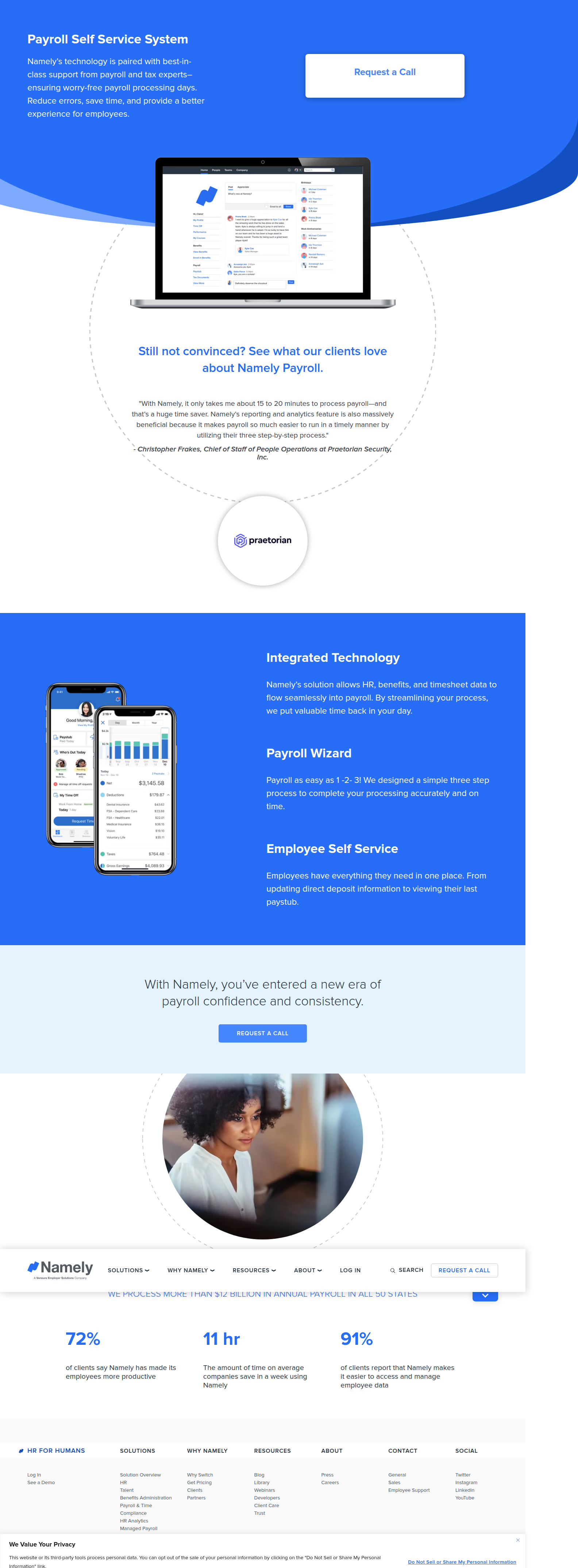
Namely Tests Button vs. Embedded Form on Its Payroll LP Hero
Namely is running a same-run CTA test on its payroll self-service landing page: a simple button vs. a full inline lead-gen form. Here's what the data shows and what to do with it.
Jordan Reeves
Founder & Operator · · Updated
TL;DR
- Detected 90% confidence, same-run variance, on
namely.com/lp/payroll-self-service/ - Variant A: simple "Request a Call" button — seen on visits 1, 2, 5, 7 (Safari/Chrome/Firefox)
- Variant B: full inline hero form (First Name, Last Name, Business Name, Employees, Email, Phone, Country, Submit) — seen on visits 3, 4, 6 (Firefox/Edge/Chrome)
- Both variants confirmed across multiple browser engines, ruling out a rendering artifact
- Surface tested: hero CTA on a payroll-focused landing page
- Likely hypothesis: does removing a click (form-in-hero) beat a lower-friction button that defers commitment
What did ABWatcher actually catch on Namely's landing page?
Namely is running a live split test on the hero of its payroll self-service landing page, pitting a plain CTA button against a fully embedded lead-gen form. We flagged this using same-run variance — the same crawl session returned two structurally different heroes depending on the visit, not the browser. Visits 1, 2, 5, and 7 (spanning Safari, Chrome, and Firefox) rendered a minimal "Request a Call" button. Visits 3, 4, and 6 (spanning Firefox, Edge, and Chrome) rendered a seven-field form sitting directly in the hero: First Name, Last Name, Business Name, Employees, Email, Phone, Country, and a Submit button. Because both variants showed up across different engines rather than clustering by browser, our analyst ruled out a CSS or rendering quirk and logged it at 90% confidence as an intentional test.
Why would a payroll SaaS company test a button against a full form?
Namely is almost certainly testing whether cutting a funnel step lifts form-fill conversion more than it hurts top-of-funnel click-through. A "Request a Call" button is a soft ask — it defers the actual data entry to a modal, a second page, or a scroll-to-form action, and it lets the visitor self-select before doing any work. The embedded form does the opposite: it puts all the friction (and all the intent signal) right in the hero, with no intermediate click. This is a classic funnel-length trade-off. Fewer steps usually means fewer total drop-offs, but it also front-loads the ask before the visitor has been sold — which matters more on a B2B HR/payroll page where the buyer is often doing anonymous research, not ready to hand over their employee count.
How does this compare to standard CTA testing advice?
Most CRO guidance treats CTA and form-placement tests as two different experiments, but Namely is running them as one. Directive's guide to SaaS CTA testing frames CTA experiments as low-risk, incremental modifications you layer onto a stable baseline — swap copy, swap color, swap position. What Namely is doing is a bigger swing: it's changing the funnel architecture itself, not just the button. That's a meaningfully higher-risk test because it doesn't just move the click-through rate on the button, it changes what "conversion" even measures — MQLs from a clean 7-field form versus a call request that still needs qualification. One piece of general A/B testing advice worth repeating here from VWO is that testing shouldn't be an isolated exercise — it needs a hypothesis about funnel economics behind it, not just "let's see which one people click." Namely's test only makes sense if their sales team can quantify the qualification cost difference between a call-back request and a filled-out form with company size data already attached.
What does the variant breakdown look like?
Here's how the two variants distributed across the sampled visits and browser engines during detection:
| Visit # | Browser | Variant | CTA surface |
|---|---|---|---|
| 1 | Safari | A | "Request a Call" button |
| 2 | Chrome | A | "Request a Call" button |
| 3 | Firefox | B | Inline 7-field form |
| 4 | Edge | B | Inline 7-field form |
| 5 | Firefox | A | "Request a Call" button |
| 6 | Chrome | B | Inline 7-field form |
| 7 | Chrome | A | "Request a Call" button |
The even mix across three different browser engines on both sides is exactly why this reads as a genuine split test rather than a caching or template bug — a rendering artifact would correlate with browser or version, not appear randomly distributed across all three.
What should a small team take away from this?
If you've shipped landing pages before, you already know the debate: does removing a step increase completions, or does it just scare off the people who weren't ready yet? I've run this exact test twice in my own funnels — once on a trial signup page, once on a demo-request page — and the results went opposite directions each time. On the trial page, the embedded form won by a wide margin because the audience was already bottom-funnel and just wanted to get moving. On the demo-request page, the button won because most traffic was cold and a big form up front read as presumptuous — people bounced rather than commit seven fields to a brand they'd been on for eleven seconds. The lesson wasn't "forms are good" or "buttons are good." It was that funnel-step tests only tell you something useful if you're segmenting results by traffic intent, and most teams don't have the tooling or patience to do that mid-sprint, so they end up reading a directional lift as universal truth. The video guide on CTA placement makes a similar point: match the friction of the ask to the intent of the traffic source, not to the aesthetic you personally prefer.
Common questions
Is Namely's test actually a legitimate A/B test, or could it be a bug?
It's very likely legitimate. Both variants appeared across three separate browser engines — Safari, Chrome, Firefox for the button, and Firefox, Edge, Chrome for the form — with no correlation to browser type. A rendering bug would typically cluster by engine or version, so the cross-browser spread points to intentional traffic splitting, logged at 90% analyst confidence.
Which variant is likely to win for a payroll landing page?
It depends on traffic source. Paid search traffic with high commercial intent often tolerates the embedded form better, since visitors already expect to submit info. Organic or cold display traffic usually favors the lower-friction button, since it lets uncommitted visitors browse before committing personal and company data.
How long should a test like this run before calling a winner?
Long enough to capture a full weekly cycle of B2B buying behavior — typically two to four weeks for mid-market SaaS landing pages — and enough submissions to reach statistical significance on your actual conversion metric, not just click-through. Payroll buying cycles are slow, so early "leads" may not reflect close-rate quality.
Should teams measure form-fills or downstream sales-qualified leads?
Downstream SQLs matter more here than raw form-fills. A form embedded in the hero may generate more submissions but lower-quality ones, since it removes a self-selection step. Namely's sales team should be tracking cost-per-SQL and close rate by variant, not just top-of-funnel conversion percentage.
What's the risk of testing CTA button vs. embedded form instead of simpler copy changes?
The risk is conflating two different metrics under one experiment. A button-to-form test changes funnel architecture, lead quality, and page load behavior simultaneously, making it harder to isolate which factor drove any lift or drop compared to a simpler, single-variable copy or color test.
What I would actually do next
If your team is choosing between two bets this sprint, don't copy Namely's exact test — copy the instinct behind it, but scope it to your own traffic mix first. Segment your landing page traffic by source and intent before you touch the hero CTA, then run the button-vs-form test only on the segment where you can cleanly measure downstream lead quality, not just submissions. If you can't segment traffic yet, that's the actual sprint priority — ship the tracking, not the form.
Read next
More from the ABWatcher blog
Nov 22, 2026
Snake River Farms Tests a $25-Off Popup on Its Ad Landing Page
We caught Snake River Farms split-testing an email-capture form and $25-off modal on its landing page. Here's the math on what it would take to call a winner.
Nov 21, 2026
Snake River Farms Tests Mid-Page Email Capture on Its Ad Landing Page
SRF is A/B testing a mid-page lead-capture block and a $25-off popup against a simpler hero-only promo banner on its paid landing page, detected 2024 week-over-week.
Nov 20, 2026
Attio Is Testing a New Tier, Higher Prices, and a New Pitch
Attio is running a live pricing page test with a new $1,000 "Ultra" tier, higher Plus/Pro prices, and a new headline — here's what we caught and what it means.
Nov 19, 2026
Found Quietly Tested a 25% Price Cut on Its Pricing Page
We caught Found running a live pricing A/B test with an annual billing toggle that drops Found Plus from $35 to $26.25/mo. Here's what changed and why it matters.
Nov 8, 2026
Astro Proves "Zero Lock-In" With a Live Code Demo, Not a Claim
Astro's homepage replaces a trust badge row with a working, clickable framework demo — here's the hierarchy and interaction design behind it, detected 60% rare on astro.build.
Nov 7, 2026
Basecamp's Big Numbers: Why Hyper-Precise Stats Beat Vague Social Proof
Basecamp's homepage swaps "trusted by thousands" for 1.7 billion to-dos and 5 petabytes of data. We break down why precision beats vagueness as social proof — and how to test it.
From the glossary
Vocabulary the article uses. See all terms →
- Shrinkage Estimator— A statistical adjustment that pulls noisy per-variant or per-segment estimates toward an overall average to reduce overfitting to randomness.
- Flicker Test— A diagnostic check to confirm whether users briefly see the original page before a variant renders in client-side experiments.
- Pre-Experiment Bucketing Audit— A review process confirming users are being randomly and evenly assigned to experiment variants before launch.
- Above-Fold Exclusion Rule— A test-design rule that deliberately prevents changes to above-the-fold elements so an experiment isolates below-the-fold effects.
- Flicker-Free Testing— A technical setup that prevents users from briefly seeing the original page before a test variant loads.
- Orthogonal Test Design— A test structure where multiple variables are changed independently so their individual effects can be measured without interference.
See more like this
ABWatcher catches A/B tests like this across 1,000+ brands.
Watch live experiments at 1,000+ high-converting brands, complete with hypothesis and takeaway. 7 days of Pro, free, no card, then Free forever for ten watched companies.