
Namely Is Testing Button vs. Full Form on Its Payroll LP
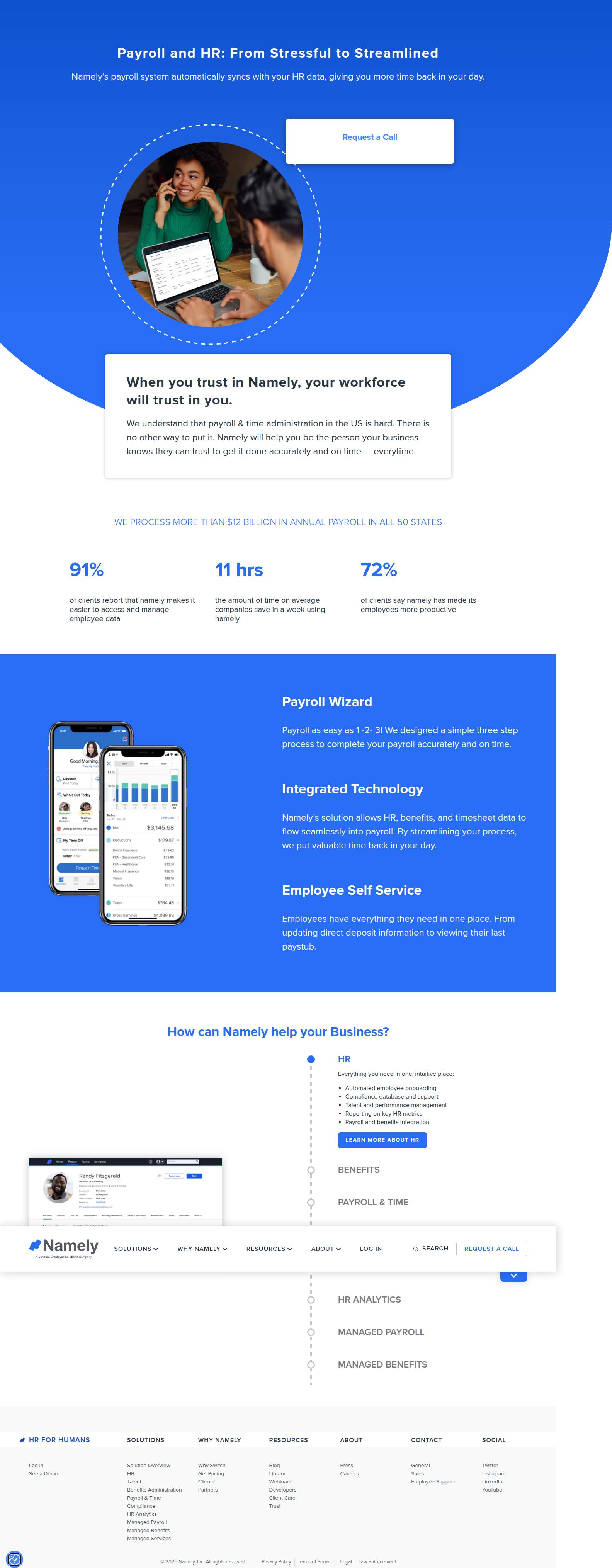
Namely is running a live A/B test on its payroll/HR landing page: a collapsed "Request a Call" CTA vs. a fully expanded 7-field lead form. Here's what we caught and what it means for your form.
Diego Hernandez
Growth Marketer · · Updated
Namely is running a hero-section experiment on its payroll/HR landing page. One bucket sees a single "Request a Call" button. The other sees the whole form, wide open, no click required. We caught it live. Here's the breakdown.
TL;DR
- Detected on namely.com/lp/payroll-hr/, a paid landing page for payroll/HR.
- Two variants: collapsed "Request a Call" button vs. fully expanded 7-field form (First/Last Name, Business Name, Employee Count, Email, Phone, Country, Submit).
- Split confirmed across Safari and Chrome, across 7 recorded visits — visits 1 and 6 saw the button, visits 2–5 and 7 saw the expanded form.
- Detection method: same_run_variance, flagged by ABWatcher's vision-AI analyser.
- Analyst confidence: 80%.
- Likely hypothesis: does an upfront, low-friction-looking form beat a CTA that gates the form behind an extra click?
What did ABWatcher actually see?
The hero CTA on Namely's payroll landing page renders two completely different states depending on the visitor bucket. Visit 1 and visit 6 loaded a compact "Request a Call" button — clean, low commitment, the kind of thing you'd expect above the fold on a cold-traffic landing page. Visits 2, 3, 4, 5, and 7 loaded the same page and got a fully expanded form instead: First Name, Last Name, Business Name, Employee Count, Email, Phone, Country, and a Submit button, all sitting inline where the button used to be.
Same URL. Same campaign, presumably. Two very different asks.
Why does browser diversity matter here?
Because it rules out the most common false positive in visual detection: a rendering bug tied to one engine. The button/form split showed up on both Safari and Chrome, which is the tell. If this were a CSS quirk or a lazy-loaded component failing on one browser, you'd expect the anomaly to cluster on a single engine. It didn't. That's what pushed our analyst confidence to 80% instead of flagging it as noise.
This is the same_run_variance detection method doing its job: catching two states of the same page appearing in the same test window, then checking whether the split correlates with something meaningful (bucket) or something incidental (browser, device, cache). Here it's bucket. That's a real experiment, not an artifact.
What is Namely actually testing?
The likely hypothesis is friction versus intent quality. A single "Request a Call" button reduces the ask to one click — low friction, higher click-through, but it defers the real conversion (a filled-out form) to a second step where drop-off happens. The expanded form removes that second step. Visitors see the full commitment immediately: name, business name, employee count, email, phone, country. That's a lot of fields for a first touch.
The bet on the expanded-form side is that showing the form inline signals "this is quick," even though it's asking for seven fields. The bet on the button side is that a lower-commitment CTA pulls in more clicks, and Namely's sales team would rather qualify leads live on a call than parse form submissions with junk data. Employee Count in the form is a strong signal too — that's a field built for lead scoring, not just contact capture. Namely almost certainly segments deals by headcount, so capturing it upfront could be worth the friction if completion rates hold up.
This is a classic CRO tradeoff, and it's exactly the kind of test VWO's guide to A/B testing argues shouldn't be run in isolation — it only makes sense as part of a broader program where you already know your baseline form completion rate and your call-to-lead conversion rate. Without that context, you're just guessing at which metric to optimize for.
Where does this fit in the bigger picture of form testing?
Lead-gen forms are one of the most tested surfaces on B2B landing pages, and for good reason — they're the last gate before a name lands in a CRM. Contentful's rundown on A/B testing for conversion rate points out that the whole discipline exists because "better" is never obvious until you measure it, and form length is one of the oldest debates in the CRO playbook: short forms convert more clicks, long forms convert better leads.
Here's a quick snapshot of what we caught across the two variants:
| Variant | Hero CTA | Fields shown | Visits observed | Browsers |
|---|---|---|---|---|
| A | "Request a Call" button (collapsed) | 0 (gated behind click) | 1, 6 | Safari, Chrome |
| B | Expanded lead form | 7 (Name, Business, Employees, Email, Phone, Country, Submit) | 2, 3, 4, 5, 7 | Safari, Chrome |
Notice the traffic skew: 5 of 7 visits landed on the expanded form. That's not proof of a winner — sample size from our crawl is too small to call it — but it does suggest Namely may have already weighted allocation toward the form variant, which usually happens mid-test when a brand starts leaning on early signal.
Common questions
What does "same_run_variance" mean as a detection method?
It means ABWatcher caught two different page states within the same monitoring run and traced the split to visitor bucketing rather than device, browser, or caching differences. When the same anomaly repeats across multiple engines, like Safari and Chrome here, it's strong evidence of a live, intentional experiment.
Is a 7-field form too long for a landing page CTA?
It depends on traffic intent and lead quality goals. Long forms typically lower conversion volume but raise lead quality, since only serious prospects finish them. For high-value B2B deals like payroll/HR software, brands often accept fewer, better-qualified leads over a flood of low-intent clicks.
Why would Namely test a button against a form instead of two buttons?
Because the real question isn't "which CTA copy wins" — it's whether removing a click step changes completion behavior entirely. Testing button-vs-form isolates a structural friction variable, not a wording variable, which is a bigger lever for landing page conversion rate.
How confident is ABWatcher that this is a real test and not a bug?
The analyst logged 80% confidence. The split appeared consistently across Safari and Chrome and across multiple visits (1, 6 vs. 2, 3, 4, 5, 7), which matches bucketed experiment behavior rather than a one-off rendering failure tied to a single browser engine.
What's the fastest way to run a similar test on my own landing page?
Start by isolating one variable: form visibility, not full redesign. Ship a collapsed CTA against an inline expanded form on your highest-traffic landing page, hold everything else constant, and let it run long enough to hit statistical significance on both click rate and completion rate, not just one.
The takeaway for your roadmap
Don't assume shorter is always better or that gating a form behind a button always hurts conversion. Namely is testing the structural question directly instead of debating it in a Slack thread. If you've got a lead form buried behind a CTA click on any high-traffic landing page, that's a one-sprint test you can ship this week — just make sure you're measuring lead quality downstream, not just form starts.
Read next
More from the ABWatcher blog
Nov 22, 2026
Snake River Farms Tests a $25-Off Popup on Its Ad Landing Page
We caught Snake River Farms split-testing an email-capture form and $25-off modal on its landing page. Here's the math on what it would take to call a winner.
Nov 21, 2026
Snake River Farms Tests Mid-Page Email Capture on Its Ad Landing Page
SRF is A/B testing a mid-page lead-capture block and a $25-off popup against a simpler hero-only promo banner on its paid landing page, detected 2024 week-over-week.
Nov 20, 2026
Attio Is Testing a New Tier, Higher Prices, and a New Pitch
Attio is running a live pricing page test with a new $1,000 "Ultra" tier, higher Plus/Pro prices, and a new headline — here's what we caught and what it means.
Nov 19, 2026
Found Quietly Tested a 25% Price Cut on Its Pricing Page
We caught Found running a live pricing A/B test with an annual billing toggle that drops Found Plus from $35 to $26.25/mo. Here's what changed and why it matters.
Nov 8, 2026
Astro Proves "Zero Lock-In" With a Live Code Demo, Not a Claim
Astro's homepage replaces a trust badge row with a working, clickable framework demo — here's the hierarchy and interaction design behind it, detected 60% rare on astro.build.
Nov 7, 2026
Basecamp's Big Numbers: Why Hyper-Precise Stats Beat Vague Social Proof
Basecamp's homepage swaps "trusted by thousands" for 1.7 billion to-dos and 5 petabytes of data. We break down why precision beats vagueness as social proof — and how to test it.
From the glossary
Vocabulary the article uses. See all terms →
- Shrinkage Estimator— A statistical adjustment that pulls noisy per-variant or per-segment estimates toward an overall average to reduce overfitting to randomness.
- Flicker Test— A diagnostic check to confirm whether users briefly see the original page before a variant renders in client-side experiments.
- Pre-Experiment Bucketing Audit— A review process confirming users are being randomly and evenly assigned to experiment variants before launch.
- Above-Fold Exclusion Rule— A test-design rule that deliberately prevents changes to above-the-fold elements so an experiment isolates below-the-fold effects.
- Flicker-Free Testing— A technical setup that prevents users from briefly seeing the original page before a test variant loads.
- Orthogonal Test Design— A test structure where multiple variables are changed independently so their individual effects can be measured without interference.
See more like this
ABWatcher catches A/B tests like this across 1,000+ brands.
Watch live experiments at 1,000+ high-converting brands, complete with hypothesis and takeaway. 7 days of Pro, free, no card, then Free forever for ten watched companies.