
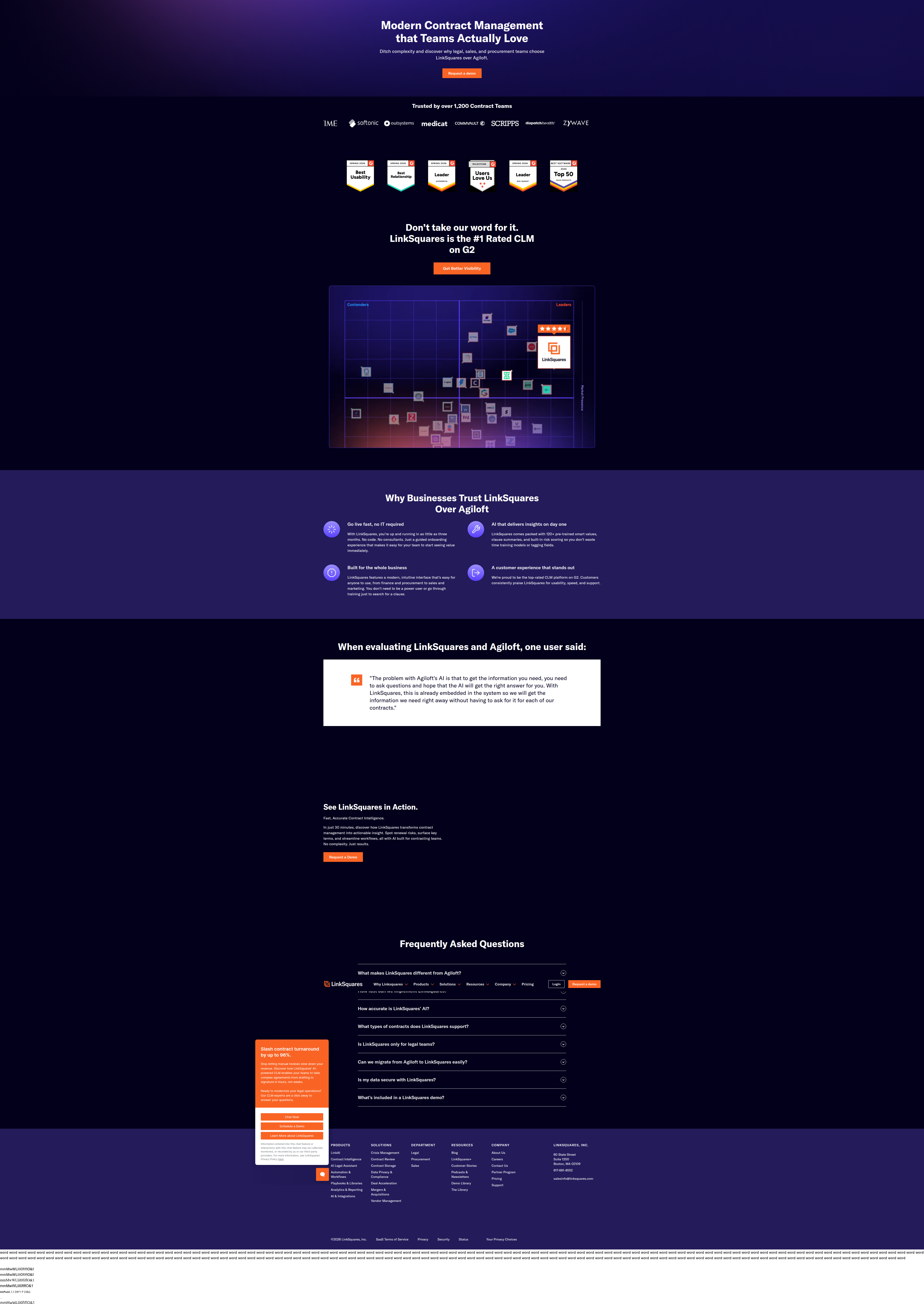
LinkSquares Tests a Bold Orange Chat Popup on Its Agiloft Comparison Page
ABWatcher caught LinkSquares A/B testing a proactive orange chat popup promising "96% faster contract turnaround" on its Agiloft vs. LinkSquares comparison landing page.
Aiko Tanaka
Design Director · · Updated
TL;DR
- ABWatcher detected the test on linksquares.com/linksquares-vs-agiloft/, a competitor-comparison landing page.
- Of 7 total captures, the orange promo popup appeared in 2 visits (visit 2 and visit 5), both on Chrome.
- 5 captures showed no popup, including a third Chrome visit (visit 6) with identical layout/engine — ruling out a rendering bug.
- Detection method: same_run_variance, with analyst confidence scored at 72%.
- Popup copy claims contract turnaround can be cut "by up to 96%," paired with Chat Now, Schedule a Demo, and Learn More CTAs.
- Bucketing pattern points to a cookie/session-based A/B/n test on the chat engagement widget, not a browser inconsistency.
What exactly did ABWatcher catch on the LinkSquares page?
ABWatcher's vision-AI analyser flagged a proactive orange popup appearing in only 2 of 7 monitored captures on the same URL. The page in question is LinkSquares' head-to-head comparison against Agiloft — a classic bottom-of-funnel page where a visitor is actively choosing between two contract lifecycle management vendors. That's exactly the moment where a brand wants to shove a high-confidence stat in front of you before you leave. The variant does it with a bright orange callout stating contract turnaround can drop "by up to 96%," backed by three exits: Chat Now, Schedule a Demo, Learn More.
The control experience — five of seven captures — renders the same page with no popup at all. No chat prompt, no proactive nudge, just the static comparison content doing the persuading on its own.
Why does the same browser showing two different states matter?
It matters because it's the strongest signal ABWatcher has that this is a real test, not a fluke. Visit 6 ran on Chrome with the same layout as visits 2 and 5, yet showed zero popup. If this were a rendering or device issue, you'd expect variance to track with browser engine or viewport — it doesn't. The variance tracks with session, which is the fingerprint of cookie-bucketed A/B testing tools like Optimizely or a vendor's own experiment layer sitting on top of a chat widget (Drift, Intercom, or similar). That's why the analyst logged 72% confidence rather than treating it as a certainty: popups can also be triggered by exit-intent, time-on-page, or geo rules that aren't strictly "test variants." But the clean 2-vs-5 split across identical browser conditions is a strong tell.
| Visit # | Browser | Popup Present? |
|---|---|---|
| 1 | — | No |
| 2 | Chrome | Yes |
| 3 | — | No |
| 4 | — | No |
| 5 | Chrome | Yes |
| 6 | Chrome | No |
| 7 | — | No |
What does the design of the popup tell you about intent?
The orange color and the specific "96%" stat are doing the persuasion work the rest of the page can't do passively. Orange sits far outside LinkSquares' primary blue/navy brand palette used across the comparison page, which is exactly the point — it's an interrupt pattern, not a page-native element. In visual hierarchy terms, this is a deliberate break in figure-ground relationship: everything else on the page recedes, and the popup becomes the only object competing for foreground attention. That's a classic use of contrast as a forcing function, not a subtlety.
The number "96%" is also doing more than decoration. Specific, oddly precise percentages (not "double your speed" but "up to 96%") read as evidence, not marketing fluff, and they anchor a visitor's expectation before they've even opened a Chat Now conversation. Pairing that stat with three CTAs — Chat, Demo, Learn More — is a funnel-splitting move: LinkSquares isn't betting on one conversion path, it's testing which exit ramp visitors actually prefer when interrupted mid-comparison. On a competitor-vs-competitor page, that's a high-stakes moment to introduce friction, and the fact that they're testing it at all suggests they suspect the current experience is leaking demo requests.
This kind of CTA experimentation is well-trodden ground in CRO literature — one guide on SaaS CTA A/B testing notes that even a 1% lift in click-through on a site with 20,000 monthly visitors nets 200 additional engaged visitors, which is exactly the kind of incremental math that justifies testing a popup on a lower-traffic, high-intent page like a comparison URL. And per Optimizely's field notes on A/B testing, the top-performing test programs prioritize metrics tied to revenue and completed conversions over raw CTA clicks — which likely means LinkSquares isn't just watching popup click rate, they're watching demo bookings downstream.
Why run this test specifically on a comparison page?
Comparison pages carry unusually high commercial intent, so even small engagement lifts there translate disproportionately into pipeline. Visitors landing on "LinkSquares vs. Agiloft" have already self-qualified — they're evaluating vendors, not learning what CLM software is. That makes the page one of the highest-leverage places on the site to test a proactive chat trigger, because the cost of a wrong CTA choice (or a popup that feels pushy) is higher too. Interrupting someone who's 80% convinced with a hard sell is a real risk if the copy or timing misfires, which is likely why LinkSquares is running this as a controlled split rather than a full rollout.
What should your team take from this test?
If you're running comparison or competitor-vs-you pages, don't treat them as static, "set it and forget it" content — they're some of the highest-intent real estate on your site and worth testing engagement triggers against, the same way LinkSquares is doing here. Before you build a new popup variant, pull your own heatmap data first, since testing before understanding where attention already clusters can save weeks of misguided iteration, a point echoed in 6smarketers' CTA optimization tactics. This sprint: audit your own bottom-funnel comparison pages, check whether any proactive engagement layer is even present, and if not, scope a controlled test rather than a blanket launch.
Common questions
What surface did ABWatcher detect this test on?
The test was detected on LinkSquares' comparison landing page at linksquares.com/linksquares-vs-agiloft/. The tested surface is a proactive chat/promo popup layered on top of the CTA experience, not the core page copy or layout itself.
How confident is ABWatcher that this is a genuine A/B test?
The analyst logged 72% confidence, based on same_run_variance detection. The popup appeared in 2 of 7 captures and was absent from an identical-browser third capture, which points to session-based bucketing rather than a rendering inconsistency.
What does the popup actually say?
It's an orange callout claiming visitors can "slash contract turnaround by up to 96%," with three action buttons: Chat Now, Schedule a Demo, and Learn More. It appears layered over the existing comparison page content.
Why does testing on a competitor comparison page matter more than testing on a homepage?
Comparison pages attract visitors already deep in vendor evaluation, so engagement or friction changes there have outsized influence on pipeline quality. A test here is lower-traffic but higher-intent than most homepage experiments, making each conversion more valuable.
Could this be a bug instead of a deliberate test?
It's unlikely. Visit 6 used the same Chrome browser and layout as the two visits showing the popup, yet displayed no popup at all, which rules out a simple rendering or device-based explanation and points to intentional session bucketing.
Read next
More from the ABWatcher blog
Nov 22, 2026
Snake River Farms Tests a $25-Off Popup on Its Ad Landing Page
We caught Snake River Farms split-testing an email-capture form and $25-off modal on its landing page. Here's the math on what it would take to call a winner.
Nov 21, 2026
Snake River Farms Tests Mid-Page Email Capture on Its Ad Landing Page
SRF is A/B testing a mid-page lead-capture block and a $25-off popup against a simpler hero-only promo banner on its paid landing page, detected 2024 week-over-week.
Nov 20, 2026
Attio Is Testing a New Tier, Higher Prices, and a New Pitch
Attio is running a live pricing page test with a new $1,000 "Ultra" tier, higher Plus/Pro prices, and a new headline — here's what we caught and what it means.
Nov 19, 2026
Found Quietly Tested a 25% Price Cut on Its Pricing Page
We caught Found running a live pricing A/B test with an annual billing toggle that drops Found Plus from $35 to $26.25/mo. Here's what changed and why it matters.
Nov 8, 2026
Astro Proves "Zero Lock-In" With a Live Code Demo, Not a Claim
Astro's homepage replaces a trust badge row with a working, clickable framework demo — here's the hierarchy and interaction design behind it, detected 60% rare on astro.build.
Nov 7, 2026
Basecamp's Big Numbers: Why Hyper-Precise Stats Beat Vague Social Proof
Basecamp's homepage swaps "trusted by thousands" for 1.7 billion to-dos and 5 petabytes of data. We break down why precision beats vagueness as social proof — and how to test it.
From the glossary
Vocabulary the article uses. See all terms →
- Shrinkage Estimator— A statistical adjustment that pulls noisy per-variant or per-segment estimates toward an overall average to reduce overfitting to randomness.
- Flicker Test— A diagnostic check to confirm whether users briefly see the original page before a variant renders in client-side experiments.
- Pre-Experiment Bucketing Audit— A review process confirming users are being randomly and evenly assigned to experiment variants before launch.
- Above-Fold Exclusion Rule— A test-design rule that deliberately prevents changes to above-the-fold elements so an experiment isolates below-the-fold effects.
- Flicker-Free Testing— A technical setup that prevents users from briefly seeing the original page before a test variant loads.
- Orthogonal Test Design— A test structure where multiple variables are changed independently so their individual effects can be measured without interference.
See more like this
ABWatcher catches A/B tests like this across 1,000+ brands.
Watch live experiments at 1,000+ high-converting brands, complete with hypothesis and takeaway. 7 days of Pro, free, no card, then Free forever for ten watched companies.