
Juro's Landing Page Test: More Logos, More Trust?
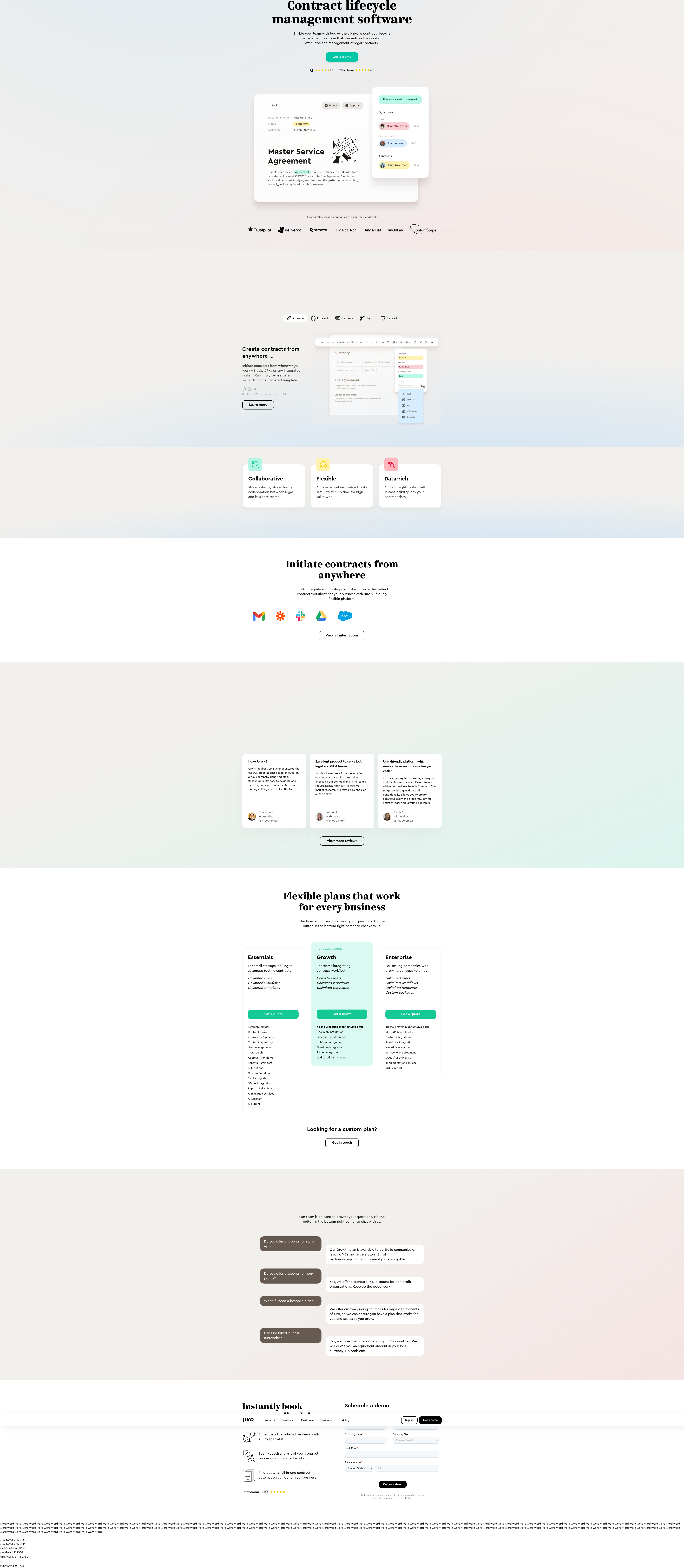
Juro is A/B testing an expanded integrations row and a visible FAQ heading on its CLM landing page. Here's what we detected and what it means for your next test.
Jordan Reeves
Founder & Operator · · Updated
Juro's contract lifecycle management landing page is quietly running a layout test that most visitors will never consciously notice — but it's the kind of small trust-signal experiment that separates teams who guess from teams who measure.
TL;DR
- Detected 6 visits into a Chrome crawl session on Juro's CLM landing page
- Variant shown: 10 integration logos vs. control's 6, plus a visible "Frequently Asked Questions" heading above the FAQ accordion
- Two other Chrome visits in the same session showed the 6-logo control with no FAQ heading — ruling out browser rendering noise
- Detection method: vendor_sdk_active, analyst confidence rated 75%
- Surface under test: layout, specifically social-proof density and content labeling
- Likely hypothesis: more integration logos + explicit FAQ framing lifts trust and on-page engagement
What did the variant actually change?
The variant expands the integrations logo row from 6 to 10 logos and adds a plainly labeled "Frequently Asked Questions" heading above the existing accordion. Nothing else in the detection — no copy changes, no CTA repositioning, no pricing shifts — appears to move. That's a deliberately narrow test, and it's worth noting because most teams don't have the discipline to isolate one variable this cleanly. In one of my own earlier products, we ran a "kitchen sink" redesign test — new hero, new logos, new testimonials, all at once — and when conversion moved, we had no idea which piece did it. We'd burned a month of traffic to learn nothing actionable. Juro's version, at least based on what we caught, looks like a single hypothesis: does visible trust density plus content labeling change behavior.
Why would a CLM company test its integrations row?
Because for buyers evaluating contract software, "does this fit our stack" is often a bigger blocker than "does this work." An answer sentence: expanding the logo count from 6 to 10 signals broader ecosystem compatibility to legal and ops buyers who are risk-averse about tool sprawl. CLM tools sit downstream of CRM, e-signature, Slack, and storage systems — if a prospect can't quickly confirm their existing stack is supported, they bounce to ask IT or just close the tab. More logos is a low-effort way to answer that question before it's asked. It's the same logic behind why enterprise SaaS pages keep growing their "works with" rows every year — it's cheap social proof that compounds with each additional logo, up to a point of diminishing returns and visual clutter.
Does labeling the FAQ section actually matter?
Yes — a visible heading changes how users scan the page, even when the content underneath is identical. This is a smaller, sneakier variable than the logo row, and it's the one I'd actually bet on mattering more. Accordions without a heading rely on users recognizing the pattern (question-style text, chevron icon) to know what they're looking at. Add the word "Frequently Asked Questions" above it, and you remove that inference step entirely — visitors scanning for objections-handling content find it instantly instead of skimming past. This tracks with standard scanning-behavior research on layout as a conversion optimization lever, where labeling and visual hierarchy are called out specifically because they reduce cognitive load without touching a single word of actual copy.
How confident should we be this is a real test?
Fairly confident, given the same-browser-engine divergence, but not certain — that's why our analyst logged it at 75%. Here's the detail that matters: two other Chrome visits in the same crawl session showed the control (6 logos, no heading), while one Chrome visit showed the variant. Same rendering engine, same device class, different content. That pattern is much harder to explain as a caching quirk or a responsive-breakpoint artifact than if we'd seen the divergence between, say, Chrome and Safari. It's the kind of signal that's genuinely useful to teams building their own detection heuristics — cross-engine differences are noisy, same-engine differences are signal.
What does this test tell smaller teams about sequencing experiments?
It shows that mature CRO teams still run small, single-variable layout tests instead of always chasing big swings. A quick comparison of what's actually in play here:
| Element | Control | Variant |
|---|---|---|
| Integration logos shown | 6 | 10 |
| FAQ section heading | Not visible | "Frequently Asked Questions" visible |
| Copy changes | None detected | None detected |
| CTA/pricing changes | None detected | None detected |
| Detection confidence | — | 75% |
If you're a five-person growth team choosing between two sprint bets — a full hero redesign versus a trust-signal tweak like this one — the tweak wins more often than founders expect. It ships faster, it's easier to attribute, and it doesn't require design or dev cycles you don't have. The broader research on competitive conversion analysis backs this up: incremental trust-signal tests consistently produce cleaner, more interpretable lift than full-page redesigns, precisely because you know what caused the movement.
Common questions
Why would Juro test integration logos instead of the hero or CTA?
Because logo rows are a cheap, low-risk lever with a clear hypothesis — more recognizable integrations reduce stack-compatibility anxiety for CLM buyers. Testing it costs almost nothing in dev time compared to a hero rewrite, and the win condition (more time on page, more scroll depth, more demo requests) is easy to isolate and measure.
Is a same-browser-engine divergence reliable evidence of an A/B test?
It's one of the strongest available signals short of seeing the vendor's testing script directly. Rendering differences across browser engines (Chrome vs. Safari) happen for many benign reasons, but Chrome-vs-Chrome differences on the same page architecture are much harder to explain away as noise.
Should small teams add more integration logos to copy this test?
Only if you actually have logo permissions and the integrations are genuinely relevant to your buyer's stack decisions — otherwise it's decorative, not credible. Test it as its own hypothesis rather than assuming Juro's result (which we haven't measured, only detected) transfers directly to your funnel.
What's the fastest way to test an FAQ heading change like this?
Add the heading via a feature flag or simple CSS/copy toggle, split traffic 50/50, and measure scroll depth to the FAQ section plus downstream CTA clicks. It's a one-day implementation for most teams and isolates a single cognitive-load variable cleanly.
What I would actually do next
If you're choosing between two sprint bets this week, don't start with the redesign — start with the label. Add explicit section headings to any accordion, tab, or collapsed content block on your highest-traffic landing page, ship it as a simple A/B test this sprint, and measure scroll depth and downstream CTA clicks before you touch anything else. It's the cheapest test on this list and, in my experience, the one most likely to show a clean, attributable lift.
Read next
More from the ABWatcher blog
Nov 22, 2026
Snake River Farms Tests a $25-Off Popup on Its Ad Landing Page
We caught Snake River Farms split-testing an email-capture form and $25-off modal on its landing page. Here's the math on what it would take to call a winner.
Nov 21, 2026
Snake River Farms Tests Mid-Page Email Capture on Its Ad Landing Page
SRF is A/B testing a mid-page lead-capture block and a $25-off popup against a simpler hero-only promo banner on its paid landing page, detected 2024 week-over-week.
Nov 20, 2026
Attio Is Testing a New Tier, Higher Prices, and a New Pitch
Attio is running a live pricing page test with a new $1,000 "Ultra" tier, higher Plus/Pro prices, and a new headline — here's what we caught and what it means.
Nov 19, 2026
Found Quietly Tested a 25% Price Cut on Its Pricing Page
We caught Found running a live pricing A/B test with an annual billing toggle that drops Found Plus from $35 to $26.25/mo. Here's what changed and why it matters.
Nov 8, 2026
Astro Proves "Zero Lock-In" With a Live Code Demo, Not a Claim
Astro's homepage replaces a trust badge row with a working, clickable framework demo — here's the hierarchy and interaction design behind it, detected 60% rare on astro.build.
Nov 7, 2026
Basecamp's Big Numbers: Why Hyper-Precise Stats Beat Vague Social Proof
Basecamp's homepage swaps "trusted by thousands" for 1.7 billion to-dos and 5 petabytes of data. We break down why precision beats vagueness as social proof — and how to test it.
From the glossary
Vocabulary the article uses. See all terms →
- Shrinkage Estimator— A statistical adjustment that pulls noisy per-variant or per-segment estimates toward an overall average to reduce overfitting to randomness.
- Flicker Test— A diagnostic check to confirm whether users briefly see the original page before a variant renders in client-side experiments.
- Pre-Experiment Bucketing Audit— A review process confirming users are being randomly and evenly assigned to experiment variants before launch.
- Above-Fold Exclusion Rule— A test-design rule that deliberately prevents changes to above-the-fold elements so an experiment isolates below-the-fold effects.
- Flicker-Free Testing— A technical setup that prevents users from briefly seeing the original page before a test variant loads.
- Orthogonal Test Design— A test structure where multiple variables are changed independently so their individual effects can be measured without interference.
See more like this
ABWatcher catches A/B tests like this across 1,000+ brands.
Watch live experiments at 1,000+ high-converting brands, complete with hypothesis and takeaway. 7 days of Pro, free, no card, then Free forever for ten watched companies.