
Hotels.com Tests Urgency Deals Module Against Membership Messaging
Hotels.com is running a live homepage test pitting a "Last-minute deals" merchandising module and direct sign-in copy against a lighter, membership-branded control. Here's what we caught and what it means for your roadmap.
Jordan Reeves
Founder & Operator · · Updated
TL;DR
- Detected 2024 on hotels.com's homepage (
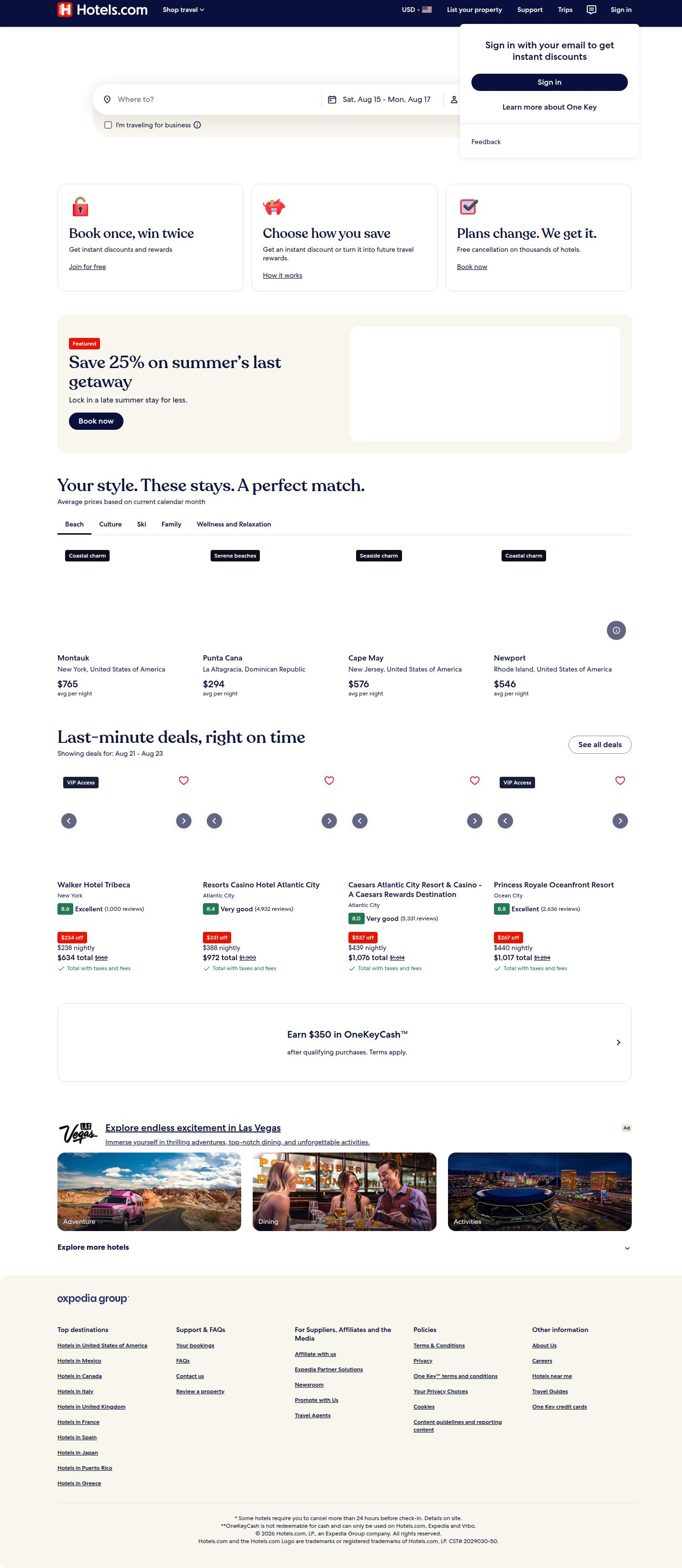
https://hotels.com) via same-run variance across browser engines. - Variant (Edge + matching Chrome/Firefox sessions) adds a full "Last-minute deals, right on time" module with pricing and reviews.
- Control (Safari + matching Chrome/Firefox sessions) shows no deals module at all — a leaner homepage.
- Sign-in CTA copy differs: "Unlock instant savings with Member Prices" (control) vs. "Sign in with your email to get instant discounts" (variant).
- Analyst confidence: 78%, flagged as a genuine server-side experiment, not rendering noise.
- Pattern is consistent across multiple browser engines, which rules out a CDN or caching artifact.
What did Hotels.com actually change on its homepage?
Hotels.com is running a two-sided homepage test: one funnel gets an entire new merchandising section, the other gets different sign-in copy with no new section at all. The variant funnel — served consistently to Edge visitors and a matching slice of Chrome/Firefox traffic — inserts a "Last-minute deals, right on time" block loaded with hotel cards, pricing, and star reviews. The control funnel, served to Safari and its matching Chrome/Firefox slice, has no such section. On top of that, the sign-in prompt itself changes tone: control reads "Unlock instant savings with Member Prices," a benefit wrapped in loyalty-program branding, while the variant strips that away for something blunter — "Sign in with your email to get instant discounts."
That's two levers moving at once: information density above the fold, and the framing of the sign-in ask. Worth noting this isn't a single component swap — it's a page architecture decision.
Why does the browser-split pattern matter here?
The recurrence of the same split across Edge, Safari, and matching Chrome/Firefox cohorts is what separates a real experiment from a rendering bug. If this were a caching issue or a browser-specific rendering quirk, we'd expect it to appear once, inconsistently, tied to a single engine's quirks. Instead it shows up as a stable, repeatable pattern where non-Safari users converge on one experience and Safari users converge on another, with Chrome/Firefox traffic splitting to match each side. That's the signature of a server-side experiment bucketing users by session or cookie, not a browser compatibility problem. It's also why our detection method here — same-run variance — exists: comparing simultaneous live sessions is one of the few ways to catch server-side tests before they ever show up in a company's own public case study.
What's the hypothesis Hotels.com is likely testing?
Hotels.com appears to be testing whether urgency-driven deal merchandising plus a plainer sign-in ask outperforms a lighter, membership-branded homepage. The "Last-minute deals" module leans on classic scarcity and immediacy cues — the kind of urgency messaging that Revfine's guide to A/B testing conversion rates flags as one of the most reliable levers in travel booking flows, because trip timing already primes travelers to respond to time pressure. Pairing that with a sign-in CTA that names the mechanism ("sign in with your email") rather than the brand program ("Member Prices") suggests Hotels.com is testing literalism against aspiration: does telling users exactly what to do beat telling them what they'll get?
This is also a layout-density test in disguise. Adding a whole new section changes scroll depth, visual hierarchy, and how fast a first-time visitor reaches a decision point. Orbit Media's rundown on multivariate and A/B testing makes the point that layout tests like this are best read as bundles — you're not just testing copy, you're testing whether more content up front helps or overwhelms.
How should you read the sign-in copy change specifically?
The copy swap is testing specificity against brand equity, and specificity usually wins on first-time-visitor pages. "Unlock instant savings with Member Prices" requires the visitor to already understand what "Member Prices" means and to want in on a program. "Sign in with your email to get instant discounts" requires nothing but an email address and a reason. For a homepage that's mostly serving new and lapsed visitors rather than loyal members, the second framing removes a comprehension step. That's a pattern worth stealing regardless of your vertical: any CTA that references an internal program name is a CTA asking the visitor to do homework first.
What does this test setup tell us about breakdown by surface?
Here's a snapshot of what changed and where, based on the detection:
| Surface | Control (Safari-matched) | Variant (Edge-matched) |
|---|---|---|
| Deals module | Absent | Full "Last-minute deals, right on time" section with pricing + reviews |
| Sign-in copy | "Unlock instant savings with Member Prices" | "Sign in with your email to get instant discounts" |
| Page density | Lighter homepage | Heavier, merchandising-forward homepage |
| Detection method | same_run_variance | same_run_variance |
| Confidence | 78% | 78% |
Two variables, one test — which is itself a decision worth flagging. Landingi's roundup of A/B testing case studies cites that only 14% of tests produce a statistically significant win, and bundling multiple changes into one variant makes it harder to know which lever actually moved the needle if it wins.
Common questions
Is this a real A/B test or a bug?
It's a real test. The pattern repeats consistently across multiple browser engines rather than appearing once, which rules out caching or rendering glitches. Our analyst confidence sits at 78%, and the detection method (same-run variance) is specifically designed to catch server-side experiments that companies never publicize.
Why would Hotels.com test two changes at once instead of one?
Combining a new deals module with new sign-in copy speeds up learning cycles when a team believes both changes point the same direction — toward urgency and directness. The tradeoff is attribution: if the variant wins, Hotels.com won't cleanly know whether the module or the copy drove it without a follow-up isolation test.
What would a smaller team learn from this test?
Even without Hotels.com's traffic volume, the sign-in copy comparison is directly testable in a sprint: literal instruction ("sign in with your email") versus branded benefit framing ("unlock savings with membership"). That's a cheap, fast test that doesn't require building a new merchandising module first.
Does adding urgency-driven deal modules always help conversion?
Not always — it depends on audience intent and page load cost. Hotel Tech Report's guide to hotel website CRO notes that added page weight and visual clutter can suppress conversion for visitors who arrive with a specific booking already in mind, so urgency modules tend to help top-of-funnel browsers more than bottom-of-funnel searchers.
How long should a test like this run before trusting the result?
Long enough to cover full weekly booking cycles and multiple browser/traffic segments, typically several weeks for a homepage-level test at Hotels.com's scale. Ending early on a layout-density change is especially risky since novelty effects from a denser page can inflate early engagement numbers before they fade.
What I would actually do next
If I were running growth on a booking or subscription homepage this sprint, I wouldn't copy the deals module first — I'd copy the sign-in copy test. Swapping a branded-benefit CTA for a literal-instruction CTA is a one-line change you can ship this week, and it isolates the exact question Hotels.com is bundling into a bigger bet. Run that alone, get a clean read on whether specificity beats aspiration for your sign-in wall, and only then decide if a heavier merchandising module is worth the added build cost and page weight.
Read next
More from the ABWatcher blog
Nov 22, 2026
Snake River Farms Tests a $25-Off Popup on Its Ad Landing Page
We caught Snake River Farms split-testing an email-capture form and $25-off modal on its landing page. Here's the math on what it would take to call a winner.
Nov 21, 2026
Snake River Farms Tests Mid-Page Email Capture on Its Ad Landing Page
SRF is A/B testing a mid-page lead-capture block and a $25-off popup against a simpler hero-only promo banner on its paid landing page, detected 2024 week-over-week.
Nov 20, 2026
Attio Is Testing a New Tier, Higher Prices, and a New Pitch
Attio is running a live pricing page test with a new $1,000 "Ultra" tier, higher Plus/Pro prices, and a new headline — here's what we caught and what it means.
Nov 19, 2026
Found Quietly Tested a 25% Price Cut on Its Pricing Page
We caught Found running a live pricing A/B test with an annual billing toggle that drops Found Plus from $35 to $26.25/mo. Here's what changed and why it matters.
Nov 8, 2026
Astro Proves "Zero Lock-In" With a Live Code Demo, Not a Claim
Astro's homepage replaces a trust badge row with a working, clickable framework demo — here's the hierarchy and interaction design behind it, detected 60% rare on astro.build.
Nov 7, 2026
Basecamp's Big Numbers: Why Hyper-Precise Stats Beat Vague Social Proof
Basecamp's homepage swaps "trusted by thousands" for 1.7 billion to-dos and 5 petabytes of data. We break down why precision beats vagueness as social proof — and how to test it.
From the glossary
Vocabulary the article uses. See all terms →
- Shrinkage Estimator— A statistical adjustment that pulls noisy per-variant or per-segment estimates toward an overall average to reduce overfitting to randomness.
- Flicker Test— A diagnostic check to confirm whether users briefly see the original page before a variant renders in client-side experiments.
- Pre-Experiment Bucketing Audit— A review process confirming users are being randomly and evenly assigned to experiment variants before launch.
- Above-Fold Exclusion Rule— A test-design rule that deliberately prevents changes to above-the-fold elements so an experiment isolates below-the-fold effects.
- Flicker-Free Testing— A technical setup that prevents users from briefly seeing the original page before a test variant loads.
- Orthogonal Test Design— A test structure where multiple variables are changed independently so their individual effects can be measured without interference.
See more like this
ABWatcher catches A/B tests like this across 1,000+ brands.
Watch live experiments at 1,000+ high-converting brands, complete with hypothesis and takeaway. 7 days of Pro, free, no card, then Free forever for ten watched companies.