
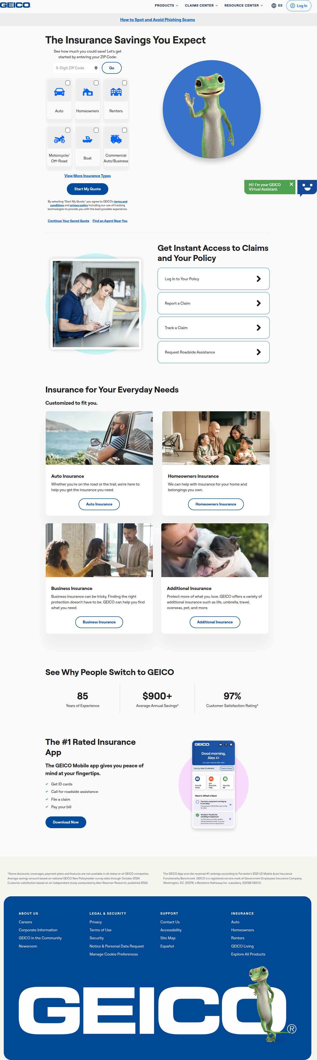
GEICO's Homepage Hero Is Running Two Very Different Quote Flows
GEICO is A/B testing a ZIP-code-first hero against a tabbed product-selector hero on geico.com — here's what the split reveals and what to steal for your own roadmap.
Jordan Reeves
Founder & Operator · Aug 2, 2026
GEICO's homepage hero isn't one thing right now — it's two. Load geico.com in Safari or Firefox and you get "Savings you expect. Protection you deserve." with a tab-based product selector and a Bundle & Save promo. Load it in Chrome or Edge and the headline changes to "The Insurance Savings You Expect," the tabs disappear, and you're staring at a bare ZIP code field, a gecko mascot, and a single "Start My Quote" button. Even the category cards underneath shift labels — "Vehicle Insurance" and "Property Insurance" in one version, "Auto Insurance" and "Homeowners Insurance" in the other.
We flagged this through same-run variance — our detection method that catches when different browser sessions hitting the same URL at the same time render meaningfully different UI. The engine split (Safari/Firefox vs. Chrome/Edge) is a little too clean to be pure coincidence, but the actual content difference — headline, CTA structure, field layout — reads like a legitimate, deliberate experiment. At GEICO's scale, this is a quote-funnel test worth studying closely.
The Real Bet: Friction vs. Framing
Strip away the copy and you're left with two different theories about what gets a visitor to start a quote.
Control (tabs + savings headline): asks the visitor to first self-sort into a product category via tabs, then presumably enter details on a secondary screen. It leads with an emotional value prop — savings and protection — before asking for any input.
Variant (ZIP-first + single CTA): skips the sorting step entirely. One field, one button, minimal copy. It bets that reducing the decision surface at the very top of the funnel beats a more persuasive headline.
This is the classic "reduce friction" vs. "improve framing" tension that shows up in nearly every high-traffic hero test. I've run versions of this exact fork at three different companies, and the pattern that keeps repeating: the friction-reducing variant almost always wins on top-of-funnel conversion (quote starts), but it doesn't always win on the metric that pays the bills. A ZIP-first flow can pull in visitors who weren't seriously shopping, inflating starts while diluting quality. GEICO clearly has the scale and the actuarial data to see through to bind rate, which is exactly the metric I'd want visibility into if I were them — and exactly the metric most teams don't have wired up when they copy this pattern.
Why the Category Labels Matter More Than They Look
The "Vehicle/Property" vs. "Auto/Homeowners" swap seems cosmetic, but it's actually testing vocabulary match. "Vehicle Insurance" is a category-first frame — useful if you're trying to group products for cross-sell later in the funnel. "Auto Insurance" is what people actually type into Google and say out loud. This is a textbook search-intent-alignment test, and it's the kind of change that's cheap to ship and easy to underrate.
I've seen a "Property" vs. "Homeowners" label swap alone move click-through on a category card by double digits, purely because it matched how visitors mentally categorized their own need. If your team is debating whether label wording is "worth a whole test cycle," the answer from repeated experience is yes — especially on a card that's essentially your top-of-page navigation. Optimizely's list of testable elements is a good reminder that navigation and menu clarity consistently punch above their visual weight in test results.
The Suspicious Part: Is This Really Session-Based?
The fact that the split maps cleanly onto browser engine rather than looking randomly distributed across all traffic is worth flagging, not dismissing. Two honest explanations:
- It's a legitimate session/user-bucketed test, and the browser correlation is a coincidence of GEICO's traffic mix (plausible at their volume, especially if certain campaigns or devices skew toward specific browsers).
- There's a feature-flag or CDN-level rollout keyed partly on user-agent — common when teams are doing a phased release disguised as an A/B test, or when a redesign is being validated engine-by-engine before a full rollout.
Either way, the lesson for smaller teams: audit your own experiment platform's bucketing logic before you trust a top-line lift number. I've been burned once by a "significant" result that was actually a caching layer serving stale variants to a specific CDN edge that happened to correlate with a browser. The team celebrated for two weeks before someone checked the raw session logs. Contentful's testing guide underscores this basic hygiene point — a valid test needs verifiably random, engine-agnostic assignment, not just a clean-looking dashboard.
What This Means If You're Running the Same Test This Sprint
If your team is debating a ZIP/postal-code-first entry vs. a tabbed selector for your own quote or signup flow, GEICO's test gives you a real-world signal that this fork is worth running, not theorizing about. But don't just copy the variant that "looks more modern." Two things I'd insist on before shipping either direction:
- Instrument the full funnel, not just the hero interaction. Quote starts are a vanity metric if you can't trace them to completed quotes and, ideally, binds or paid conversions.
- Segment your result by traffic source. A ZIP-first flow will look artificially strong with paid search traffic (high intent, already knows what they want) and artificially weak with organic homepage browsers still comparing options.
What I Would Actually Do Next
If I were running growth on a quote-based or lead-gen product this sprint, I'd ship the low-friction, single-field variant to 20% of traffic, but I'd hold the tabbed/category version as the default for anyone arriving from a comparison or research-intent channel (organic, comparison-site referral) — then compare bind rate, not just quote starts, at the two-week mark. The label wording test (Auto vs. Vehicle) I'd run in parallel since it's nearly free to build and the upside on search-intent match is disproportionate to the effort.
See more like this
ABWatcher catches A/B tests like this every day.
Watch live experiments at 1,000+ high-converting brands, complete with hypothesis and takeaway. Free forever for ten watched companies.