
Funding Circle Splits Its Homepage: Cashback Card vs. "Business Finance That Backs You"
ABWatcher caught Funding Circle running two entirely different homepage heroes on the same Chrome browser — a cashback-card pitch vs. a broader business-finance narrative. Here's the design breakdown.
Aiko Tanaka
Design Director · · Updated
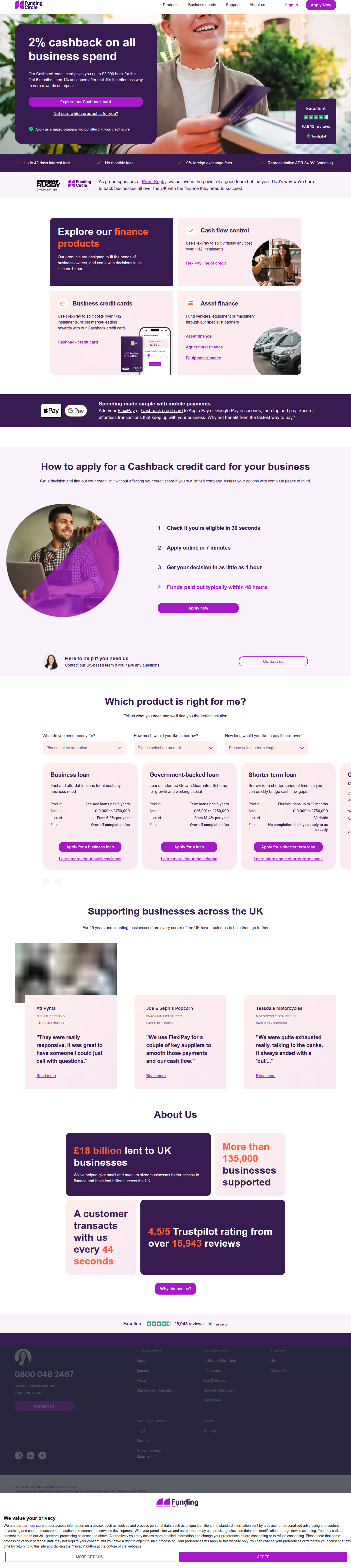
Same browser. Same site. Two completely different front doors. On 5 separate visits to fundingcircle.com, our vision-AI analyser caught Chrome rendering the familiar "2% cashback on all business spend" hero — except once, when it instead served a variant headlined "Business finance that backs you," complete with a different hero image, relabeled product tiles, and a rewritten quote-flow section.
TL;DR
- Brand: Funding Circle (fundingcircle.com), homepage hero surface
- Detected: live A/B test, same-run variance across identical Chrome sessions, confidence 80%
- Control: "2% cashback on all business spend" hero, seen on 4 of 5 visits including the same Chrome browser
- Variant: "Business finance that backs you" hero, distinct image, "Get started" CTA, relabeled tiles (Term loans vs. Cash flow control)
- Test engine: Optimizely, confirmed via diverging localStorage variation maps rather than a caching artifact
- Hypothesis: cashback-card-led messaging vs. broad business-finance positioning, measured on application starts
What did the two hero variants actually look like?
One hero leads with a single product hook (cashback), the other leads with a category promise (business finance), and the visual system shifts underneath both.
The control hero — the one showing up in four of five captured visits — puts the reward mechanic front and center: "2% cashback on all business spend." That's a specific, quantified, self-interested benefit. It reads like a card acquisition ad, not a lending homepage. The eye lands on the percentage first; numbers pull attention before words do, and "2%" is doing the job a hero image usually does.
The variant swaps that out entirely. "Business finance that backs you" is a positioning line, not an offer line — it's selling reassurance and breadth, not a specific perk. It pairs with a different hero image (the analyser flags this as a materially distinct asset, not a crop or a color swap) and a "Get started" CTA instead of whatever action-verb button sits on the cashback version. That's a meaningfully different first-impression contract with the visitor: one says "here's what you get," the other says "here's who we are."
Why does the product-tile relabeling matter more than it looks?
Renaming tiles from "Term loans" to "Cash flow control" reframes the product from a finance category to a customer outcome, which changes what visitors scan for first.
This is the part of the test I'd watch closest. "Term loans" is a product-taxonomy label — it assumes the visitor already knows what they need and is scanning for a match. "Cash flow control" is a job-to-be-done label — it assumes the visitor is scanning for a problem, not a product name. In an F-pattern read, tile labels sit in that second horizontal sweep after the hero, so this isn't a throwaway microcopy tweak. It's testing whether SMB owners self-select faster by category or by pain point. Gestalt's law of similarity is doing real work here too: whichever label groups more naturally with the hero's tone (reward-driven vs. reassurance-driven) will feel more coherent, and coherence is half of what makes a hero section convert.
How was this confirmed as a real test and not a rendering glitch?
The same Chrome browser produced both variants across visits, with diverging Optimizely localStorage variation maps proving cookie-keyed bucketing rather than a caching or rendering artifact.
That distinction matters for anyone reading detection reports: a one-off visual difference could be a CDN cache miss, a broken image CDN, or a stale service worker. What confirms a genuine test is the pairing of visual divergence with backend state divergence — in this case, Optimizely's own variation-assignment data stored client-side. Visit 2 and Visit 5 ran on the same engine but landed in different buckets, which is exactly what you'd expect from a live experiment with sticky cookie-based assignment, not a fluke.
What's the likely hypothesis behind this test?
Funding Circle is likely testing whether a specific cashback incentive out-converts a broader business-finance narrative on hero click-through and application starts.
The cashback framing is a fast, legible hook — it should win on raw click-through for visitors who are rate-shopping or card-shopping. But "Business finance that backs you" is built for a longer consideration set: it's the version that keeps a visitor reading into the rewritten "Get a personalised quote" steps section, which suggests Funding Circle is also testing funnel depth, not just hero clicks. In financial services specifically, the real signal isn't the first click — it's what happens after. FullStory's research on financial services CRO points at exactly this: track time between steps, retry rates on document upload, and abandonment at funding, because the hero only buys you the first micro-conversion. A cashback hook might spike "Get started" clicks and still lose on completed applications if it attracts the wrong intent.
How does this compare to typical hero-test patterns?
Most hero tests we log change one variable at a time; this one changes headline, image, CTA label, tile taxonomy, and a full funnel-step section simultaneously.
| Element | Control (cashback) | Variant (business finance) |
|---|---|---|
| Headline | "2% cashback on all business spend" | "Business finance that backs you" |
| Hero image | Standard/incumbent asset | Distinct image, different subject |
| CTA | Reward-framed button | "Get started" |
| Tile 1 label | Term loans | Cash flow control |
| Steps section | Existing quote flow copy | Rewritten "Get a personalised quote" steps |
| Detected via | same_run_variance, Chrome visit 2 | same_run_variance, Chrome visit 5 |
That's a multivariate swing dressed up as a single hero test — five coordinated elements moving together, which tells you Funding Circle isn't isolating variables so much as testing two entire brand narratives against each other. Contentful's guide to A/B testing makes the point that hero-section tests are most reliable when the surrounding page stays constant enough to isolate the effect — worth noting here because Funding Circle didn't do that, which means whatever wins will be hard to attribute to any single element without a follow-up isolation test.
Common questions
What is "same_run_variance" detection?
Same-run variance is when our system captures two different site states from repeat visits using the same browser configuration, in this case Chrome, ruling out device or browser differences and pointing instead to cookie- or session-based A/B test bucketing.
Which platform is powering Funding Circle's test?
Optimizely. We confirmed this by inspecting localStorage variation-map data, which diverged between the two visits in a pattern consistent with genuine experiment assignment rather than a caching issue.
Why would a lender test cashback vs. broad positioning?
Cashback is a fast, legible hook that likely drives higher top-of-funnel clicks, while broader positioning may attract visitors with higher application-completion intent. Testing both lets Funding Circle see which hero produces more funded deals, not just more clicks.
Is changing five elements at once a good testing practice?
Not if the goal is clean attribution. Coordinated multivariate swings like this one are useful for testing whole narratives quickly, but teams should follow up with isolated single-variable tests to learn which specific element drove the result.
The takeaway for your roadmap
If you're running hero tests this sprint, decide upfront whether you're testing a narrative or a variable — Funding Circle's test reads like the former, and that's fine, but it means the next test on their roadmap should isolate headline, image, or CTA individually to find out which one actually moved the needle. Ship the big swing first to learn direction; ship the isolated version second to learn causation.
Read next
More from the ABWatcher blog
Nov 22, 2026
Snake River Farms Tests a $25-Off Popup on Its Ad Landing Page
We caught Snake River Farms split-testing an email-capture form and $25-off modal on its landing page. Here's the math on what it would take to call a winner.
Nov 21, 2026
Snake River Farms Tests Mid-Page Email Capture on Its Ad Landing Page
SRF is A/B testing a mid-page lead-capture block and a $25-off popup against a simpler hero-only promo banner on its paid landing page, detected 2024 week-over-week.
Nov 20, 2026
Attio Is Testing a New Tier, Higher Prices, and a New Pitch
Attio is running a live pricing page test with a new $1,000 "Ultra" tier, higher Plus/Pro prices, and a new headline — here's what we caught and what it means.
Nov 19, 2026
Found Quietly Tested a 25% Price Cut on Its Pricing Page
We caught Found running a live pricing A/B test with an annual billing toggle that drops Found Plus from $35 to $26.25/mo. Here's what changed and why it matters.
Nov 8, 2026
Astro Proves "Zero Lock-In" With a Live Code Demo, Not a Claim
Astro's homepage replaces a trust badge row with a working, clickable framework demo — here's the hierarchy and interaction design behind it, detected 60% rare on astro.build.
Nov 7, 2026
Basecamp's Big Numbers: Why Hyper-Precise Stats Beat Vague Social Proof
Basecamp's homepage swaps "trusted by thousands" for 1.7 billion to-dos and 5 petabytes of data. We break down why precision beats vagueness as social proof — and how to test it.
From the glossary
Vocabulary the article uses. See all terms →
- Shrinkage Estimator— A statistical adjustment that pulls noisy per-variant or per-segment estimates toward an overall average to reduce overfitting to randomness.
- Flicker Test— A diagnostic check to confirm whether users briefly see the original page before a variant renders in client-side experiments.
- Pre-Experiment Bucketing Audit— A review process confirming users are being randomly and evenly assigned to experiment variants before launch.
- Above-Fold Exclusion Rule— A test-design rule that deliberately prevents changes to above-the-fold elements so an experiment isolates below-the-fold effects.
- Flicker-Free Testing— A technical setup that prevents users from briefly seeing the original page before a test variant loads.
- Orthogonal Test Design— A test structure where multiple variables are changed independently so their individual effects can be measured without interference.
See more like this
ABWatcher catches A/B tests like this across 1,000+ brands.
Watch live experiments at 1,000+ high-converting brands, complete with hypothesis and takeaway. 7 days of Pro, free, no card, then Free forever for ten watched companies.