
Fibery Replaces Its Signup Form With an AI-Built Workspace
Fibery swapped its blank signup form for an AI prompt that pre-builds a personalized workspace, delivering value before signup. Here's the CRO logic behind it.
Maya Patel
Senior CRO Strategist · · Updated
TL;DR
- Detected on fibery.io signup page, form surface, category ai_integration
- Rarity score 85%, importance score 75% — one of the less common patterns ABWatcher tracks across 1,000+ monitored sites
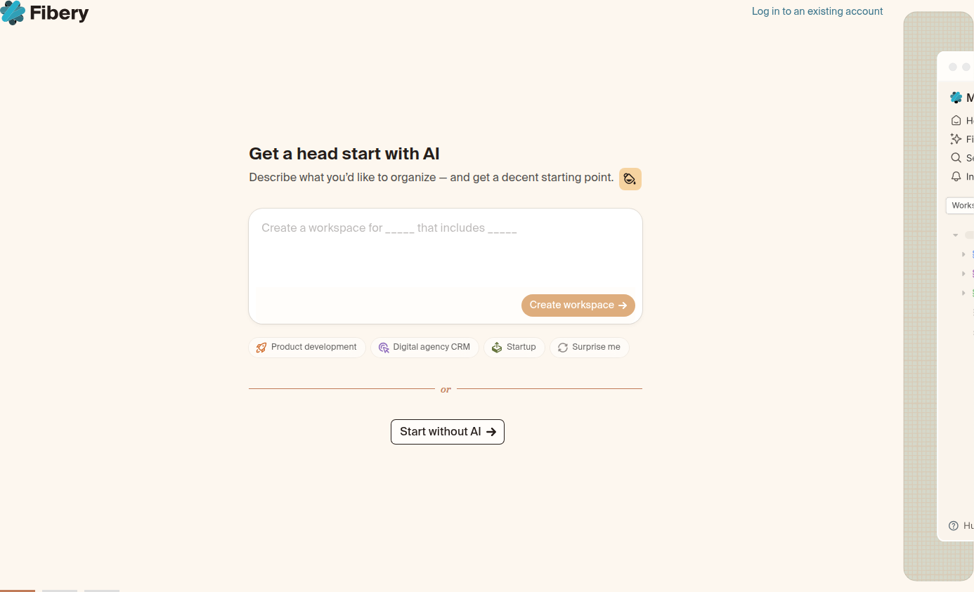
- Instead of a blank form, Fibery asks users to describe what they want to organize and AI generates a starter workspace
- Evidence copy pulled directly from the page: "Get a head start with AI — Describe what you'd like to organize — and get a decent starting point."
- The change moves value delivery before account commitment, inverting the standard signup-then-onboard sequence
- Pattern sits at the intersection of form simplification and personalization, two CRO levers with strong independent evidence
What did Fibery actually change on its signup page?
Fibery replaced the traditional blank signup form with a single prompt asking visitors to describe what they want to organize, then generates a personalized workspace before account creation is finalized. The evidence quote is explicit: "Get a head start with AI — Describe what you'd like to organize — and get a decent starting point." Rather than collecting name, email, and password up front and promising value later, the form itself becomes the first onboarding step. The AI output — a pre-built workspace structure — functions as an immediate, tangible artifact rather than a vague promise of what the product could eventually do.
This is a meaningful structural shift, not a copy tweak. Traditional B2B signup flows are built on a sequence: convert first, activate second. Fibery is testing whether collapsing that sequence — activate as part of conversion — reduces the psychological cost of signing up.
Why does asking a question convert better than showing a form?
Replacing static fields with a descriptive prompt lowers perceived commitment while simultaneously increasing perceived personalization, a dual lever most single-tactic tests can't pull at once. Standard CRO guidance has treated these as separate problems. Form-length reduction is one of the most well-documented levers in the discipline — best-practice guidance consistently recommends asking for the minimum required information and considering multi-step forms for longer inputs, because every additional field or decision point introduces drop-off risk. Personalization is treated as a separate, later-funnel lever — tailored landing experiences consistently outperform one-size-fits-all messaging because they close the gap between visitor intent and page content.
What's notable about the Fibery pattern is that it uses one interaction to service both principles simultaneously. The form doesn't feel like a form because the input is framed as a question about the user's problem, not a data-collection exercise. The output — an AI-generated workspace — is the personalization layer, generated from a single free-text field rather than a multi-step segmentation flow.
Is this actually a form simplification, or does it add friction?
It's a tradeoff, and the honest answer is: it depends on execution quality of the AI output, not the concept itself. A few dimensions worth running through an ICE-style filter before assuming this is a straightforward win:
| Dimension | Traditional blank form | AI-prompt form (Fibery pattern) |
|---|---|---|
| Cognitive load at entry | Low (familiar pattern) | Medium (requires articulating a use case) |
| Perceived value before signup | None | Immediate (workspace preview) |
| Personalization effort | Zero, generic post-signup onboarding | High, tailored from first input |
| Drop-off risk if AI output disappoints | N/A | Elevated — a bad first output can kill trust fast |
| Time-to-value | Post-signup, often days | Pre-commitment, seconds |
The risk column matters. Confidence-Lift-Risk thinking would flag that this pattern's upside is gated entirely on output quality. A generic or low-relevance AI-generated workspace is worse than a blank form, because it actively demonstrates the product's shortcomings during the moment meant to build trust. Teams considering this pattern should treat AI output quality as the primary risk variable in their test plan, not a secondary polish item.
How does this compare to standard CRO guidance on forms and mobile?
Most published CRO guidance still assumes forms are static and personalization happens after conversion, which is exactly the assumption this pattern breaks. Mobile behavior is a good stress test here: most landing page traffic now arrives on mobile, where tiny tap targets and awkward multi-step flows are disproportionately punishing. A free-text prompt is arguably more mobile-friendly than a five-field form — one thumb-typed sentence versus five taps between fields — but it also depends on generation latency. If the AI workspace takes more than a couple seconds to render on a mobile connection, the pattern's time-to-value advantage evaporates and it becomes a liability instead.
This is why the rarity score (85%) tracks with genuine novelty rather than just aesthetic difference. Most "innovative" signup redesigns we log are variations on layout, copy, or field count. This one changes what the form is — an input to a generative system rather than a data-capture mechanism.
What should teams test on their own signup flow this sprint?
Don't copy the pattern wholesale — pressure-test the underlying hypothesis first with a lighter-weight variant. Before building a full AI-generation pipeline into your signup form, run a PIE-scored experiment on the narrower claim: does showing any personalized preview before commitment lift conversion for your funnel? That could be a templated preview based on a dropdown selection, a use-case picker that reveals a mocked-up dashboard, or a single free-text field that maps to pre-built templates rather than live generation. Measure completion rate, but also measure downstream activation — a pattern that lifts signups but produces users who bounce in week one hasn't actually solved anything. If the lighter version shows lift, the case for investing in true generative pre-build gets much stronger, and you'll have avoided sinking engineering time into an AI pipeline before validating the behavioral premise.
Common questions
What page and company did ABWatcher detect this on?
ABWatcher logged this pattern on the signup page at fibery.io, specifically on the form surface. It's categorized under ai_integration, with a rarity score of 85% and importance score of 75%, indicating both novelty and material business relevance.
Is an AI-generated workspace at signup a common pattern?
No — an 85% rarity score means this is one of the less frequently observed patterns across the 1,000+ sites ABWatcher monitors daily. Most signup-flow experiments involve field count, copy, or layout changes rather than restructuring the form into a generative input.
What's the main risk with this approach?
The primary risk is output quality. If the AI-generated workspace is generic, irrelevant, or slow to render, it can damage trust more than a plain blank form would, since it's demonstrating the product's core capability at the most scrutinized moment of the funnel.
How does this relate to standard form-optimization advice?
It extends it. Standard guidance favors minimal fields and smart autofill to reduce friction. This pattern goes further by making the single required input generate immediate personalized value, combining form simplification with personalization in one interaction.
Should smaller teams attempt this without a mature AI pipeline?
Not immediately. Teams should first validate the underlying hypothesis — that pre-commitment personalization lifts signups — with a lower-cost mechanism like templated previews, before investing engineering effort into live generative workspace building.
Read next
More from the ABWatcher blog
Nov 22, 2026
Snake River Farms Tests a $25-Off Popup on Its Ad Landing Page
We caught Snake River Farms split-testing an email-capture form and $25-off modal on its landing page. Here's the math on what it would take to call a winner.
Nov 21, 2026
Snake River Farms Tests Mid-Page Email Capture on Its Ad Landing Page
SRF is A/B testing a mid-page lead-capture block and a $25-off popup against a simpler hero-only promo banner on its paid landing page, detected 2024 week-over-week.
Nov 20, 2026
Attio Is Testing a New Tier, Higher Prices, and a New Pitch
Attio is running a live pricing page test with a new $1,000 "Ultra" tier, higher Plus/Pro prices, and a new headline — here's what we caught and what it means.
Nov 19, 2026
Found Quietly Tested a 25% Price Cut on Its Pricing Page
We caught Found running a live pricing A/B test with an annual billing toggle that drops Found Plus from $35 to $26.25/mo. Here's what changed and why it matters.
Nov 8, 2026
Astro Proves "Zero Lock-In" With a Live Code Demo, Not a Claim
Astro's homepage replaces a trust badge row with a working, clickable framework demo — here's the hierarchy and interaction design behind it, detected 60% rare on astro.build.
Nov 7, 2026
Basecamp's Big Numbers: Why Hyper-Precise Stats Beat Vague Social Proof
Basecamp's homepage swaps "trusted by thousands" for 1.7 billion to-dos and 5 petabytes of data. We break down why precision beats vagueness as social proof — and how to test it.
From the glossary
Vocabulary the article uses. See all terms →
- Shrinkage Estimator— A statistical adjustment that pulls noisy per-variant or per-segment estimates toward an overall average to reduce overfitting to randomness.
- Flicker Test— A diagnostic check to confirm whether users briefly see the original page before a variant renders in client-side experiments.
- Pre-Experiment Bucketing Audit— A review process confirming users are being randomly and evenly assigned to experiment variants before launch.
- Above-Fold Exclusion Rule— A test-design rule that deliberately prevents changes to above-the-fold elements so an experiment isolates below-the-fold effects.
- Flicker-Free Testing— A technical setup that prevents users from briefly seeing the original page before a test variant loads.
- Orthogonal Test Design— A test structure where multiple variables are changed independently so their individual effects can be measured without interference.
See more like this
ABWatcher catches A/B tests like this across 1,000+ brands.
Watch live experiments at 1,000+ high-converting brands, complete with hypothesis and takeaway. 7 days of Pro, free, no card, then Free forever for ten watched companies.