
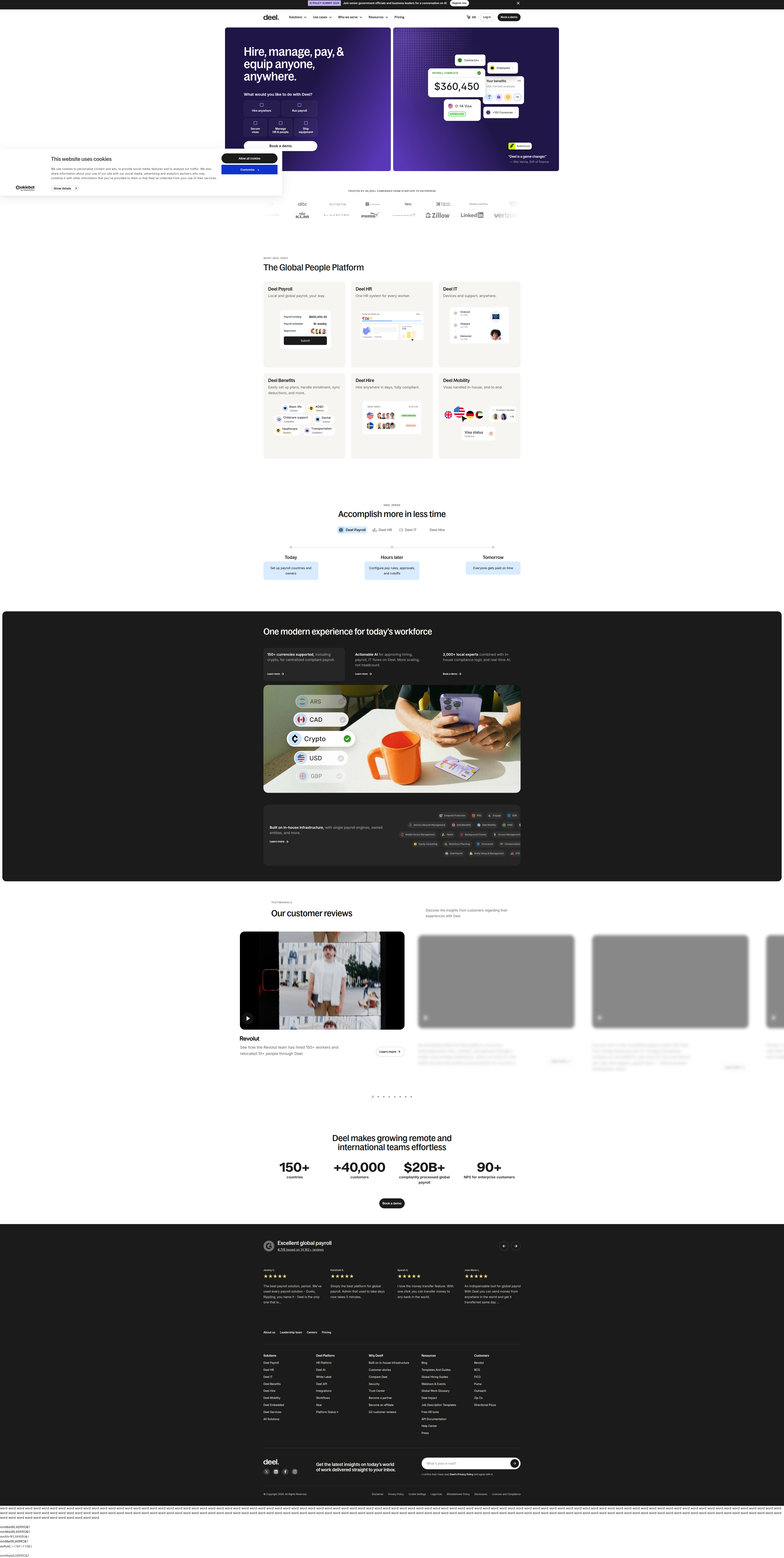
Deel Tests Product UI vs. Lifestyle Photography in Its Hero
Deel is A/B testing its homepage hero visual — a lifestyle photo vs. a product dashboard illustration — in a classic emotional-vs-functional B2B test. Here's what it signals and how to run your own.
Maya Patel
Senior CRO Strategist · Jul 29, 2026
Deel's homepage hero is currently split-testing the single most viewed asset on deel.com: the right-side visual. We caught it via vendor SDK activity, with the cookie frontend.exp22-people-design flipping true/false across visits and two distinct Optimizely/VWO experiment IDs firing depending on session. Confidence on this detection sits at 82%.
What's Actually in the Variants
The control shows a photograph of a woman working on a laptop — warm, human, aspirational. The variant swaps that out entirely for a product UI dashboard illustration: dotted background, interface chrome, data modules. Same headline real estate, same CTA position, same layout grid — only the hero visual language changes.
This is a clean, single-variable test by CRO standards. No copy changes, no CTA repositioning, no layout shift detected. That matters: when only the image changes, any statistically significant delta in signup rate, demo request rate, or scroll depth can be attributed to the visual itself, not confounded by other moving parts. It's the kind of test structure we'd score highly on an ICE framework — high Confidence in attribution, low Effort to build, and Impact that's genuinely unknown until the data comes in, which is precisely why it's worth running.
The Emotional vs. Functional Tension
This is a well-worn debate in B2B SaaS hero design, and Deel sits in an interesting position to litigate it. Deel sells global payroll and compliance infrastructure — a category where buyers are evaluating risk, operational trust, and product capability simultaneously.
Lifestyle photography tends to do heavy lifting on the trust and relatability axis. It signals "real people use this," lowers perceived complexity, and performs well when the buyer's primary hesitation is emotional (Can I trust this vendor? Will this feel human?). Product UI illustrations do the opposite job: they compress the "what does this actually do" education into a glance, which matters when buyers are further down the funnel and comparing capabilities across 3-4 vendors in category review.
Optimizely's own field research lists hero image variation as one of the highest-leverage tests a team can run precisely because it front-loads comprehension — their guidance notes that product demo visuals can increase time on page by helping visitors understand the offering faster than a static lifestyle shot. That's directionally consistent with what Deel appears to be testing here, though the inverse is also true: the wrong UI screenshot can overwhelm a cold visitor who hasn't yet decided the category matters to them.
What This Signals About Deel's Funnel Priorities
Deel's homepage is a top-of-funnel asset that has to serve a wide range of visitor intent — a founder evaluating global hiring, an HR ops lead comparing EOR platforms, and a finance buyer checking compliance claims all land on the same hero. Testing product UI against lifestyle photography suggests Deel is trying to determine whether that broad audience converts better when shown proof of product earlier, rather than proof of humanity.
This is a meaningful strategic signal, not just a design refresh. If Deel's traffic mix has shifted toward more bottom-funnel, comparison-shopping visitors (plausible for a category leader with strong branded search volume), a functional hero that shows the actual dashboard could reduce the "what is this, exactly" hesitation that a lifestyle photo leaves unresolved. Category leaders often make this shift once brand awareness matures — the job of the hero moves from "build trust in the category" to "differentiate on capability."
Reading the Confidence-Lift-Risk Tradeoff
Before recommending either direction, it's worth running this through a Confidence-Lift-Risk lens, the way we'd evaluate it internally:
- Confidence: Moderate-high. The test is well-isolated (single variable), which means any result will be clean and actionable.
- Lift potential: Uncertain but plausible in the 3-8% range on primary CTA click-through, based on typical hero-visual test outcomes we've logged across SaaS homepages — functional imagery tends to outperform when the target segment is already commercial-intent, while lifestyle imagery tends to hold or outperform on colder, brand-building traffic.
- Risk: Low to the business, but there's a segmentation risk — a single winner declared globally may suppress conversion for the segment that responded better to the losing variant. Deel would benefit from checking whether paid vs. organic, or new vs. returning, traffic responds differently before fully committing.
Fullstory's guide to A/B testing makes a point worth repeating here: A/B testing exists to redirect budget from acquisition into conversion efficiency, but only if the test is read at the segment level, not just in aggregate. A global "variant B wins" conclusion can mask a scenario where variant B wins on returning traffic and loses on cold, top-of-funnel visitors — which is exactly the mixed audience Deel's homepage serves.
The Takeaway for Your Roadmap
If your hero currently defaults to lifestyle photography out of brand convention rather than data, this is a low-effort, high-signal test to prioritize this sprint. Isolate the hero visual as the single variable, hold headline and CTA constant, and segment your results by traffic source and funnel stage before declaring a winner. The Deel test is a useful reminder that "emotional vs. functional" isn't a universal answer — it's a question your own traffic mix has to answer, and the only way to get that answer is to run the test rather than default to whichever visual the brand team prefers.
See more like this
ABWatcher catches A/B tests like this every day.
Watch live experiments at 1,000+ high-converting brands, complete with hypothesis and takeaway. Free forever for ten watched companies.