
Deel Tests a Softer CTA and Longer Copy on Its Pricing Page
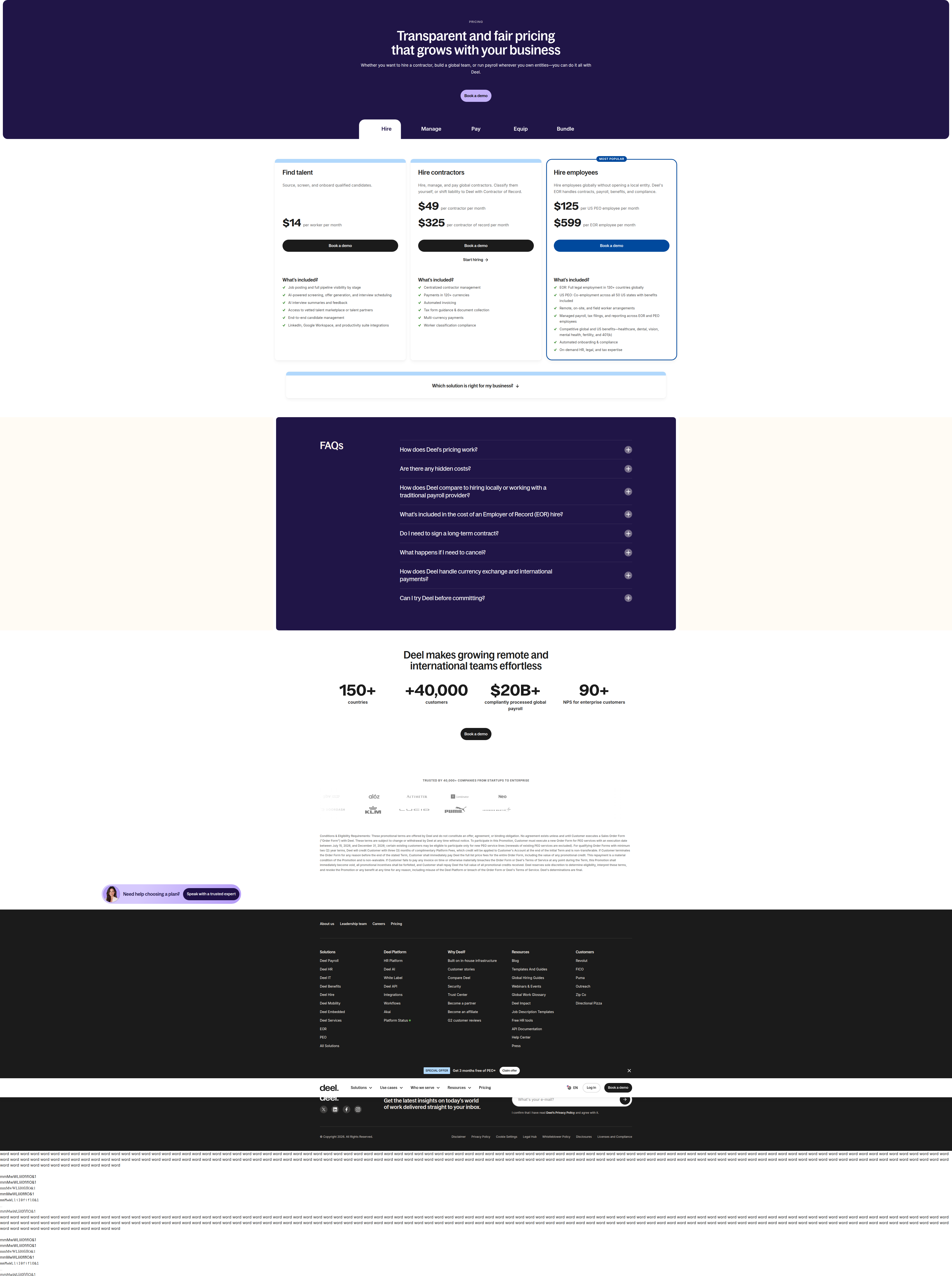
Deel is running a live pricing-page test swapping "Book a demo" for a consultative CTA, dropping the Bundle tab, and rewriting plan copy — detected 85% confidence via week-over-week diff.
Maya Patel
Senior CRO Strategist · · Updated
Deel's pricing page is running a live experiment, and it's not a small copy tweak — it touches the hero CTA, the tab structure, and the plan card descriptions all at once.
TL;DR
- Detected on deel.com/pricing via week-over-week diff, analyst confidence 85%
- Hero CTA changes from "Book a demo" to "Speak with a trusted expert" in the variant
- Variant removes the "Bundle" tab entirely from the pricing page navigation
- Plan card copy shifts from terse bullets to longer, benefit-style descriptions (e.g., "Hire employees" → "Hire full-time employees")
- Experiment cookie
frontend.exp048-formconfirms deliberate bucketing, not a rendering artifact - Likely hypothesis: a consultative CTA plus expanded plan copy lifts pricing-page conversion versus the direct, terse control
What exactly changed on the page?
The variant softens the primary CTA, removes a navigation tab, and lengthens plan descriptions — three coordinated changes, not one isolated tweak. In the control, visitors see "Book a demo" as the hero CTA alongside a "Bundle" tab and short, functional bullet copy under each plan (e.g., "Hire employees"). In the variant, the CTA reads "Speak with a trusted expert," the Bundle tab disappears from the tab set, and plan descriptions expand into fuller, benefit-oriented sentences ("Hire full-time employees" with more context on what that unlocks). Our vision-AI analyser flagged the pattern through a week-over-week diff, and the presence of the frontend.exp048-form cookie is what pushed our confidence to 85% — it rules out a caching glitch or a partial deploy and confirms real bucketing logic behind the scenes.
Why would Deel soften its CTA language?
A consultative CTA typically targets buyers who feel underqualified or overwhelmed by a "demo" ask, trading urgency for perceived guidance. "Book a demo" is a transactional, sales-forward phrase — it implies a scheduled, structured pitch. "Speak with a trusted expert" reframes the same action as advisory support, which matters more on a page like Deel's, where the buying committee spans HR, finance, and legal, and where global payroll and compliance complexity can make self-serve decisions feel risky. This is a classic Confidence-Lift-Risk tradeoff: the softer phrasing may raise confidence for hesitant buyers and lift click-through, but it also risks attracting lower-intent clicks who aren't ready to transact, which can dilute lead quality downstream in the funnel. Teams running this kind of test should track SQL conversion, not just CTA click rate, before declaring a winner.
Why remove the Bundle tab?
Cutting the Bundle tab likely reduces decision paralysis at the cost of hiding a path some buyers were actively using. Pricing pages with too many parallel navigation options — plan tabs, bundle tabs, add-on tabs — can trigger choice overload, a well-documented conversion drag in pricing UX research. If Deel's bundle option was underused or confusing next to the core EOR/contractor/payroll tabs, removing it simplifies the primary decision tree. The tradeoff: any segment of buyers who came specifically for bundled pricing now has to dig for it or ask a rep, which could shift volume rather than create it. This is worth watching for a secondary metric — contact-form mentions of "bundle" or "package" pricing post-launch would signal suppressed demand rather than eliminated demand.
Why lengthen the plan card copy?
Longer, benefit-style copy trades scan-speed for persuasion depth, a tradeoff that pricing-page tests frequently surface. The shift from "Hire employees" to "Hire full-time employees" with expanded supporting copy suggests Deel is testing whether more explicit, benefit-forward language reduces ambiguity for enterprise buyers comparing EOR, contractor, and payroll tiers. Terse bullets scan fast but can under-communicate scope, especially for a product category (global employment infrastructure) where the buyer needs to understand jurisdictional nuance before committing. This mirrors a common PIE-framework consideration — Potential is high because pricing-page comprehension directly affects self-serve and sales-assisted conversion, but Ease is lower here because it requires rewriting and QA-ing copy across every plan tier and locale.
How does this compare to standard pricing-test practice?
Coordinated, multi-element pricing tests are more common at scale than single-variable tests, despite textbook CRO advice favoring isolation. Best-practice guidance on split testing for pricing pages generally recommends isolating variables to attribute lift cleanly. Deel's test bundles three changes — CTA, navigation, and copy — into one variant, which is common at high-traffic B2B brands where full factorial testing would take too long to reach significance. The tradeoff is attribution: if the variant wins, Deel's team will need a follow-up test to isolate which element (CTA, tab removal, or copy) drove the lift. Under a rigorous A/B testing process, that's the expected next step — treat this as a bundled hypothesis test, not a final read.
Here's a summary of the detected differences:
| Element | Control | Variant |
|---|---|---|
| Hero CTA | "Book a demo" | "Speak with a trusted expert" |
| Bundle tab | Present | Removed |
| Plan copy style | Short, functional bullets | Longer, benefit-style copy |
| Example plan line | "Hire employees" | "Hire full-time employees" |
| Detection date | Week-over-week diff, current cycle | Same cycle |
| Confidence | — | 85% |
Common questions
What confirms this is a real A/B test and not a page bug?
The frontend.exp048-form experiment cookie confirms deliberate bucketing logic. Combined with three consistent, coordinated changes (CTA, tab removal, copy rewrite) across the page rather than a single rendering glitch, this rules out caching errors or partial deploys — it's a genuine, intentionally split experiment.
Why would a B2B pricing page test CTA wording instead of price itself?
CTA wording is cheaper and faster to test than price changes, and it directly affects top-of-funnel conversion without touching revenue mechanics. For complex B2B categories like global payroll, buyers often need reassurance before a sales conversation, making CTA framing a high-leverage, low-risk lever compared to pricing changes.
Should other teams remove secondary navigation tabs to simplify pricing pages?
Only if usage data shows the tab creates more confusion than value. Removing options can reduce decision paralysis, but it risks hiding a path real buyers use. Test removal with a fallback path (e.g., a link in the FAQ or footer) so intent isn't fully lost.
How long should a bundled multi-element test like this run before calling a winner?
Follow standard sample-size and duration math — plug in baseline conversion rate, minimum detectable effect, and a 95% significance threshold before setting a stop date, as outlined in standard A/B testing process guidance. For enterprise pricing pages with lower traffic, this often means three to six weeks minimum.
Takeaway for your roadmap this sprint
If you're planning a pricing-page test, decide upfront whether you're running a bundled hypothesis test or an isolated one — Deel's variant bundles CTA, navigation, and copy changes together, which is faster to ship but harder to attribute. Before you copy this pattern, define your ICE score for each element separately (Impact, Confidence, Ease), and if the bundled variant wins, budget a follow-up round to isolate which change actually drove the lift.
Read next
More from the ABWatcher blog
Nov 22, 2026
Snake River Farms Tests a $25-Off Popup on Its Ad Landing Page
We caught Snake River Farms split-testing an email-capture form and $25-off modal on its landing page. Here's the math on what it would take to call a winner.
Nov 21, 2026
Snake River Farms Tests Mid-Page Email Capture on Its Ad Landing Page
SRF is A/B testing a mid-page lead-capture block and a $25-off popup against a simpler hero-only promo banner on its paid landing page, detected 2024 week-over-week.
Nov 20, 2026
Attio Is Testing a New Tier, Higher Prices, and a New Pitch
Attio is running a live pricing page test with a new $1,000 "Ultra" tier, higher Plus/Pro prices, and a new headline — here's what we caught and what it means.
Nov 19, 2026
Found Quietly Tested a 25% Price Cut on Its Pricing Page
We caught Found running a live pricing A/B test with an annual billing toggle that drops Found Plus from $35 to $26.25/mo. Here's what changed and why it matters.
Nov 8, 2026
Astro Proves "Zero Lock-In" With a Live Code Demo, Not a Claim
Astro's homepage replaces a trust badge row with a working, clickable framework demo — here's the hierarchy and interaction design behind it, detected 60% rare on astro.build.
Nov 7, 2026
Basecamp's Big Numbers: Why Hyper-Precise Stats Beat Vague Social Proof
Basecamp's homepage swaps "trusted by thousands" for 1.7 billion to-dos and 5 petabytes of data. We break down why precision beats vagueness as social proof — and how to test it.
From the glossary
Vocabulary the article uses. See all terms →
- Shrinkage Estimator— A statistical adjustment that pulls noisy per-variant or per-segment estimates toward an overall average to reduce overfitting to randomness.
- Flicker Test— A diagnostic check to confirm whether users briefly see the original page before a variant renders in client-side experiments.
- Pre-Experiment Bucketing Audit— A review process confirming users are being randomly and evenly assigned to experiment variants before launch.
- Above-Fold Exclusion Rule— A test-design rule that deliberately prevents changes to above-the-fold elements so an experiment isolates below-the-fold effects.
- Flicker-Free Testing— A technical setup that prevents users from briefly seeing the original page before a test variant loads.
- Orthogonal Test Design— A test structure where multiple variables are changed independently so their individual effects can be measured without interference.
See more like this
ABWatcher catches A/B tests like this across 1,000+ brands.
Watch live experiments at 1,000+ high-converting brands, complete with hypothesis and takeaway. 7 days of Pro, free, no card, then Free forever for ten watched companies.