
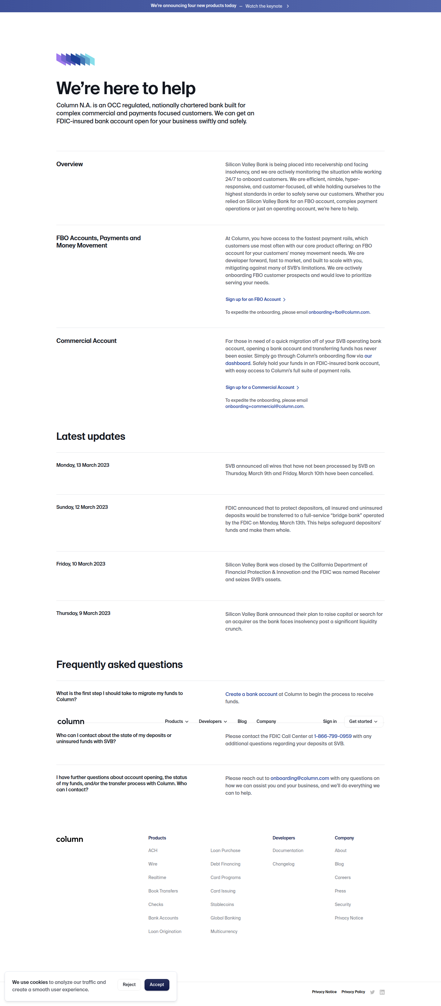
Column Banking's Segmented CTA: A Masterclass in Crisis-Mode Routing
Column Banking split its signup CTA into FBO and Commercial routing emails during the SVB migration surge — a rare, low-tech CRO move worth stealing.
Jordan Reeves
Founder & Operator · · Updated
TL;DR
- Detected on column.com/banking, CTA surface, signup_flow category, logged with a rarity score of 75% and importance of 55%.
- Column split one generic signup CTA into two routed email aliases:
onboarding+fbo@column.comand a parallel commercial alias. - The pattern surfaced during the SVB collapse window, when "urgent refugee" signups needed fast account-type triage.
- No new form fields were added — the segmentation happens entirely through CTA copy and email routing, not UI complexity.
- This is a rare detection pattern (75% rarity) because most fintech landing pages still funnel every visitor into one undifferentiated "get started" button.
What did Column Banking actually change on its CTA?
Column replaced a single generic signup prompt with two account-specific CTAs, each pointing to a dedicated, pre-filled routing email. The evidence line we pulled straight off the page — "To expedite the onboarding, please email onboarding+fbo@column.com" — tells you everything about the intent. This isn't a stylistic A/B test on button color or copy tone. It's operational segmentation disguised as a CTA. Visitors self-select into FBO (for-benefit-of accounts, common with fintechs and marketplaces holding customer funds) or Commercial accounts, and each path lands in a differently tagged inbox before a human ever looks at it.
I've shipped a lot of CTA tests in my time, and most of them are vanity exercises — "Get Started" versus "Start Free Trial" versus "Try It Now." This one is different because the segmentation isn't cosmetic. It's routing infrastructure wearing a CTA costume. The +fbo suffix is a Gmail-style plus-addressing trick that any ops team could set up in five minutes, but the fact that it's surfaced directly in landing page copy — not buried in a help doc — is the real signal.
Why does this matter more during a bank run than a normal quarter?
Because during the SVB collapse in March 2023, speed of account-type triage was the entire ballgame, and generic CTAs actively slowed down panicked depositors. When thousands of companies needed a new banking home in days, not weeks, every extra step between "I need an account" and "someone qualified is looking at my request" cost Column real deposits. Segmenting at the CTA level — before the user even fills out a form — meant the right internal team saw the right request type immediately. No intake form routing logic needed, no "please specify your account type" dropdown adding friction. The copy itself did the sorting.
This lines up with a principle that shows up again and again in landing page research: form field count has a measurable, almost linear cost on completion rate, with each additional field shaving 3-5% off completions. Column's solution sidesteps that tradeoff entirely. Instead of adding a field to capture account type, they added a decision point in the copy itself — zero additional friction in the form, full segmentation in the routing.
Is this really a CRO pattern, or just good ops?
It's both, and that's exactly why it's rare — most teams treat "ops readiness" and "conversion optimization" as separate workstreams. The 75% rarity score on this detection reflects how uncommon it is to see operational capacity signaled directly in CTA copy. Most fintech landing pages optimize for one thing: get the click, get the form fill, hand off to sales or onboarding later. Column's version does something subtler — it uses the CTA to signal "we have already built the infrastructure to handle your specific situation fast," which is itself a trust signal during a moment when trust was the scarcest resource in banking.
Financial services CRO best practice consistently points back to clarity and confidence working together, not creativity for its own sake. A segmented CTA with a pre-filled routing alias is about as unglamorous as CRO gets — no modal, no animation, no personalization engine. It's just correctly anticipating that your visitor pool has two distinct urgent needs and giving each one a dedicated, visibly fast lane.
What would I check before copying this pattern?
Before you fork a CTA into multiple routed paths, confirm you actually have two (or more) visitor segments with different downstream handling — not just different marketing personas. Here's how I'd think about the tradeoff on a typical sprint:
| Signal | Single generic CTA | Segmented CTA (Column-style) |
|---|---|---|
| Build cost | Near zero | Low — email alias + copy change |
| Best for | Homogeneous visitor intent | Distinct operational paths (account types, plan tiers, urgency tiers) |
| Risk | Slower internal triage, mismatched handoffs | Visitor picks wrong bucket, needs a fallback |
| Signal sent to visitor | Generic "we'll sort it out" | "We already built for your specific case" |
| Dependency | None | Internal routing/ops must actually be ready |
The last row is the one people skip. A segmented CTA only works if your ops team is genuinely faster on the other side of it. If you fake the signal — split the CTA but funnel both into the same slow queue — you've added a decision point for the visitor with no payoff. That's worse than the generic version.
Common questions
What is a segmented CTA in CRO terms?
A segmented CTA replaces one generic call-to-action with multiple options tied to distinct visitor intents or account types, each routed differently on the backend. Unlike A/B testing copy variants, segmentation runs all paths simultaneously and lets the visitor self-select, often reducing downstream processing time.
Why did Column Banking use email aliases instead of a form?
Plus-addressed email aliases like onboarding+fbo@column.com require no new engineering — no form logic, no database field, no deploy. During a fast-moving crisis like the SVB collapse in March 2023, that meant Column could stand up differentiated routing in hours rather than sprint cycles.
Does adding CTA segmentation hurt conversion rate?
Not if the segments are genuinely distinct and the visitor can self-identify easily, since optimized landing pages can see conversion lifts up to 160% when CTAs match visitor intent precisely. It can hurt conversion if segments are ambiguous or too granular, causing hesitation.
Is this pattern specific to fintech, or does it generalize?
It generalizes well to any product with operationally distinct onboarding paths — enterprise versus self-serve SaaS, regulated versus unregulated accounts, or high-touch versus low-touch ecommerce fulfillment. The core idea — let copy do the sorting before the form does — applies anywhere support teams need to triage by type.
How rare is this kind of detection across the brands ABWatcher monitors?
This detection carries a 75% rarity score, meaning it's uncommon relative to typical CTA tests like copy or color variants we see daily across 1,000+ monitored brands. Most teams still default to a single undifferentiated CTA even when their backend handling clearly diverges by segment.
What I would actually do next
Pull up your own signup CTA this week and ask one question: does every visitor who clicks it get handled the same way on the other side? If the honest answer is no — some go to sales, some to a different onboarding team, some need expedited handling — stop optimizing button copy and start splitting the CTA itself. You don't need a personalization platform or a new form field. Column proved you can ship this with a plus-addressed email alias and a sentence of copy. Ship the cheap version first, measure whether your ops team is actually faster on the other side, then decide if it's worth formalizing into the product.
Read next
More from the ABWatcher blog
Nov 22, 2026
Snake River Farms Tests a $25-Off Popup on Its Ad Landing Page
We caught Snake River Farms split-testing an email-capture form and $25-off modal on its landing page. Here's the math on what it would take to call a winner.
Nov 21, 2026
Snake River Farms Tests Mid-Page Email Capture on Its Ad Landing Page
SRF is A/B testing a mid-page lead-capture block and a $25-off popup against a simpler hero-only promo banner on its paid landing page, detected 2024 week-over-week.
Nov 20, 2026
Attio Is Testing a New Tier, Higher Prices, and a New Pitch
Attio is running a live pricing page test with a new $1,000 "Ultra" tier, higher Plus/Pro prices, and a new headline — here's what we caught and what it means.
Nov 19, 2026
Found Quietly Tested a 25% Price Cut on Its Pricing Page
We caught Found running a live pricing A/B test with an annual billing toggle that drops Found Plus from $35 to $26.25/mo. Here's what changed and why it matters.
Nov 8, 2026
Astro Proves "Zero Lock-In" With a Live Code Demo, Not a Claim
Astro's homepage replaces a trust badge row with a working, clickable framework demo — here's the hierarchy and interaction design behind it, detected 60% rare on astro.build.
Nov 7, 2026
Basecamp's Big Numbers: Why Hyper-Precise Stats Beat Vague Social Proof
Basecamp's homepage swaps "trusted by thousands" for 1.7 billion to-dos and 5 petabytes of data. We break down why precision beats vagueness as social proof — and how to test it.
From the glossary
Vocabulary the article uses. See all terms →
- Shrinkage Estimator— A statistical adjustment that pulls noisy per-variant or per-segment estimates toward an overall average to reduce overfitting to randomness.
- Flicker Test— A diagnostic check to confirm whether users briefly see the original page before a variant renders in client-side experiments.
- Pre-Experiment Bucketing Audit— A review process confirming users are being randomly and evenly assigned to experiment variants before launch.
- Above-Fold Exclusion Rule— A test-design rule that deliberately prevents changes to above-the-fold elements so an experiment isolates below-the-fold effects.
- Flicker-Free Testing— A technical setup that prevents users from briefly seeing the original page before a test variant loads.
- Orthogonal Test Design— A test structure where multiple variables are changed independently so their individual effects can be measured without interference.
See more like this
ABWatcher catches A/B tests like this across 1,000+ brands.
Watch live experiments at 1,000+ high-converting brands, complete with hypothesis and takeaway. 7 days of Pro, free, no card, then Free forever for ten watched companies.