
Column Banking Turned the SVB Collapse Into a Live Trust Timeline
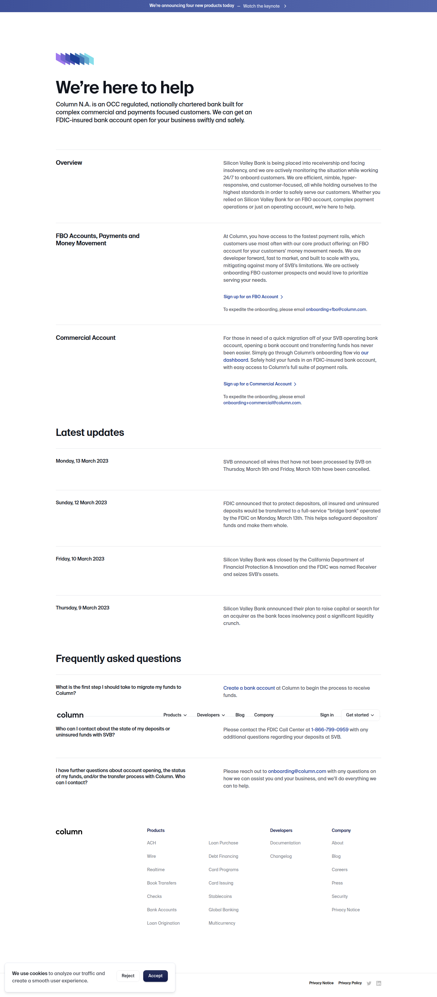
Column Banking built a dated, real-time SVB crisis log into its landing page — a rare newsjacking mechanic that converts breaking news into trust. Detected by ABWatcher.
Aiko Tanaka
Design Director · · Updated
TL;DR
- Detected on column.com/banking, a public landing page, layout surface, logged as a unique_mechanic pattern.
- Rarity score: 90/100 — one of the rarest mechanics ABWatcher has surfaced across 1,000+ monitored brands.
- Importance score: 60/100, reflecting high strategic upside tied to a narrow news window.
- Evidence quote timestamped Monday, 13 March 2023, referencing SVB's wire-processing cancellations from March 9–10.
- The mechanic: a dated "Latest updates" log turning the SVB collapse into a live, scrolling trust narrative.
- Positioning goal: present Column as the informed, responsive bank alternative at the exact moment displaced customers were searching for one.
What did Column Banking actually change on the page?
Column added a dated, chronologically stacked "Latest updates" module tracking the SVB collapse in real time, styled like a live incident log rather than marketing copy. The entry we captured reads: "Monday, 13 March 2023 — SVB announced all wires that have not been processed by SVB on Thursday, March 9th and Friday, March 10th have been cancelled." That's not brand voice — it's operational, timestamped, almost like a status page. And that's the point.
Visually, a module like this earns its place through restraint. The eye lands on the date first — bold, left-aligned, functioning as the anchor point in an F-pattern scan. Everything below it reads as subordinate detail. This is Gestalt's law of common region at work: each dated block is visually grouped as one discrete "event," so a visitor skimming the page perceives a sequence, a timeline, a narrative arc — without having to read every word. The chronological stacking itself does the persuasion; you don't need adjectives when the facts are this dramatic.
Why does a crisis log work as a conversion mechanic?
It works because it reframes a landing page from a sales pitch into a credible, evolving record, which lowers the guard of a visitor who is actively fleeing a collapsing bank. Most SaaS and fintech landing pages are built around the classic single-CTA doctrine — strip the navigation, remove exit points, keep one action in front of the user. Column's timeline breaks that convention on purpose. It adds content density at a moment of high anxiety, because the content itself — dated, factual, sourced from the crisis as it unfolds — is the trust signal. The CTA doesn't need to shout when the context is doing the emotional work.
This is newsjacking married to information hierarchy. The visual weight isn't on a headline claiming "we're stable" — it's on a log that lets the visitor conclude that themselves. Self-derived conclusions convert harder than asserted ones; that's basic persuasion psychology wearing a fintech UI.
How rare is this pattern across the brands ABWatcher tracks?
Vanishingly rare — this is a 90/100 rarity score, meaning almost no other monitored brand has shipped a live, dated event-log-as-landing-page mechanic.
| Attribute | Value |
|---|---|
| Brand | Column Banking |
| Surface | Landing page — layout |
| Pattern category | Unique mechanic |
| Rarity score | 90 / 100 |
| Importance score | 60 / 100 |
| Detected quote date | 13 March 2023 |
| Mechanic | Dated "Latest updates" crisis timeline |
The rarity makes sense once you consider the constraints: this mechanic only works if (a) you have a live, fast-moving news event directly relevant to your category, (b) your brand is positioned as the beneficiary of the disruption, and (c) you can update the page in near real time without it looking reactive or opportunistic. Most teams can't hit all three simultaneously. Column had the SVB collapse land directly in its addressable market — banking infrastructure for startups — and moved fast enough to capture it mid-event, not after.
What's the design craft worth stealing here?
The craft worth stealing is the restraint: factual, timestamped copy in a stacked layout does more persuasive work than a hero headline ever could in a crisis moment. Look at the contrast choices implied by the structure — dates likely set in a heavier weight or monospace treatment to signal "log," body copy kept neutral and unembellished. There's no urgency styling, no red alert banners, no countdown timers. The confidence comes from not over-designing a moment that's already dramatic on its own merits. That's a harder discipline than it sounds; the instinct under pressure is to add visual alarm. Column's approach suggests the opposite: matching your visual register to the credibility you're trying to project. A bank wants to look calm, procedural, and reliable — even, especially, while reporting chaos.
The spacing between entries also matters for scannability. Chronological logs live or die on whether a visitor can skim five entries in three seconds and grasp the arc. That requires generous vertical rhythm between blocks and a consistent left-edge alignment for the dates — classic proximity and alignment principles from Gestalt, applied to a use case most teams never encounter: live-documenting someone else's crisis to sell your own stability.
Common questions
What is newsjacking in a CRO context?
Newsjacking is the practice of inserting your brand into a live news event to capture attention and relevance in real time. On a landing page, it means restructuring content around a breaking event — like Column did with the SVB collapse — rather than static, evergreen messaging, to convert people actively searching for alternatives.
Why did Column Banking use a dated log instead of a banner or headline?
A dated log reads as evidence, not marketing — critical when the target audience is scared account holders vetting a bank's competence. A banner claiming stability would feel like a claim; a timestamped, factual sequence of events feels like proof, which better matches the anxious mental state of the visitor.
Does this pattern generalize outside of banking or fintech?
Yes, in principle — any brand positioned as the beneficiary of a competitor's public failure or an industry disruption can use a similar real-time log mechanic, though it requires speed, factual restraint, and a genuinely relevant crisis. Message match between context and content is what makes it credible rather than opportunistic.
How does this compare to standard landing page best practices?
Standard advice pushes toward single-CTA focus and stripped navigation, and this mechanic doesn't contradict that — it adds a dense trust module while keeping the primary action intact. The average landing page still converts around 2.35% across industries, so any structural addition has to earn its space, and a live crisis log earns it through relevance timing.
Your takeaway for this sprint
You don't need a banking collapse to apply this: audit your own category for a live, relevant disruption — a competitor outage, a policy change, a platform shutdown — and test a factual, dated log module against your usual hero copy. Keep the visual register calm and procedural, let the timestamps carry the urgency, and measure whether proof-by-narrative outconverts proof-by-assertion on your next landing page test.
Read next
More from the ABWatcher blog
Nov 22, 2026
Snake River Farms Tests a $25-Off Popup on Its Ad Landing Page
We caught Snake River Farms split-testing an email-capture form and $25-off modal on its landing page. Here's the math on what it would take to call a winner.
Nov 21, 2026
Snake River Farms Tests Mid-Page Email Capture on Its Ad Landing Page
SRF is A/B testing a mid-page lead-capture block and a $25-off popup against a simpler hero-only promo banner on its paid landing page, detected 2024 week-over-week.
Nov 20, 2026
Attio Is Testing a New Tier, Higher Prices, and a New Pitch
Attio is running a live pricing page test with a new $1,000 "Ultra" tier, higher Plus/Pro prices, and a new headline — here's what we caught and what it means.
Nov 19, 2026
Found Quietly Tested a 25% Price Cut on Its Pricing Page
We caught Found running a live pricing A/B test with an annual billing toggle that drops Found Plus from $35 to $26.25/mo. Here's what changed and why it matters.
Nov 8, 2026
Astro Proves "Zero Lock-In" With a Live Code Demo, Not a Claim
Astro's homepage replaces a trust badge row with a working, clickable framework demo — here's the hierarchy and interaction design behind it, detected 60% rare on astro.build.
Nov 7, 2026
Basecamp's Big Numbers: Why Hyper-Precise Stats Beat Vague Social Proof
Basecamp's homepage swaps "trusted by thousands" for 1.7 billion to-dos and 5 petabytes of data. We break down why precision beats vagueness as social proof — and how to test it.
From the glossary
Vocabulary the article uses. See all terms →
- Shrinkage Estimator— A statistical adjustment that pulls noisy per-variant or per-segment estimates toward an overall average to reduce overfitting to randomness.
- Flicker Test— A diagnostic check to confirm whether users briefly see the original page before a variant renders in client-side experiments.
- Pre-Experiment Bucketing Audit— A review process confirming users are being randomly and evenly assigned to experiment variants before launch.
- Above-Fold Exclusion Rule— A test-design rule that deliberately prevents changes to above-the-fold elements so an experiment isolates below-the-fold effects.
- Flicker-Free Testing— A technical setup that prevents users from briefly seeing the original page before a test variant loads.
- Orthogonal Test Design— A test structure where multiple variables are changed independently so their individual effects can be measured without interference.
See more like this
ABWatcher catches A/B tests like this across 1,000+ brands.
Watch live experiments at 1,000+ high-converting brands, complete with hypothesis and takeaway. 7 days of Pro, free, no card, then Free forever for ten watched companies.