
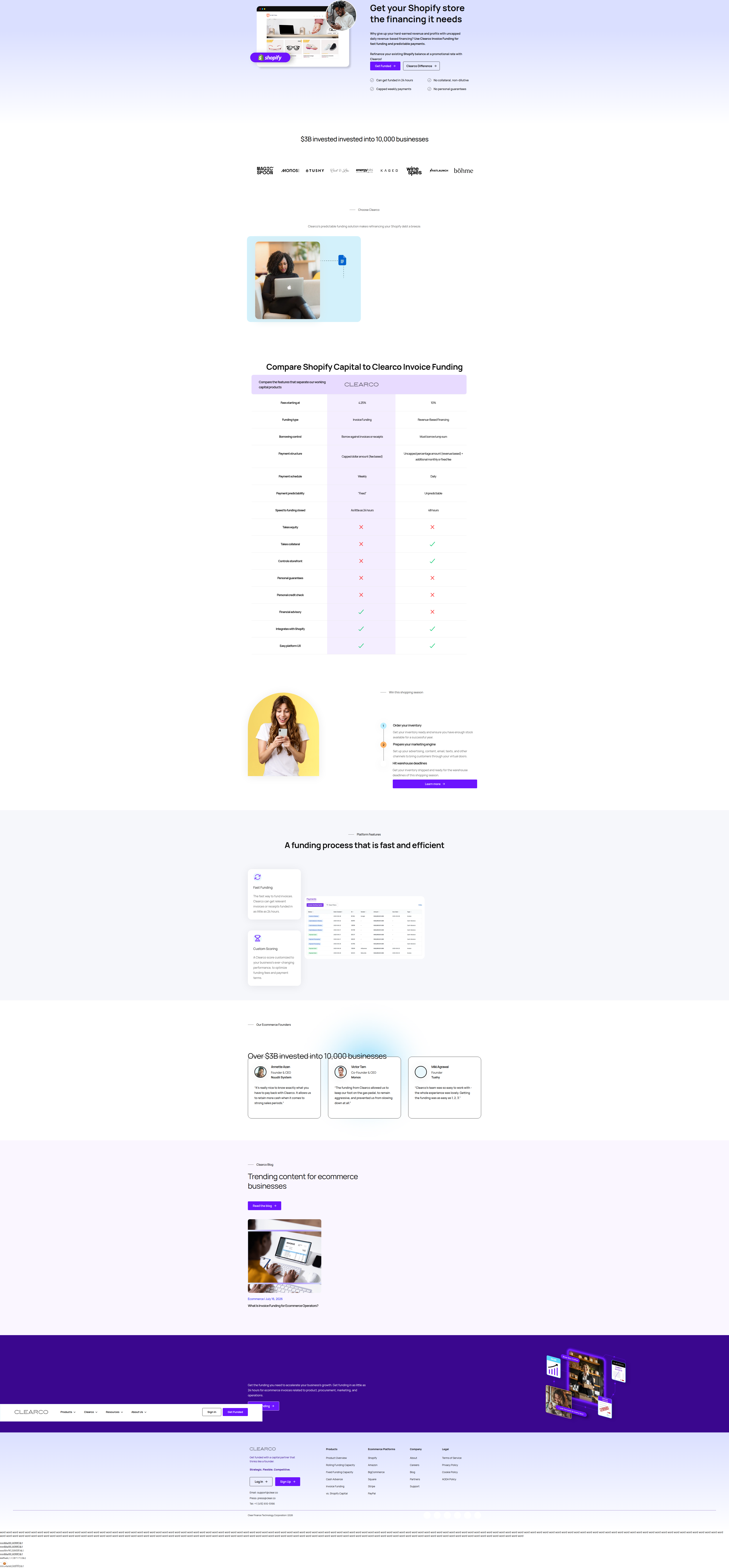
Clearco Named Shopify Capital on Its Landing Page. Here's Why That's Rare.
Clearco built a 13-row comparison table calling out Shopify Capital by name on a live landing page. We break down why most brands won't do this — and when it works.
Diego Hernandez
Growth Marketer · · Updated
TL;DR
- Detection: Clearco (clear.co) running a 13-row comparison table vs. Shopify Capital on a public landing page, logged this cycle by ABWatcher.
- Surface: layout change, category tagged social_proof.
- Rarity score: 65% — uncommon pattern across the 1,000+ sites we monitor daily.
- Importance score: 60% — meaningful conversion lever, not cosmetic.
- Evidence pulled straight from the page copy: "Compare Shopify Capital to Clearco Invoice Funding."
- Table covers fees, payment structure, collateral, and predictability — not a generic feature grid.
What did Clearco actually ship?
Clearco put a direct, named-competitor comparison table on its landing page, not a vague "us vs. them" chart.
The headline is blunt: "Compare Shopify Capital to Clearco Invoice Funding." No hedging, no "leading alternative" euphemism. Thirteen rows deep, the table walks through fees, payment structure, collateral requirements, and predictability of repayment — the exact variables a merchant comparing financing options actually cares about. This isn't a features checklist designed to make Clearco look busy. It's built to answer the one question a prospect has already typed into Google: "Clearco vs Shopify Capital."
That's the tell. Most comparison tables on landing pages are self-referential — "here's what you get with us" against a nameless "typical provider." Clearco skipped that step and went straight for the brand prospects are already shopping against.
Why is naming a competitor directly so rare?
Most brands avoid naming competitors on landing pages because legal, brand, and sales teams all have veto power, and it's genuinely risky if the comparison is sloppy.
That's why this pattern scores 65% rarity in our detection set. Legal doesn't love it. Brand teams worry about giving a competitor's name real estate on your own site. And if even one row in a 13-row table is wrong or outdated, you've handed the competitor a screenshot for their sales deck. Most teams decide the risk isn't worth it and default to generic positioning instead.
But Clearco's category — embedded fintech / revenue-based financing — is a space where merchants genuinely cross-shop two or three providers before committing. Shopify Capital is the default option for any Shopify merchant, pre-filled and one click away in the admin panel. Clearco can't out-convenience that. So instead of competing on convenience, they compete on math: fees, collateral, predictability. A direct table is the only honest way to make that case.
Does naming competitors actually convert better?
Named comparisons convert well specifically when the prospect is already evaluating both options — otherwise they can introduce a competitor you didn't need to mention.
Unbounce's CRO guide makes the point that the strongest value props make a visitor think "this was built for someone like me." A named comparison table does that job more precisely than almost any other asset on a page — it meets the prospect exactly where their research already is, mid-comparison, tab open to a competitor's pricing page.
Leadfeeder's landing page playbook lists "clear value proposition" and "social proof" as separate best practices. Clearco's table does both at once — it is the value prop, framed as proof. That's unusually efficient use of a single page section.
The risk: if your prospect wasn't already considering the named competitor, you just introduced them to it. That's why this tactic works best in categories with an obvious default alternative — Shopify Capital for Shopify merchants, QuickBooks for bookkeeping tools, Mailchimp for email. If there's no dominant incumbent in your category, naming names mostly just does free advertising for someone else.
What does the comparison table actually cover?
The table is built around the four variables that determine real cost of capital, not surface-level feature bullets.
| Row category | What it signals to the prospect |
|---|---|
| Fees | Direct cost comparison — the number merchants actually calculate against |
| Payment structure | Fixed vs. revenue-share repayment — affects cash flow risk |
| Collateral | Whether personal guarantees or assets are required |
| Predictability | How repayment amount varies month to month |
Each row maps to a real objection a finance-savvy merchant would raise before signing. That's the difference between a comparison table built for SEO and one built to close a deal.
How should growth teams steal this pattern responsibly?
Build the comparison table around the three or four variables your prospect is actually calculating, cite them accurately, and only name a competitor if there's a clear incumbent in your category.
Before you ship anything like this:
- Audit for accuracy first. A 13-row table only works if every row survives a fact-check. One wrong number and the whole asset becomes a liability.
- Pick variables prospects already compare. Fees and payment structure aren't arbitrary — they're the two numbers a merchant plugs into a spreadsheet. Don't pad the table with vanity features.
- Place it where the comparison decision happens, not buried below the fold. Skymoon's 2026 benchmarks note that moving social proof closer to the point of decision consistently lifts conversion — the same logic applies to comparison tables.
- Get legal and brand sign-off before launch, not after someone screenshots it.
Common questions
Is naming a competitor on a landing page legally risky?
It can be, if claims are inaccurate or misleading. Comparative advertising is generally legal in the U.S. as long as claims are truthful and substantiated, but brands should get legal review on every row before publishing a named comparison table.
Why did Clearco compare itself to Shopify Capital specifically?
Shopify Capital is the default, pre-integrated financing option inside the Shopify admin for millions of merchants. Any competitor selling invoice funding to Shopify sellers is implicitly competing against it, so naming it directly meets prospects where their actual decision is happening.
Does this tactic work outside of fintech?
Yes, in any category with one dominant incumbent prospects already compare against — CRM, email marketing, payroll. It works less well in fragmented categories without an obvious default competitor, since you risk introducing a brand your prospect hadn't considered.
What made this detection "rare" versus "important"?
Rarity (65%) reflects how uncommon named-competitor tables are across the 1,000+ sites ABWatcher monitors. Importance (60%) reflects that this is a structural, decision-stage asset — not a copy tweak — likely to meaningfully affect conversion if it's working.
Takeaway for your roadmap this sprint
If your category has one obvious incumbent prospects compare you against, build the honest, numbers-first version of that comparison table this sprint — fact-checked, specific, and placed right where the decision happens. Skip it if your category has no clear default; you'll just be doing marketing for someone else.
Read next
More from the ABWatcher blog
Nov 22, 2026
Snake River Farms Tests a $25-Off Popup on Its Ad Landing Page
We caught Snake River Farms split-testing an email-capture form and $25-off modal on its landing page. Here's the math on what it would take to call a winner.
Nov 21, 2026
Snake River Farms Tests Mid-Page Email Capture on Its Ad Landing Page
SRF is A/B testing a mid-page lead-capture block and a $25-off popup against a simpler hero-only promo banner on its paid landing page, detected 2024 week-over-week.
Nov 20, 2026
Attio Is Testing a New Tier, Higher Prices, and a New Pitch
Attio is running a live pricing page test with a new $1,000 "Ultra" tier, higher Plus/Pro prices, and a new headline — here's what we caught and what it means.
Nov 19, 2026
Found Quietly Tested a 25% Price Cut on Its Pricing Page
We caught Found running a live pricing A/B test with an annual billing toggle that drops Found Plus from $35 to $26.25/mo. Here's what changed and why it matters.
Nov 8, 2026
Astro Proves "Zero Lock-In" With a Live Code Demo, Not a Claim
Astro's homepage replaces a trust badge row with a working, clickable framework demo — here's the hierarchy and interaction design behind it, detected 60% rare on astro.build.
Nov 7, 2026
Basecamp's Big Numbers: Why Hyper-Precise Stats Beat Vague Social Proof
Basecamp's homepage swaps "trusted by thousands" for 1.7 billion to-dos and 5 petabytes of data. We break down why precision beats vagueness as social proof — and how to test it.
From the glossary
Vocabulary the article uses. See all terms →
- Shrinkage Estimator— A statistical adjustment that pulls noisy per-variant or per-segment estimates toward an overall average to reduce overfitting to randomness.
- Flicker Test— A diagnostic check to confirm whether users briefly see the original page before a variant renders in client-side experiments.
- Pre-Experiment Bucketing Audit— A review process confirming users are being randomly and evenly assigned to experiment variants before launch.
- Above-Fold Exclusion Rule— A test-design rule that deliberately prevents changes to above-the-fold elements so an experiment isolates below-the-fold effects.
- Flicker-Free Testing— A technical setup that prevents users from briefly seeing the original page before a test variant loads.
- Orthogonal Test Design— A test structure where multiple variables are changed independently so their individual effects can be measured without interference.
See more like this
ABWatcher catches A/B tests like this across 1,000+ brands.
Watch live experiments at 1,000+ high-converting brands, complete with hypothesis and takeaway. 7 days of Pro, free, no card, then Free forever for ten watched companies.