
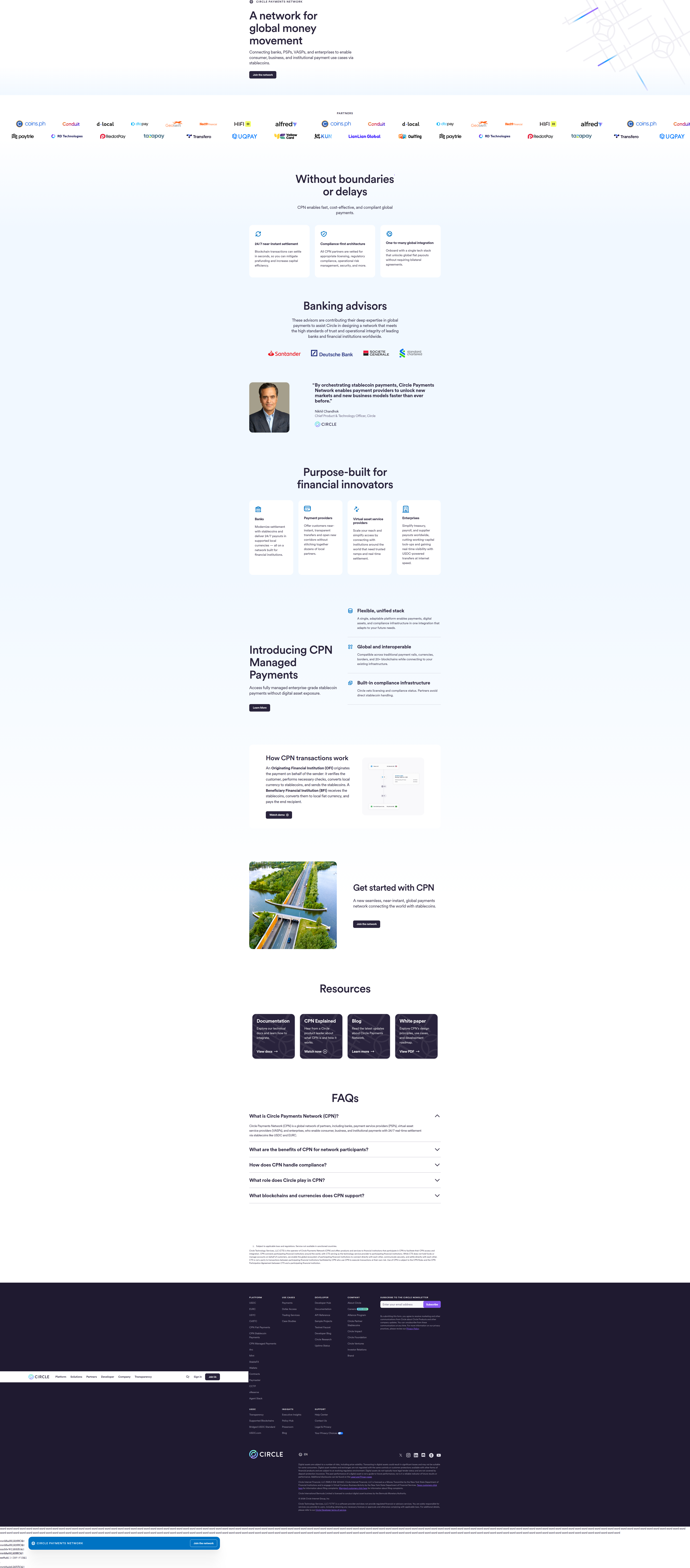
Circle Ditches the Logo Wall for Named Banking Advisors — Here's Why
Circle.com swaps the generic logo wall for named banking advisors from Santander, Deutsche Bank, and Standard Chartered. Detected 12 March 2026, here's the design breakdown.
Aiko Tanaka
Design Director · · Updated
TL;DR
- Brand: Circle (circle.com), stablecoin/payments infrastructure company
- Surface: product landing page, social proof section
- Pattern: named individual "Banking Advisors" from Santander, Deutsche Bank, Societe Generale, and Standard Chartered — not a generic logo wall
- Rarity score: 75% — this pattern shows up in a small minority of the 1,000+ high-converting sites ABWatcher monitors daily
- Importance score: 60%, reflecting high credibility payoff for a category still fighting trust friction
- Detected: 12 March 2026, logged under category
social_proof
What did Circle actually change on the page?
Circle replaced the expected wall of bank logos with named individuals credited as "Banking Advisors" from four specific institutions. The evidence line reads: "These advisors are contributing their deep expertise in global payments to assist Circle in designing a network that meets the high standards of trust and operational integrity of leading banks and financial institutions worldwide." That's a full sentence of justification sitting next to the names — not just a badge, a rationale.
The eye doesn't land on a logo first here. It lands on a name, then a title, then the institution. That ordering matters more than it looks like on the surface.
Why does naming individuals beat a logo wall for credibility?
Named advisors create a specific, checkable claim, while logo walls read as an aggregate, low-effort signal that visitors' eyes skip past. A logo wall asks the visitor to do the trust math themselves — "I recognize that mark, therefore this company must be legitimate by association." It's a Gestalt closure trick: scattered marks, same size, same alignment, visually grouped into one blob of "credibility," and skimmed in under a second. Most visitors never read a single logo; they just register the density of familiar shapes.
Naming an advisor breaks that pattern intentionally. It forces figure-ground separation — a name in bold, a title in a lighter weight, an institution as the anchor. That's three tiers of visual hierarchy where a logo wall gives you one. For a crypto-adjacent product, where the core objection is "is my money actually safe here," a checkable name beats an unverifiable mark. You can't Google a logo's opinion. You can Google Deutsche Bank's advisory relationships.
This also plays directly into F-pattern reading behavior on a long-scroll landing page. Visitors skim the first line of a block, then decide whether to keep reading. "Banking advisors" as a label, followed immediately by four recognizable institution names, gives that first skim something worth stopping for — a small pattern interrupt in a section type users have learned to ignore.
How does this compare to standard social-proof placement advice?
Most CRO guidance says to put social proof near the CTA and keep it lightweight, but Circle's version does the opposite — it's dense, positioned as its own section, and reads more like a credential than a badge. Unbounce's CRO best practices note that the strongest messaging makes a visitor think "this was made specifically for someone like me" — and named advisors from Santander or Standard Chartered do that specifically for an institutional or fintech-adjacent buyer persona, not a retail one. It's social proof aimed upward at due-diligence teams, not sideways at peers.
Apexure's landing page optimization research lists placing social proof near the CTA as one of the five highest-impact levers tested across clients. Circle's advisor block isn't glued to a buy button — it's a trust-building detour earlier in the page, which tells you this isn't a last-mile conversion nudge. It's positioned to survive scrutiny from a slower-moving, higher-stakes buyer: a treasury team, a compliance officer, a fintech partner doing diligence before a contract, not a card-swipe consumer.
What does the visual hierarchy tell us about intent?
The choice to spell out a justification sentence next to the names signals this section is doing persuasion work, not decoration. Most social-proof blocks are visual shorthand — logos, star ratings, a testimonial pull-quote in italics. Circle's version reads like a mini case-for-trust, with enough copy to actually argue a point. That's a spacing and content-density decision as much as a typographic one: more words per section means more cognitive load, but also more perceived rigor. For a stablecoin company, rigor is the actual product feature being sold in this section — arguably more important than the payments feature copy elsewhere on the page.
What surfaces should you watch for this pattern?
Named-expert social proof tends to show up where the buyer needs institutional-grade trust, not just peer validation — think fintech, healthtech, and B2B infrastructure.
| Surface type | Typical social proof | When named-experts outperform |
|---|---|---|
| Consumer SaaS signup | Logo wall + review count | Rarely — peer validation wins |
| Fintech/crypto onboarding | Named advisors, compliance badges | Often — regulatory trust is the objection |
| B2B infrastructure pricing | Case study logos + quotes | Sometimes — depends on buyer seniority |
| Healthtech landing pages | Named clinical advisors | Often — credential-checking is expected |
Common questions
What is a "named advisor" pattern in CRO?
It's a social-proof format where a company credits specific individuals by name and title, tied to a recognizable institution, instead of showing an unattributed logo or generic testimonial. It trades breadth for verifiability, aimed at buyers who do due diligence before converting, common in fintech and healthtech.
Why would a crypto company lean on traditional banks for trust?
Stablecoin and crypto infrastructure products face a structural trust gap with institutional buyers who default to trusting legacy banking names. Borrowing credibility from Santander, Deutsche Bank, Societe Generale, and Standard Chartered signals regulatory and operational maturity that the crypto brand alone can't yet claim.
Is this pattern rare across the sites ABWatcher tracks?
Yes — this detection carries a 75% rarity score, meaning named-individual advisor credits are uncommon compared to standard logo walls or aggregated customer counts across the 1,000+ high-converting sites monitored daily.
Does this replace the need for a logo wall entirely?
Not necessarily. Named advisors work well for high-stakes categories needing deep trust, but logo walls still work fast for peer-validation categories like consumer SaaS. The right call depends on whether your buyer needs to verify credibility or just recognize familiarity.
How should a design team test something similar?
Start by identifying your highest-friction trust objection, then test whether a named, titled credential resonates more than an aggregate logo block with your specific buyer segment — run it as an A/B split on the same page position to isolate the format, not just the content.
The takeaway for your roadmap this sprint
Before your next social-proof refresh, audit whether your visitors are skimming your logo wall or actually reading it — if your buyer persona does due diligence before converting, test swapping one generic trust signal for one named, titled, checkable credential and measure time-on-section as a leading indicator before you wait on full conversion data.
Read next
More from the ABWatcher blog
Nov 22, 2026
Snake River Farms Tests a $25-Off Popup on Its Ad Landing Page
We caught Snake River Farms split-testing an email-capture form and $25-off modal on its landing page. Here's the math on what it would take to call a winner.
Nov 21, 2026
Snake River Farms Tests Mid-Page Email Capture on Its Ad Landing Page
SRF is A/B testing a mid-page lead-capture block and a $25-off popup against a simpler hero-only promo banner on its paid landing page, detected 2024 week-over-week.
Nov 20, 2026
Attio Is Testing a New Tier, Higher Prices, and a New Pitch
Attio is running a live pricing page test with a new $1,000 "Ultra" tier, higher Plus/Pro prices, and a new headline — here's what we caught and what it means.
Nov 19, 2026
Found Quietly Tested a 25% Price Cut on Its Pricing Page
We caught Found running a live pricing A/B test with an annual billing toggle that drops Found Plus from $35 to $26.25/mo. Here's what changed and why it matters.
Nov 8, 2026
Astro Proves "Zero Lock-In" With a Live Code Demo, Not a Claim
Astro's homepage replaces a trust badge row with a working, clickable framework demo — here's the hierarchy and interaction design behind it, detected 60% rare on astro.build.
Nov 7, 2026
Basecamp's Big Numbers: Why Hyper-Precise Stats Beat Vague Social Proof
Basecamp's homepage swaps "trusted by thousands" for 1.7 billion to-dos and 5 petabytes of data. We break down why precision beats vagueness as social proof — and how to test it.
From the glossary
Vocabulary the article uses. See all terms →
- Shrinkage Estimator— A statistical adjustment that pulls noisy per-variant or per-segment estimates toward an overall average to reduce overfitting to randomness.
- Flicker Test— A diagnostic check to confirm whether users briefly see the original page before a variant renders in client-side experiments.
- Pre-Experiment Bucketing Audit— A review process confirming users are being randomly and evenly assigned to experiment variants before launch.
- Above-Fold Exclusion Rule— A test-design rule that deliberately prevents changes to above-the-fold elements so an experiment isolates below-the-fold effects.
- Flicker-Free Testing— A technical setup that prevents users from briefly seeing the original page before a test variant loads.
- Orthogonal Test Design— A test structure where multiple variables are changed independently so their individual effects can be measured without interference.
See more like this
ABWatcher catches A/B tests like this across 1,000+ brands.
Watch live experiments at 1,000+ high-converting brands, complete with hypothesis and takeaway. 7 days of Pro, free, no card, then Free forever for ten watched companies.