
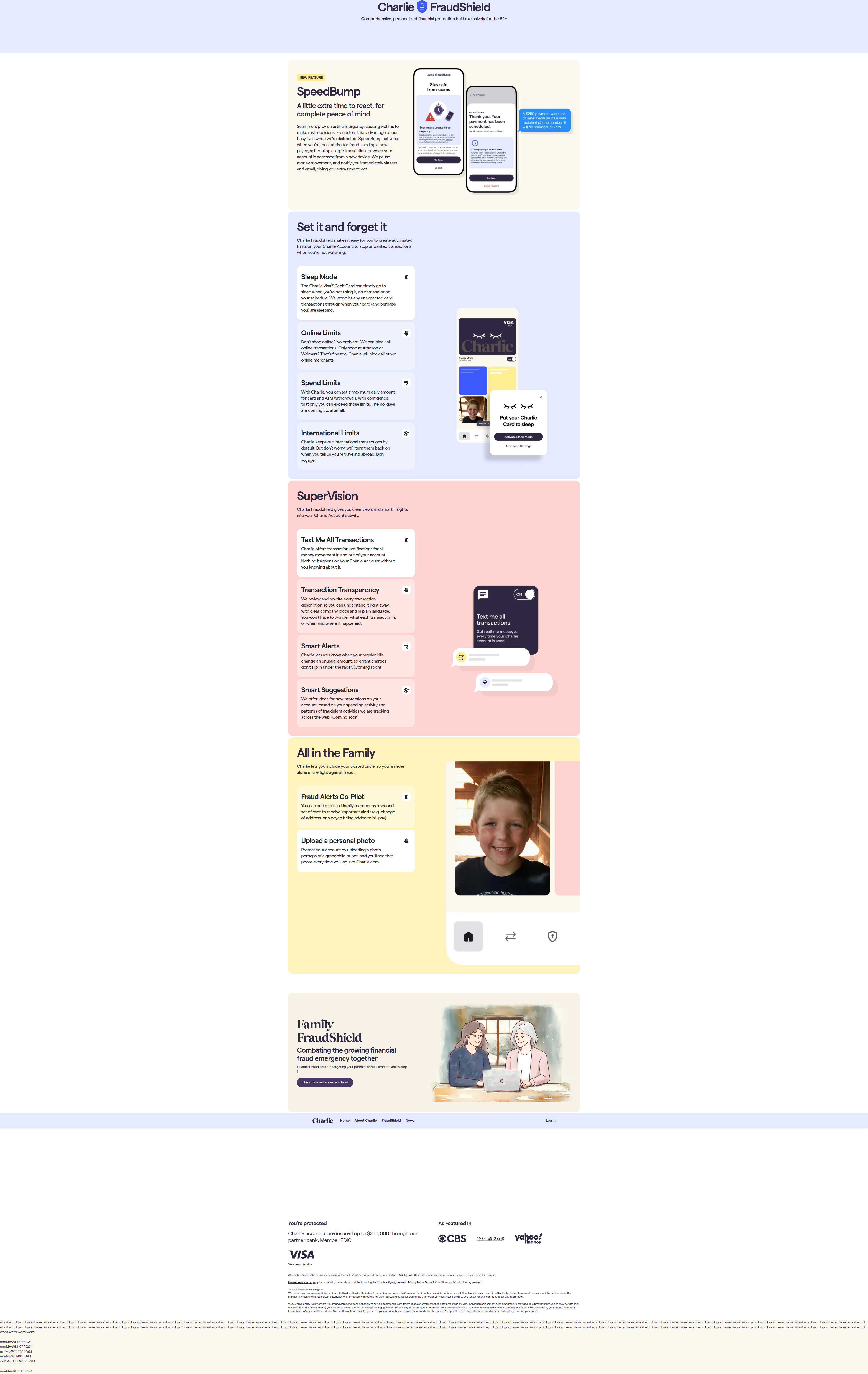
Charlie Finance's Weird Login Flex: Grandkid Photos as Fraud Prevention
Charlie Finance lets users set a personal photo (grandchild, pet) as a login trust cue. We break down why this emotional anti-fraud mechanic is rare — and whether it's worth stealing.
Diego Hernandez
Growth Marketer · · Updated
TL;DR
- Detected on charlie.com, a product-page layout change aimed at older/retirement-focused users.
- Mechanic: users upload a personal photo (grandchild, pet) that displays every login as a visual trust cue.
- ABWatcher rarity score: 75% — this pattern shows up in almost none of the 1,000+ sites we track daily.
- Importance score: 40% — niche but directionally interesting for fraud-prone, trust-dependent categories.
- Category tagged: unique_mechanic — not a standard security feature like 2FA or biometrics.
- Evidence pulled directly from page copy: "Protect your account by uploading a photo, perhaps of a grandchild or pet..."
What exactly did Charlie Finance ship?
Charlie Finance added a personal-photo upload step framed explicitly as fraud protection, not personalization. The copy is blunt about it: upload a photo of your grandchild or pet, and you'll see it every time you log in. No mention of encryption, no mention of device fingerprinting. Just a warm, familiar image sitting on the login screen.
This isn't a new design pattern wearing security language. It's the opposite — a security feature wearing an emotional costume. And that's rare enough that it tripped our rarity detector at 75%.
Why would a fintech lead with "upload a grandchild photo" instead of 2FA?
Because Charlie's core user is older, and the real fraud vector is social engineering, not password theft. The copy is solving for the "is this actually Charlie.com or a spoofed phishing page" problem using recognition, not cryptography.
Think about who gets phished. It's rarely someone outsmarting a firewall. It's someone convinced by a fake site that looks close enough to the real one. A personal photo is nearly impossible for a scammer to replicate because it's not pulled from a database — it's uploaded by the user and tied to nothing public. If the login screen doesn't show your dog, you know instantly something's off.
Standard security UX tries to make users feel safe through authority signals — lock icons, badges, "bank-level encryption" language. Charlie is doing something closer to behavioral psychology: use an emotionally anchored, personally unique cue that's hard to fake and easy to notice when it's missing.
That's smart for a demographic that doesn't parse "AES-256 encryption" but absolutely notices "wait, where's my grandson's photo?"
How does this compare to typical CRO patterns we track?
Most of what we log falls into predictable buckets — CTA copy tests, pricing page layout swaps, urgency banners, social proof counters. This one doesn't fit any of those buckets cleanly, which is exactly why it scored high on rarity.
| Pattern type | Frequency across tracked sites | Example |
|---|---|---|
| CTA copy A/B tests | Very common | "Get Started" vs "Start Free Trial" |
| Social proof counters | Common | "10,000+ customers trust us" |
| Pricing page layout tests | Common | Toggle vs tiered cards |
| Emotional anti-fraud mechanics | Extremely rare (this detection) | Personal photo on login |
Financial services CRO guidance consistently stresses that high-converting finance pages win on clarity, confidence, and compliance — not novelty. Charlie's move technically breaks that rule on the surface. But look closer: the photo mechanic is a confidence play. It's just confidence delivered emotionally instead of through compliance badges.
Does a feature like this actually move conversion, or is it a gimmick?
It's unproven at scale, but the psychological logic holds up better than most "trust signal" tests we see. The traditional CRO playbook says reduce friction and keep the user's eyes on the primary action. Landing page best practice guidance specifically warns against adding elements that don't reinforce the conversion goal.
An upload step is friction. No way around that. But if the goal isn't signup conversion — it's retention and reduced churn from fraud-scared users bailing after a scare — then friction here is the point, not the enemy. This is a feature built for session two and beyond, not the first click.
The risk: if the photo upload gets bundled into onboarding and isn't optional, you'll see drop-off. If it's positioned as an optional trust feature post-signup, you get the emotional benefit without taxing initial conversion. We don't have Charlie's funnel data, so we can't say which path they picked. But the copy reads like it's framed as a value-add, not a gate.
What should growth teams actually take from this?
Don't copy the mechanic blindly. Copy the principle: match your trust signal to your user's actual fear, not a generic security checklist. A 25-year-old crypto trader and a 70-year-old retirement saver are scared of completely different things. One wants speed and control. The other wants certainty they're not being scammed by a stranger pretending to be their bank.
Most teams default to the same trust toolkit — lock icons, "bank-grade security," testimonial logos. CRO best practice research is clear that the biggest lifts come from testing against your actual audience's behavior, not copying competitor patterns wholesale. Charlie clearly did the work to understand what their specific users are anxious about, then built a mechanic around it instead of reaching for the generic playbook.
Common questions
What is the "personal photo login" mechanic Charlie Finance uses?
It's a feature where users upload a personal photo — commonly a grandchild or pet — that then appears on the login screen every time they sign in. It functions as a visual verification cue that the site is legitimate, not a fake phishing clone, serving as an emotional anti-fraud signal rather than a technical one.
Why is this detection rated 75% rarity by ABWatcher?
ABWatcher scores rarity based on how often a pattern appears across the 1,000+ high-converting sites we monitor daily. Emotional/psychological anti-fraud mechanics like this almost never appear; most sites rely on standard 2FA, biometrics, or badge-based trust signals instead, making this a statistical outlier.
Is this better than two-factor authentication?
No, it's not a replacement — it's a complement. 2FA verifies identity through a secondary channel. The photo mechanic verifies the site's legitimacy to the user, addressing phishing and spoofing fears rather than account takeover. Charlie likely still needs standard auth underneath this layer.
Could this hurt signup conversion?
It could, if positioned as a mandatory onboarding step before first login. Any upload requirement adds friction. If it's offered as an optional post-signup trust feature instead, the conversion risk drops significantly while retaining the emotional retention benefit for users who opt in.
Should other fintech or DTC brands test this?
Only if your audience has a specific, nameable fear this solves. Copying the exact mechanic without understanding your users' actual anxiety is cargo-culting. Test the underlying principle — audience-specific trust cues — not the literal photo upload feature.
The takeaway for your roadmap this sprint
Audit your current trust signals against your actual user's actual fear, not the industry default. If you're serving an audience worried about something other than "is my data encrypted," your lock icon isn't doing the job. Ship one test this sprint that replaces a generic trust badge with a signal built for your specific user's specific anxiety — then measure retention, not just conversion.
Read next
More from the ABWatcher blog
Nov 22, 2026
Snake River Farms Tests a $25-Off Popup on Its Ad Landing Page
We caught Snake River Farms split-testing an email-capture form and $25-off modal on its landing page. Here's the math on what it would take to call a winner.
Nov 21, 2026
Snake River Farms Tests Mid-Page Email Capture on Its Ad Landing Page
SRF is A/B testing a mid-page lead-capture block and a $25-off popup against a simpler hero-only promo banner on its paid landing page, detected 2024 week-over-week.
Nov 20, 2026
Attio Is Testing a New Tier, Higher Prices, and a New Pitch
Attio is running a live pricing page test with a new $1,000 "Ultra" tier, higher Plus/Pro prices, and a new headline — here's what we caught and what it means.
Nov 19, 2026
Found Quietly Tested a 25% Price Cut on Its Pricing Page
We caught Found running a live pricing A/B test with an annual billing toggle that drops Found Plus from $35 to $26.25/mo. Here's what changed and why it matters.
Nov 8, 2026
Astro Proves "Zero Lock-In" With a Live Code Demo, Not a Claim
Astro's homepage replaces a trust badge row with a working, clickable framework demo — here's the hierarchy and interaction design behind it, detected 60% rare on astro.build.
Nov 7, 2026
Basecamp's Big Numbers: Why Hyper-Precise Stats Beat Vague Social Proof
Basecamp's homepage swaps "trusted by thousands" for 1.7 billion to-dos and 5 petabytes of data. We break down why precision beats vagueness as social proof — and how to test it.
From the glossary
Vocabulary the article uses. See all terms →
- Shrinkage Estimator— A statistical adjustment that pulls noisy per-variant or per-segment estimates toward an overall average to reduce overfitting to randomness.
- Flicker Test— A diagnostic check to confirm whether users briefly see the original page before a variant renders in client-side experiments.
- Pre-Experiment Bucketing Audit— A review process confirming users are being randomly and evenly assigned to experiment variants before launch.
- Above-Fold Exclusion Rule— A test-design rule that deliberately prevents changes to above-the-fold elements so an experiment isolates below-the-fold effects.
- Flicker-Free Testing— A technical setup that prevents users from briefly seeing the original page before a test variant loads.
- Orthogonal Test Design— A test structure where multiple variables are changed independently so their individual effects can be measured without interference.
See more like this
ABWatcher catches A/B tests like this across 1,000+ brands.
Watch live experiments at 1,000+ high-converting brands, complete with hypothesis and takeaway. 7 days of Pro, free, no card, then Free forever for ten watched companies.