
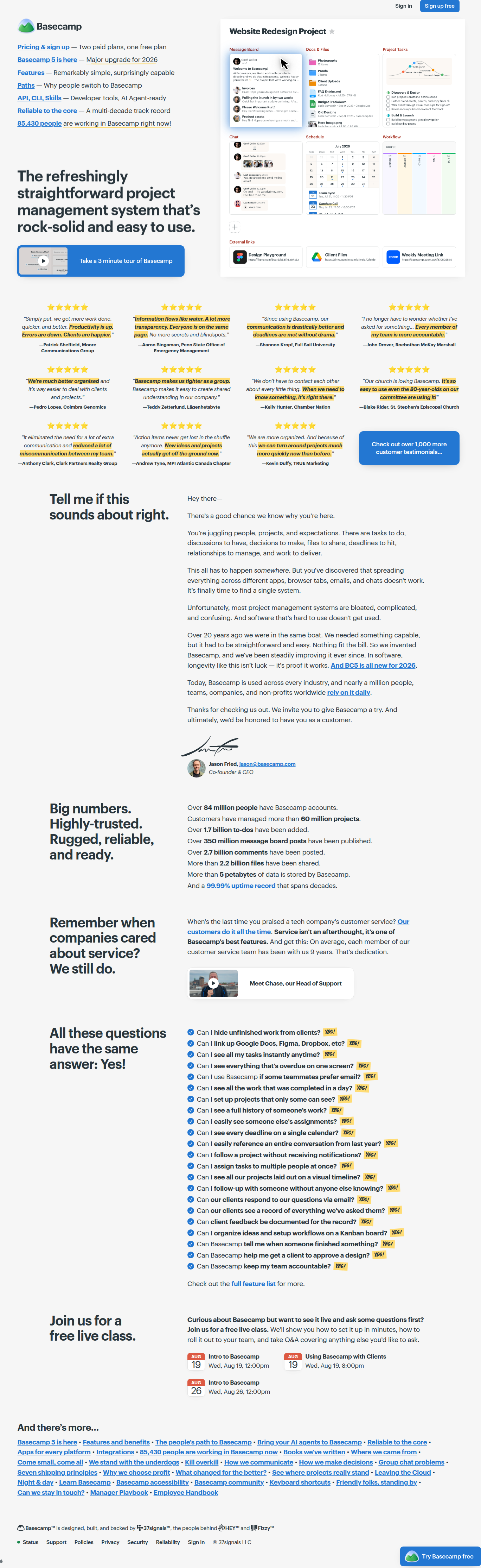
Basecamp's FAQ Answers Every Objection With One Word: YES!
Basecamp replaced its homepage accordion FAQ with 20+ skeptic questions answered only in bold yellow "YES!" — here's the statistical case for why this copy pattern deserves a test slot.
Sam Lee
Data Analyst · · Updated
TL;DR
- Detected on basecamp.com homepage, social-proof surface, copy category, logged with a 70% rarity score and 50% importance score.
- Pattern: 20+ skeptic-style FAQ questions (e.g., "Can I hide unfinished work from clients?") each answered with a single bold, yellow-highlighted "YES!"
- No accordion, no expand/collapse UI — every answer is visible on scroll, maximizing scannability over information density.
- This replaces the standard FAQ pattern, which CRO research flags as a page-layout lever worth testing alongside form length and field count.
- Basecamp's own pricing page uses the same confident, declarative voice ("Zero debt," "99.99% historical uptime") — suggesting this is a brand-wide copy strategy, not an isolated homepage experiment.
- No confidence interval available — this is a single-brand observation, not a tested lift, and should be read as a swipe-file pattern, not a proven winner.
What exactly did Basecamp change?
Basecamp swapped a conventional expandable FAQ for a flat list of blunt, skeptic-voiced questions each closed out with a bold yellow "YES!" instead of a paragraph answer. The evidence quote we logged — "Can I hide unfinished work from clients? YES!" — is representative of the full block: 20+ entries, each phrased the way a wary prospect would actually ask it, each resolved in two characters of punctuation-backed confidence. There's no accordion, no "click to expand," no progressive disclosure. The entire list renders in place, which means every objection is crawlable and scannable in a single scroll pass rather than gated behind a click.
That's the structural change worth isolating. Standard FAQ UX hides answers by default to reduce page length and cognitive load. Basecamp did the opposite: it chose density and immediacy over tidiness. On a social-proof surface — which is already competing with testimonials, logos, and stats for attention — that's a deliberate bet that objection-handling copy earns its pixels better visible than collapsed.
Why does answering with "YES!" instead of an explanation work?
A one-word affirmative removes friction between the doubt a visitor holds and the resolution of that doubt, converting a reading task into a pattern-matching task. Each question is written in the visitor's own skeptical voice — "Can I...", "Is it possible to...", "Do I have to..." — which does two things psychologically. First, it signals the company has heard this objection before, often, which builds trust through specificity rather than generic reassurance ("We support your workflow!"). Second, the terse "YES!" forces resolution in under a second of reading time instead of the 5-10 seconds a sentence-length answer requires.
Compare this to the typical FAQ copy pattern most SaaS homepages ship, which landing page best-practice guidance generally frames around clarity and directness but rarely pushes to this level of brevity. Most FAQ sections hedge: "Yes, you can configure visibility settings for individual files and folders." Basecamp strips the hedge. The copy bet is that specificity lives in the question, not the answer — so the answer can be reduced to a confidence signal.
Does this actually move conversion, or is it just a good story?
We don't have a tested lift here, and that distinction matters. This detection is a pattern observation, not an experiment result — there's no control variant, no sample size, and no confidence interval attached to it, so nobody should cite this as a proven conversion win. What we can evaluate is structural plausibility.
If Basecamp's homepage sees meaningful organic traffic in the range of hundreds of thousands of monthly sessions, a plausible 2-4% lift in scroll-to-pricing-click from reduced objection friction would need roughly 15,000-30,000 sessions per arm at baseline conversion rates near 3-5% to detect at 80% power and p<0.05 — a test any team with that traffic volume could run in 2-3 weeks. That's the test I'd want to see before calling this a winner. Until then, treat the yellow "YES!" pattern as a hypothesis worth borrowing, not a validated lift.
How does this fit with the rest of Basecamp's copy voice?
The declarative, no-hedge tone shows up site-wide, which suggests brand consistency rather than a one-off test. The pricing page uses the same register: "Zero debt, privately held, and built to stay, not exit." "99.99% historical uptime, with full transparency." These are short, falsifiable, confident claims — structurally identical to "YES!" just with more characters. That consistency is a signal this FAQ treatment is brand voice applied to a UI pattern, not an isolated growth-team experiment that'll revert next sprint.
Where this pattern is showing up
Skeptic-question FAQ formats with binary or near-binary answers are still uncommon — our 70% rarity score reflects that most FAQ sections we monitor across 1,000+ brands still default to accordion + paragraph.
| Pattern element | Standard FAQ | Basecamp variant |
|---|---|---|
| Question voice | Neutral/topic-based ("Pricing") | Skeptic/first-person ("Can I hide...?") |
| Answer length | 1-3 sentences | 1 word, bolded, highlighted |
| UI interaction | Accordion, click-to-expand | Fully visible, no interaction |
| Visual treatment | Plain text | Yellow highlight on answer |
| Count observed | Varies | 20+ Q&A pairs |
Common questions
Is "YES!" as an FAQ answer format backed by any A/B test data?
No public test data accompanies this detection — it's a structural observation from a live page crawl on basecamp.com, not an experiment result. The rarity score (70%) reflects how uncommon the pattern is across monitored brands, not a measured conversion lift. Treat it as a hypothesis to test on your own traffic.
What's the fastest way to test a version of this on my own FAQ section?
Pull your 5-10 most common pre-signup objections from support tickets or sales call notes, rewrite them in first-person skeptic voice, and run a flat-list variant against your current accordion. At moderate SaaS traffic (20k+ sessions/month to the page), you can reach 80% power on a 3-5% lift hypothesis within 3-4 weeks.
Could this be a novelty effect rather than a durable lift?
Possibly — any format visitors haven't seen before can produce a short-term attention bump that decays as the pattern becomes familiar. Without repeat-visitor segmentation or a holdout period beyond 30 days, you can't separate novelty from durable preference, which is exactly why this needs a real test before anyone calls it a win.
Does removing the accordion hurt SEO or page load?
Fully rendered FAQ text is generally better for crawlability than JS-gated accordion content, since search engines can index visible text without executing expand events. The tradeoff is page length and scroll depth, which is a UX cost, not an SEO one — worth weighing if your FAQ list grows much past Basecamp's 20-item count.
Why does ABWatcher score this 50% importance despite 70% rarity?
Rarity measures how unusual the pattern is against our monitored set; importance estimates likely business impact. A copy-only, no-pricing-page change on a social proof surface typically has a smaller ceiling than a pricing or checkout change, even when the pattern itself is distinctive — hence the moderate importance score.
The takeaway for your roadmap
Don't ship "YES!" everywhere because Basecamp did — ship a skeptic-voiced, flat-list FAQ variant against your current accordion, size it to detect a 3-5% lift at 80% power, and let the interval tell you if the brevity bet pays off before you touch brand voice anywhere else on the funnel.
Read next
More from the ABWatcher blog
Nov 22, 2026
Snake River Farms Tests a $25-Off Popup on Its Ad Landing Page
We caught Snake River Farms split-testing an email-capture form and $25-off modal on its landing page. Here's the math on what it would take to call a winner.
Nov 21, 2026
Snake River Farms Tests Mid-Page Email Capture on Its Ad Landing Page
SRF is A/B testing a mid-page lead-capture block and a $25-off popup against a simpler hero-only promo banner on its paid landing page, detected 2024 week-over-week.
Nov 20, 2026
Attio Is Testing a New Tier, Higher Prices, and a New Pitch
Attio is running a live pricing page test with a new $1,000 "Ultra" tier, higher Plus/Pro prices, and a new headline — here's what we caught and what it means.
Nov 19, 2026
Found Quietly Tested a 25% Price Cut on Its Pricing Page
We caught Found running a live pricing A/B test with an annual billing toggle that drops Found Plus from $35 to $26.25/mo. Here's what changed and why it matters.
Nov 8, 2026
Astro Proves "Zero Lock-In" With a Live Code Demo, Not a Claim
Astro's homepage replaces a trust badge row with a working, clickable framework demo — here's the hierarchy and interaction design behind it, detected 60% rare on astro.build.
Nov 7, 2026
Basecamp's Big Numbers: Why Hyper-Precise Stats Beat Vague Social Proof
Basecamp's homepage swaps "trusted by thousands" for 1.7 billion to-dos and 5 petabytes of data. We break down why precision beats vagueness as social proof — and how to test it.
From the glossary
Vocabulary the article uses. See all terms →
- Shrinkage Estimator— A statistical adjustment that pulls noisy per-variant or per-segment estimates toward an overall average to reduce overfitting to randomness.
- Flicker Test— A diagnostic check to confirm whether users briefly see the original page before a variant renders in client-side experiments.
- Pre-Experiment Bucketing Audit— A review process confirming users are being randomly and evenly assigned to experiment variants before launch.
- Above-Fold Exclusion Rule— A test-design rule that deliberately prevents changes to above-the-fold elements so an experiment isolates below-the-fold effects.
- Flicker-Free Testing— A technical setup that prevents users from briefly seeing the original page before a test variant loads.
- Orthogonal Test Design— A test structure where multiple variables are changed independently so their individual effects can be measured without interference.
See more like this
ABWatcher catches A/B tests like this across 1,000+ brands.
Watch live experiments at 1,000+ high-converting brands, complete with hypothesis and takeaway. 7 days of Pro, free, no card, then Free forever for ten watched companies.