
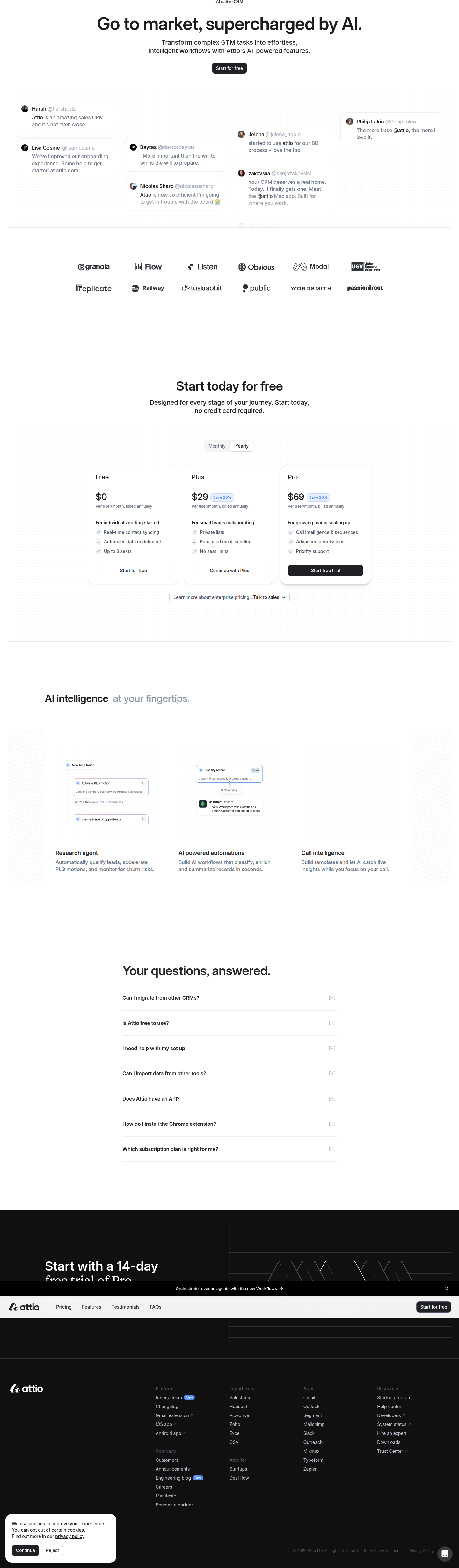
Attio's Landing Page A/B Test: Tweets First or Features First?
Attio is testing whether social proof or feature explainers should come first on its AI CRM landing page. Here's what the variants reveal about proof-point sequencing.
Diego Hernandez
Growth Marketer · Jul 27, 2026
Attio just ran a layout test on its AI CRM landing page, and it's a masterclass in something most teams overlook: proof-point sequencing.
We caught it live at attio.com/p/ai-crm-.... Same blocks. Same content. Completely different order and framing. That's the whole test. No new copy, no new offer, no redesign. Just: what goes first?
The Two Variants, Side by Side
Variant A plays it straightforward. Hero, then feature cards immediately below. It explains the product before it tries to convince you anyone else likes it. Testimonials come later, under "Loved by thousands of companies," styled as clean quote cards. FAQ closes it out under the standard "Frequently asked questions."
Variant B flips the script. Right under the hero: a tweet-style testimonial grid. Real talk, screenshot-style social proof, before you've even seen what the product does. Feature cards get pushed all the way down past pricing, relabeled "AI intelligence at your fingertips." Even the FAQ gets a rename — "Your questions, answered," which reads warmer and more conversational than the generic default.
Same ingredients. Totally different meal.
Takeaway: if you're only testing headlines and button colors, you're leaving the bigger lever untouched. Order is a design decision with conversion consequences.
Why This Test Matters More Than It Looks
Most CRO advice tells you to test one variable at a time. Button copy. CTA color. Headline. Fine for small lifts.
But Attio is testing something structural: does a visitor need to be convinced the product works before they trust that other people like it? Or does social proof do the convincing so the product explanation becomes confirmation, not persuasion?
This is a sequencing bet, not a copy bet. And it's smart, because layout changes affect how visitors interact with the entire page, not just the section you touched. Move testimonials up, and you change the emotional context every block below it gets read in.
Takeaway: test order before you test wording. A better headline on a badly-sequenced page still underperforms.
The Tweet-Grid Bet
Leading with tweet-style testimonials is a trust-transfer play. It borrows credibility from people who aren't you, before you've made a single claim about your own product.
This works especially well for AI products right now, because buyers are skeptical by default. Everyone claims "AI-powered." Nobody believes it until someone else vouches for it. Attio's Variant B is betting that skepticism is the real conversion blocker, not lack of feature clarity.
The risk: if visitors don't recognize the tweeters, the social proof reads as noise. Tweet grids work when the names are legible — investors, known operators, recognizable logos. If Attio's audience doesn't know who's tweeting, this variant loses its whole reason for existing.
Takeaway: social-proof-first only works if your proof is instantly recognizable. Otherwise you're just adding scroll depth with no payoff.
The Feature-First Bet
Variant A assumes the opposite: people land on an AI CRM page because they're evaluating a category, and they want to understand the mechanics before they care who else uses it. Feature cards up top respect that intent. It's a more traditional SaaS funnel — show, then validate.
This is lower-risk, more expected, and probably higher-clarity for cold traffic that arrived without brand context — say, from a Google search for "AI CRM" rather than a referral from someone's tweet.
Takeaway: if your traffic is cold and unbranded, feature-first often outperforms. Save the tweet grid for warm, retargeted, or brand-aware audiences.
What Attio Is Really Optimizing For
Renaming sections is the quiet giveaway here. "Frequently asked questions" becoming "Your questions, answered" isn't a functional change — it's tone. It signals Attio is testing not just structure but voice, section by section, to see what reads as more human versus more corporate.
Same with "AI intelligence at your fingertips" replacing a generic feature-cards label. That's benefit-driven language replacing a description. It's a small thing. But small copy shifts compound when they're applied consistently across every section header on the page.
This is the kind of test that's easy to run and easy to underestimate. According to Crazy Egg's guide to landing page testing, layout and copy adjustments are "basically the same as a basic landing page builder" to execute — the hard part is deciding what to test, not building it. Attio clearly decided proof-point order and section tone were worth the shot.
Takeaway: audit your section headlines. Generic labels ("FAQ," "Testimonials," "Pricing") are free real estate for reinforcing your value prop.
What To Watch Before You Copy This
One in eight A/B tests produces a statistically significant result — that's the sobering stat from Elevation B2B's CRO breakdown. Don't assume Attio's variant B "wins" just because it's the newer, punchier layout. Newer isn't better. Tested isn't the same as proven.
If you're going to run this exact test, segment by traffic source before you draw conclusions. Cold organic traffic and warm referral traffic will likely prefer different variants, and pooling them will wash out the signal. Check for sample ratio mismatch early, and don't peek at conversion significance before you've got real volume — a mistake that kills more landing page tests than bad hypotheses do.
The Takeaway For Your Roadmap This Sprint
Stop testing headlines in isolation. Pull your landing page apart into blocks — hero, proof, features, pricing, FAQ — and test the order, not just the words inside each one. Segment cold vs. warm traffic before you pick a winner. And if you rename a section, make sure the new label carries a benefit, not just a friendlier tone.
Attio didn't redesign their landing page. They rearranged furniture that was already there. That's the whole hack — and it's one you can ship this week without touching a single line of new copy.
See more like this
ABWatcher catches A/B tests like this every day.
Watch live experiments at 1,000+ high-converting brands, complete with hypothesis and takeaway. Free forever for ten watched companies.