
Attio's A/B Test: Killing Enterprise Pricing and Leading with Tweets
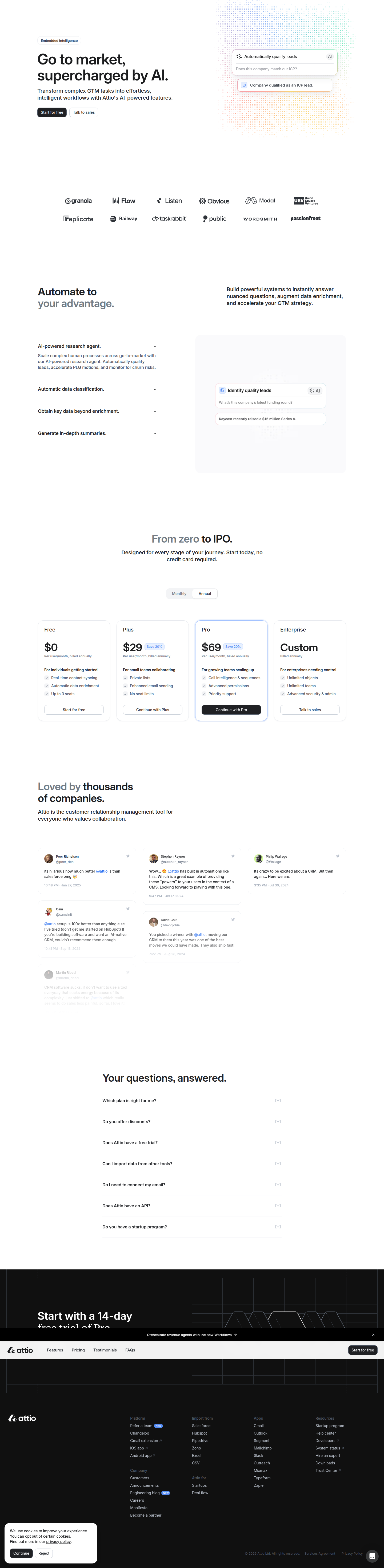
Attio is running a live A/B test on its AI CRM landing page, swapping a left-aligned 4-tier pricing layout for a centered hero, social proof, and a simplified 3-tier table.
Aiko Tanaka
Design Director · Jul 21, 2026
Attio's landing page at /p/ai_crm-0212-25 is running two very different arguments for the same product. We caught it via URL cluster variance, and the confidence is high (90%) — this isn't a caching glitch or a broken component render. It's a structural rewrite of the page's entire persuasion sequence, from hero alignment down to which pricing tier gets to exist at all.
What the Eye Lands On First
Control opens with a left-aligned hero. That's a deliberate hierarchy choice — left-aligned headlines read as more editorial, more "product," and they let the eye enter at the top-left and travel naturally into a two-column feature explainer underneath. It's built for F-pattern scanning: headline, subhead, then a horizontal sweep into supporting copy. This is the layout you choose when you trust the visitor to read.
Variant centers the hero. Centered copy kills the F-pattern entry point and replaces it with a single vertical axis — everything stacks on top of everything else, Z-pattern collapses into a straight line down the middle. Centered hero treatments read as more "campaign" than "product," and they're almost always paired with an immediate proof point, which is exactly what happens next: a tweet cluster drops in directly below the fold instead of after the feature explainer. That's a sequencing bet, not just a cosmetic one — control makes you understand the product before it shows you who trusts it; variant leads with trust and asks you to suspend judgment on mechanics until later.
Social Proof Moved to the Top of the Fold
This is the most aggressive move in the variant. Moving a testimonial grid from mid-page (control) to immediately-post-hero (variant) is a bet on the primacy effect — whatever a visitor sees right after the headline gets disproportionate weight in how they read everything after it. A tweet cluster specifically (as opposed to a formatted testimonial card) also changes the contrast profile of the page: tweets carry their own chrome, avatars, handles, timestamps. That visual noise is doing double duty — it reads as unstaged, which is precisely the point. Curated testimonial grids look like marketing. A tweet cluster looks like the internet talking amongst itself.
Gestalt-wise, this is proximity and similarity working together: grouping real usernames and avatars close to the hero creates an implicit "these people are why you're here" association before the visitor has evaluated a single feature. Control asks for a rational read-through. Variant asks for an emotional shortcut. Neither is wrong — but they're optimizing for different visitor types, and that's worth noting if you're segmenting traffic by source.
Three Tiers, Not Four
The pricing change is the part growth teams should study closest. Control ships a four-tier table: Free / Plus / Pro / Enterprise. Variant drops Enterprise entirely, landing on three: Free / Plus / Pro.
This isn't just simplification for simplification's sake — it's a scope decision about who the page is even trying to sell to. A four-tier table with Enterprise visible does two things: it anchors Pro as "the reasonable middle" (classic decoy pricing), and it signals to enterprise-curious visitors that there's a sales-assisted path without making them hunt for it. Removing Enterprise from the self-serve table doesn't necessarily mean Attio stopped selling to enterprise — more likely, it means they're testing whether Enterprise's mere presence is adding decision fatigue for the self-serve segment that makes up most of this landing page's traffic. Layout testing research consistently finds that reducing the number of comparison points on a pricing table lowers time-to-decision, even when it doesn't change which tier people actually pick. Fewer columns means less horizontal eye travel, which on a centered-hero page reinforces the vertical, low-friction read the rest of the variant is built around.
The risk, of course, is qualified enterprise leads bouncing because they don't see themselves reflected in the table. Whether that risk is worth it depends entirely on what fraction of this page's traffic Attio is actually trying to self-serve versus sales-assist — a question their internal funnel data will answer far better than the page alone.
Feature Explainer: Two Columns vs. Three Cards
Control's two-column feature explainer is a denser, more editorial format — closer to a spec sheet, better suited to visitors doing side-by-side evaluation against competitors. Variant's three-card "AI intelligence" layout is a shift toward modular, scannable chunks, each card presumably carrying its own icon, headline, and one line of support copy. Three cards in a row is one of the most well-worn patterns in SaaS marketing for a reason: it maps cleanly to a rule-of-three cognitive shortcut, and it resists the visual fatigue that two dense columns can create for a visitor who's already scrolled past a hero and a tweet cluster. Given that the variant has front-loaded emotional proof, the feature section doing less cognitive work makes structural sense — it's not trying to convince, it's trying to confirm.
Shorter FAQ, Different Questions
Control's FAQ set is longer and, presumably, covers more ground — likely including questions relevant to enterprise buyers (security, SSO, data residency) given the four-tier table above it. Variant's FAQ is shorter with different questions, which tracks with a simplified, self-serve-first page: fewer edge cases to address when you're not actively selling an Enterprise tier at the point of pricing.
The Takeaway
If you're running your own pricing or landing page tests this sprint, don't treat Attio's changes as isolated tweaks — they're one coherent hypothesis executed across five separate surfaces at once: hero alignment, proof placement, tier count, feature format, and FAQ scope. That's the real lesson. Structural CRO tests rarely win or lose on a single element; they win or lose on whether the whole page tells one consistent story. Before you A/B test a pricing table in isolation, ask whether your hero and proof placement are already arguing for the audience you're trying to simplify for — and check the core CRO fundamentals that support hypothesis-first testing before you start moving cards around.
See more like this
ABWatcher catches A/B tests like this every day.
Watch live experiments at 1,000+ high-converting brands, complete with hypothesis and takeaway. Free forever for ten watched companies.