
Andi Search Ditched the Hero Image for a Live Chatbot. Here's Why It Works.
Andi's homepage hero is a real, working chat interface — not a screenshot. We break down why this rare CRO pattern converts and how to steal the logic.
Diego Hernandez
Growth Marketer · · Updated
TL;DR
- Brand: Andi (andisearch.com) — AI search assistant
- Surface detected: homepage hero, category "interactive_demo"
- Rarity score: 75% · Importance score: 70%
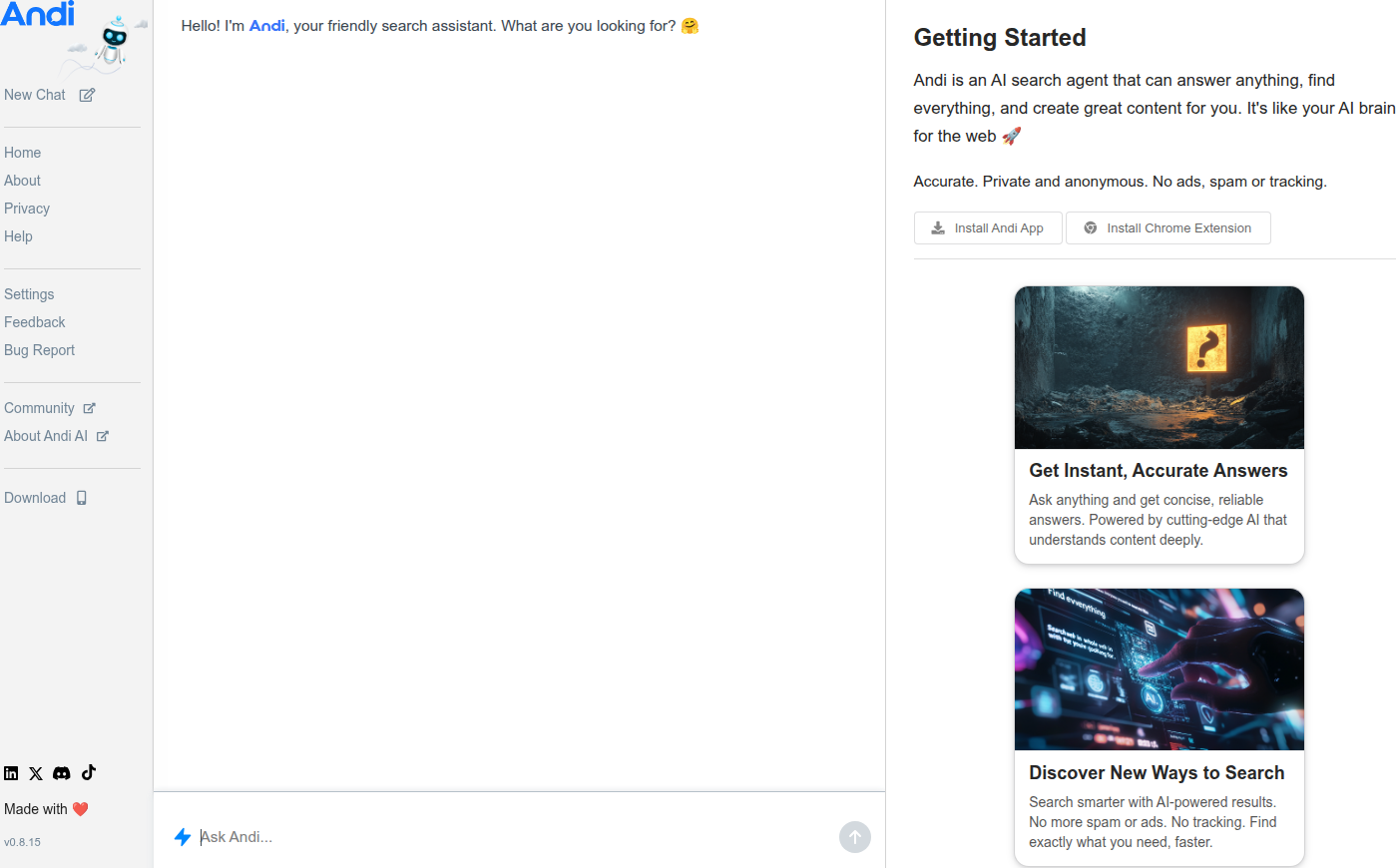
- What's live: a functioning chat UI greets visitors with "Hello! I'm Andi, your friendly search assistant. What are you looking for? 🤔"
- The twist: no static headline, no mockup screenshot — the hero is the product, already running
- Why it matters: this collapses the classic explain-then-convert funnel into one step
What did Andi actually change on their homepage?
Andi replaced the standard hero — headline, subhead, CTA button, product screenshot — with a live chat window that's already talking to you.
No "Search smarter with AI" copy block. No hero image of a dashboard you can't touch. You land on the page and Andi (the bot) has already said hello and asked what you're looking for. The evidence line we pulled straight from the page: "Hello! I'm Andi, your friendly search assistant. What are you looking for? 🤔"
That's it. That's the whole hero. The product loads first, the pitch loads never.
Why is this rare, and why does it score high on both axes?
It's rare because almost nobody trusts their product enough to skip the sales pitch entirely. We logged this at 75% rarity and 70% importance — high on both because it's uncommon and it's a meaningful structural bet, not a color-of-button tweak.
Most teams treat the hero as a trust-building zone before the product reveal. Andi skips trust-building and goes straight to product. That's a bet that the demo sells harder than any headline could. For a search/chat product, that bet is easy to justify — the entire value prop is "watch how I respond," and copy can't simulate that.
Does "product as landing page" actually convert better?
Direction-wise, yes — friction drops when the first interaction is the real product instead of a description of it, which shortens the path from land to "aha."
Classic CRO doctrine says reduce steps between arrival and value. Landingi's CRO guide frames this as removing friction and testing what already works rather than chasing one dramatic redesign — but Andi's hero is the dramatic redesign, and it removes an entire step: the step where a visitor has to read copy, form a mental model of the product, and then decide to try it. Andi collapses "read about it" and "try it" into a single moment.
Unbounce's CRO best practices also push iterative testing over guesswork — worth flagging here because this isn't a small copy tweak you A/B test in an afternoon. This is a hero-architecture decision. If you're going to test something this structural, you need real traffic volume and patience, not a two-day test window.
Where else could this pattern work, and where would it flop?
This pattern works when the product is instantly legible in one interaction and flops when your product needs setup, context, or a login before it does anything useful.
Here's a quick gut-check table for whether "product-as-hero" fits your homepage:
| Product type | Fit for live-demo hero | Why |
|---|---|---|
| AI chat / search tools | High | Value shows in one exchange, zero setup |
| Design/no-code tools | Medium | Needs a template or seed state to feel real |
| B2B SaaS with onboarding | Low | Product needs data/context to look good |
| Fintech / banking | Low | Compliance and security concerns front-load trust needs |
| Ecommerce | Low | Hero's job is merchandising, not functionality |
If your product's first 10 seconds are genuinely impressive without any setup, you're a candidate. If your product needs a populated dashboard or three onboarding steps to look like anything, don't do this — you'll show visitors an empty box, which converts worse than a good headline.
What should you test on your own hero this sprint?
You don't need to rebuild your whole homepage to borrow the logic. Start smaller and directional.
- Add one live, interactive element above the fold — a mini-calculator, a real search box, a sample query — instead of only a screenshot.
- Track whether visitors who touch that element convert higher than visitors who scroll past it.
- If interaction rate is low, your copy is still doing the heavy lifting — that's a signal, not a failure.
Even Contentsquare's landing page optimization guide points out there's no universal conversion benchmark — you set your own goal and iterate against it. Andi's hero isn't a template to copy-paste. It's a hypothesis: for products where the demo is the pitch, hide the pitch and show the demo.
Common questions
What makes Andi's hero different from a normal product demo video or GIF?
A video or GIF is passive — visitors watch it happen to someone else. Andi's hero is a live, functioning chat interface responding to that specific visitor's input in real time. Detected as a homepage hero pattern, it removes the "is this real?" doubt that pre-recorded demos create.
Is this pattern only for AI or chat products?
Mostly, yes. It works best when the product's core value is legible in a single interaction with no setup — search, chat, and calculators fit. Products requiring accounts, data import, or multi-step configuration will show an empty or confusing state instead of value, which hurts rather than helps.
How would I A/B test replacing my hero with a live product demo?
Run it as a structural test, not a copy test — hold traffic split for at least 2-3 weeks to account for weekly conversion cycles. Measure interaction rate with the live element plus downstream signup conversion, not just time-on-page, since engagement without conversion is a false positive.
Does removing headline copy hurt SEO or clarity for new visitors?
It can, if there's zero supporting text anywhere on the page. Best practice is to keep a thin layer of context — a small tagline or subhead near the chat window — so search engines and skimmers still get the "what is this" signal while the interactive element does the conversion work.
What's the one takeaway to apply this sprint?
Audit your hero for passive proof versus active proof. Anywhere you're showing a screenshot of your product working, ask if you could let visitors make it work themselves instead — even in a stripped-down sandbox version.
Read next
More from the ABWatcher blog
Nov 22, 2026
Snake River Farms Tests a $25-Off Popup on Its Ad Landing Page
We caught Snake River Farms split-testing an email-capture form and $25-off modal on its landing page. Here's the math on what it would take to call a winner.
Nov 21, 2026
Snake River Farms Tests Mid-Page Email Capture on Its Ad Landing Page
SRF is A/B testing a mid-page lead-capture block and a $25-off popup against a simpler hero-only promo banner on its paid landing page, detected 2024 week-over-week.
Nov 20, 2026
Attio Is Testing a New Tier, Higher Prices, and a New Pitch
Attio is running a live pricing page test with a new $1,000 "Ultra" tier, higher Plus/Pro prices, and a new headline — here's what we caught and what it means.
Nov 19, 2026
Found Quietly Tested a 25% Price Cut on Its Pricing Page
We caught Found running a live pricing A/B test with an annual billing toggle that drops Found Plus from $35 to $26.25/mo. Here's what changed and why it matters.
Nov 8, 2026
Astro Proves "Zero Lock-In" With a Live Code Demo, Not a Claim
Astro's homepage replaces a trust badge row with a working, clickable framework demo — here's the hierarchy and interaction design behind it, detected 60% rare on astro.build.
Nov 7, 2026
Basecamp's Big Numbers: Why Hyper-Precise Stats Beat Vague Social Proof
Basecamp's homepage swaps "trusted by thousands" for 1.7 billion to-dos and 5 petabytes of data. We break down why precision beats vagueness as social proof — and how to test it.
From the glossary
Vocabulary the article uses. See all terms →
- Shrinkage Estimator— A statistical adjustment that pulls noisy per-variant or per-segment estimates toward an overall average to reduce overfitting to randomness.
- Flicker Test— A diagnostic check to confirm whether users briefly see the original page before a variant renders in client-side experiments.
- Pre-Experiment Bucketing Audit— A review process confirming users are being randomly and evenly assigned to experiment variants before launch.
- Above-Fold Exclusion Rule— A test-design rule that deliberately prevents changes to above-the-fold elements so an experiment isolates below-the-fold effects.
- Flicker-Free Testing— A technical setup that prevents users from briefly seeing the original page before a test variant loads.
- Orthogonal Test Design— A test structure where multiple variables are changed independently so their individual effects can be measured without interference.
See more like this
ABWatcher catches A/B tests like this across 1,000+ brands.
Watch live experiments at 1,000+ high-converting brands, complete with hypothesis and takeaway. 7 days of Pro, free, no card, then Free forever for ten watched companies.