
Ally.com Is A/B Testing Its Entire Homepage Hero — And the Nav Bar
ABWatcher caught Ally.com running a full hero, nav, and card-copy experiment via Adobe Target — brand lifestyle imagery vs. a Spending Account product pitch.
Aiko Tanaka
Design Director · · Updated
TL;DR
- Brand: Ally (ally.com) — homepage hero experiment detected 90% confidence
- Detection method: week-over-week diff across two same-browser Safari visits
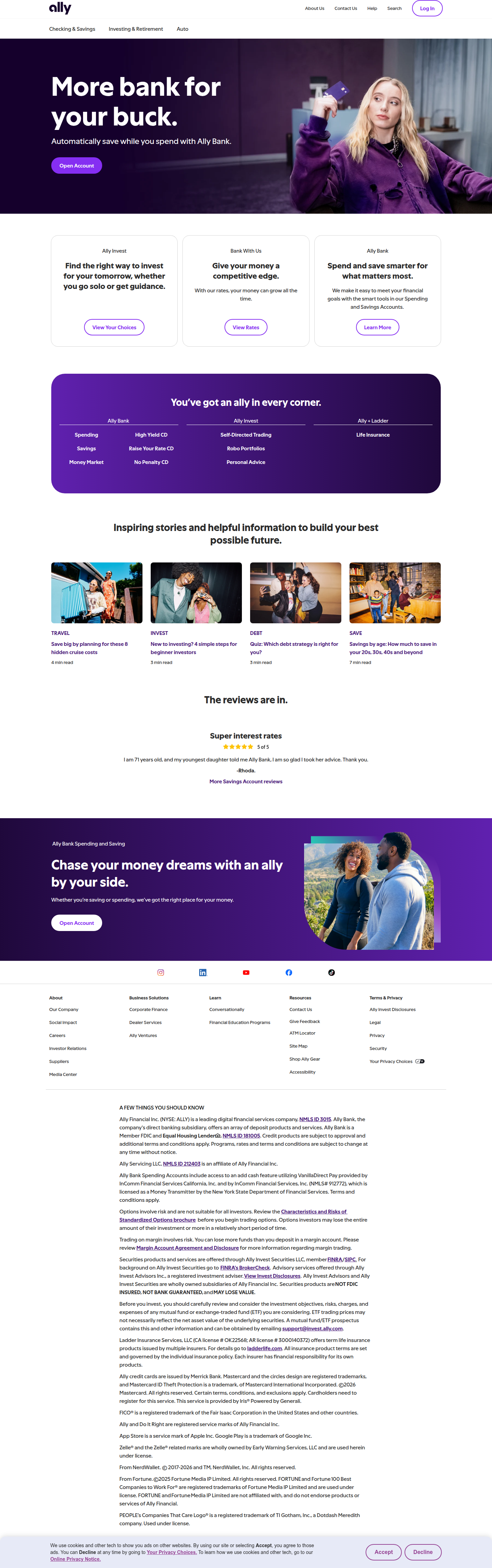
- Variant A: Lifestyle-photo hero with "More bank for your buck" brand messaging, no Credit Cards nav link
- Variant B: Product-feature hero pitching the Spending Account app and early paycheck access, Credit Cards link present
- Platform: Adobe Target, bucketed by mboxEdgeCluster/mbox cookies — not a caching artifact
- Scope: Hero headline, hero graphic, CTA label, nav bar, and three-column card copy all shift together
What did Ally actually change in the hero?
Ally swapped nearly every element an eye lands on first in the top fold — headline, imagery, CTA label, and even a nav item — between two visitor buckets. This isn't a single-variable test; it's a coordinated redesign of the entire above-the-fold experience, running live on ally.com's homepage as of this detection window.
In Variant A, the hero leans into lifestyle photography and a brand-positioning headline: "More bank for your buck." The tone is aspirational, image-forward, and light on specifics — the kind of hero built to make you feel something about the brand before it asks you to do anything. Visually, this is a classic figure-ground composition: a warm photographic backdrop with a short headline and CTA floating on top, minimal text competing for attention. The eye has one job — read the line, hit the button.
Variant B flips the strategy entirely. The hero graphic shifts to a product-feature illustration tied to the Spending Account, and the headline copy pivots to a concrete benefit: early access to your paycheck. This is a much more literal, feature-first hero. Where Variant A asks you to trust the brand, Variant B asks you to understand the product. Gestalt-wise, it trades emotional similarity-grouping for a more explicit, labeled hierarchy — the kind of hero that assumes a colder, more skeptical visitor who needs proof of utility before a brand story lands.
Why does the nav bar change between variants?
The nav bar differs because Ally is testing navigation as part of the same experiment, not as an unrelated bug — Variant A drops the Credit Cards link entirely. That's a meaningful signal. Removing a nav item isn't cosmetic; it's an active choice to narrow the decision surface for one bucket of visitors, likely to reduce competing paths away from the primary CTA. If the lifestyle hero is meant to build broad brand affinity, a simpler nav with fewer product categories keeps attention on the singular story being told. The feature-first hero, by contrast, keeps Credit Cards visible — consistent with a strategy that treats this visitor as already shopping across product lines and wants full navigational access.
This kind of nav-plus-hero bundling is a heavier lift than typical hero copy tests, and it points to a multivariate or full-page experiment design rather than a simple two-button CTA test. For teams thinking about their own roadmap, this is the kind of test multivariate testing setups are built for — when you're not just swapping a headline but recombining headline, image, and structural chrome simultaneously, you need an engine that can track interaction effects, not just isolated lifts.
What do the three-column cards below the hero say in each version?
The card copy directly underneath the hero also splits between variants, reinforcing whichever narrative the hero already set. In Variant A, expect the three cards to continue the "more bank for your buck" theme — value-oriented, benefit-driven copy that supports a brand-affinity read. In Variant B, the cards echo the product-feature angle, likely detailing Spending Account mechanics, fee structure, or the early-paycheck benefit in more specificity. This consistency across the fold matters: Ally isn't just testing a headline in isolation, they're testing two complete narrative arcs from hero through supporting content, which is a stronger signal of intent than a single-element swap.
How does this compare to typical hero tests we see?
Most hero tests we track at ABWatcher are narrower — a headline swap, a CTA label change, or a single hero image variant. Ally's test is unusually broad in scope.
| Element | Variant A (Brand) | Variant B (Product) |
|---|---|---|
| Headline | "More bank for your buck" | Spending Account / early paycheck benefit |
| Hero visual | Lifestyle photography | Product-feature graphic |
| CTA label | Brand-toned | Feature/action-toned |
| Nav bar | No Credit Cards link | Credit Cards link present |
| Card copy | Value/brand-aligned | Feature/product-aligned |
| Platform | Adobe Target | Adobe Target |
This full-page bundling approach is closer to what Contentful's CRO guide describes as testing for a fundamentally different conversion hypothesis, not a minor optimization — Ally seems to be asking whether an emotional brand story or a rational product pitch converts better on their single highest-traffic page.
Common questions
Is this a bug or a real A/B test?
It's a real test. Both visits rendered fully and consistently, and the divergence tracked with Adobe Target's mboxEdgeCluster/mbox bucketing cookies rather than a broken cache or partial page load — our analyst logged 90% confidence this is an intentional, live experiment.
What testing platform is Ally using?
Ally is running this experiment on Adobe Target, identifiable through mbox cookie behavior that determines which hero, nav configuration, and card copy a given visitor bucket sees on repeat visits from the same browser.
Why would a bank test removing a nav link?
Removing the Credit Cards nav link in one variant likely narrows the decision surface to keep attention on the primary hero CTA. Fewer navigational exits can support a brand-story hero designed to build affinity before introducing product complexity.
What's the takeaway for teams running their own hero tests?
If you're only testing headline or CTA copy, you're testing a fraction of what's possible. Ally's experiment shows real returns may come from testing full narrative arcs — hero, nav, and supporting copy together — especially when a single headline swap alone shows no movement, as some teams have found.
The takeaway for your next sprint
If your last few hero tests were single-variable swaps with flat results, consider what Ally is doing here: testing two entirely different value narratives — brand vs. product — bundled across hero, nav, and supporting cards. Before your next test, ask whether you're testing a sentence or a story. A multivariate test that recombines your hero, your nav, and your first three content blocks around one coherent hypothesis is a heavier build, but it's far more likely to surface a real signal than another CTA-color tweak.
Read next
More from the ABWatcher blog
Nov 22, 2026
Snake River Farms Tests a $25-Off Popup on Its Ad Landing Page
We caught Snake River Farms split-testing an email-capture form and $25-off modal on its landing page. Here's the math on what it would take to call a winner.
Nov 21, 2026
Snake River Farms Tests Mid-Page Email Capture on Its Ad Landing Page
SRF is A/B testing a mid-page lead-capture block and a $25-off popup against a simpler hero-only promo banner on its paid landing page, detected 2024 week-over-week.
Nov 20, 2026
Attio Is Testing a New Tier, Higher Prices, and a New Pitch
Attio is running a live pricing page test with a new $1,000 "Ultra" tier, higher Plus/Pro prices, and a new headline — here's what we caught and what it means.
Nov 19, 2026
Found Quietly Tested a 25% Price Cut on Its Pricing Page
We caught Found running a live pricing A/B test with an annual billing toggle that drops Found Plus from $35 to $26.25/mo. Here's what changed and why it matters.
Nov 8, 2026
Astro Proves "Zero Lock-In" With a Live Code Demo, Not a Claim
Astro's homepage replaces a trust badge row with a working, clickable framework demo — here's the hierarchy and interaction design behind it, detected 60% rare on astro.build.
Nov 7, 2026
Basecamp's Big Numbers: Why Hyper-Precise Stats Beat Vague Social Proof
Basecamp's homepage swaps "trusted by thousands" for 1.7 billion to-dos and 5 petabytes of data. We break down why precision beats vagueness as social proof — and how to test it.
From the glossary
Vocabulary the article uses. See all terms →
- Shrinkage Estimator— A statistical adjustment that pulls noisy per-variant or per-segment estimates toward an overall average to reduce overfitting to randomness.
- Flicker Test— A diagnostic check to confirm whether users briefly see the original page before a variant renders in client-side experiments.
- Pre-Experiment Bucketing Audit— A review process confirming users are being randomly and evenly assigned to experiment variants before launch.
- Above-Fold Exclusion Rule— A test-design rule that deliberately prevents changes to above-the-fold elements so an experiment isolates below-the-fold effects.
- Flicker-Free Testing— A technical setup that prevents users from briefly seeing the original page before a test variant loads.
- Orthogonal Test Design— A test structure where multiple variables are changed independently so their individual effects can be measured without interference.
See more like this
ABWatcher catches A/B tests like this across 1,000+ brands.
Watch live experiments at 1,000+ high-converting brands, complete with hypothesis and takeaway. 7 days of Pro, free, no card, then Free forever for ten watched companies.