Rivian's 0.99% APR Tile: When a Financing Rate Becomes the Hero
Rivian swapped its usual hero imagery for a bold red 0.99% APR tile — turning a financing rate into the primary conversion anchor. Here's what the pattern tells us about price-as-hook strategy.
Maya Patel
Senior CRO Strategist · Jul 2, 2026
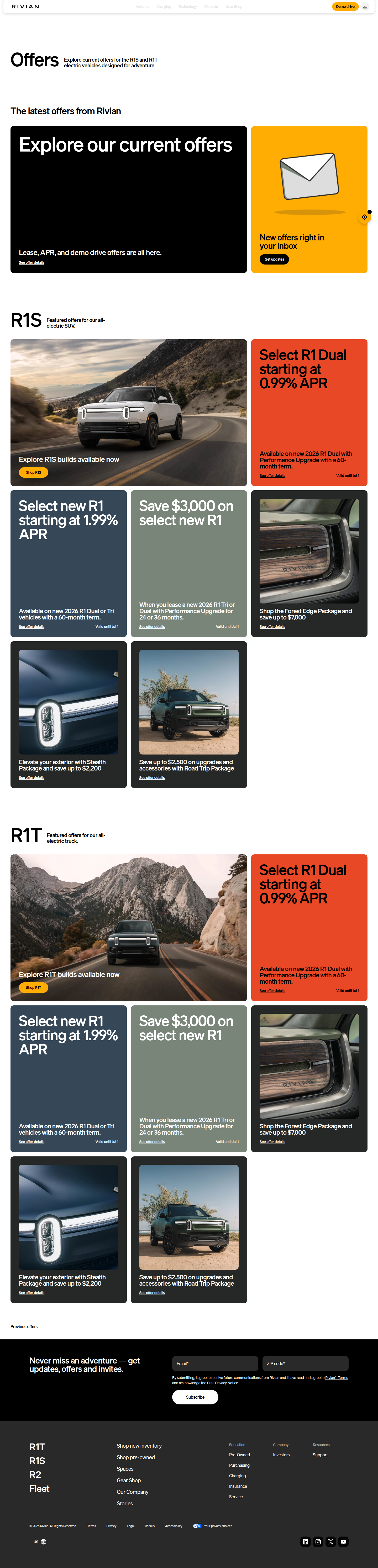
Rivian's homepage hero doesn't lead with a truck. It leads with a number: 0.99% APR, rendered in a high-contrast red tile that reads more like a flash-sale markdown than a financing disclosure. The full copy — "Select R1 Dual starting at 0.99% APR — Available on new 2026 R1 Dual with Performance Upgrade with a 60-month term" — sits above the fold, doing the job usually reserved for a hero shot of the vehicle in motion.
That's a meaningful departure from category norms, and it's worth unpacking why it works, where it's fragile, and what it signals for teams outside automotive who are sitting on a similarly extreme number they haven't dared to put in the hero.
The Mechanic: Price as Pattern Interrupt
Most automotive and big-ticket ecommerce hero sections optimize for aspiration — lifestyle imagery, product hero shots, brand mission statements. Financing terms, when they appear at all, live in a secondary module or footer disclosure. Rivian inverts that hierarchy entirely.
By putting 0.99% in bold red at the top of the funnel, Rivian is using the rate itself as the attention-grabbing asset. This isn't a standard "as low as X% APR" footnote — it's sized, colored, and positioned to function as the primary value prop, ahead of range, performance specs, or design language. In CRO terms, it's a classic pattern interrupt: visitors scanning a familiar page layout hit a number that doesn't match their expectation of what a hero headline contains, which forces a beat of attention before they process anything else.
The tactic borrows directly from retail markdown psychology — a red price tag against white space triggers the same "too good to scroll past" reflex as a 70%-off tag on an ecommerce category page. Applying that visual grammar to a financing rate, rather than a sticker price, is the unusual part.
Why the Anchor Works Here Specifically
Three conditions make this play land for Rivian in a way it might not elsewhere:
- The category baseline is high. Average new auto loan APRs have sat well above 6% for most of the past two years, so 0.99% isn't just competitive — it's a shock relative to what the visitor assumes going in. The gap between expectation and reality is the entire mechanic.
- The purchase is high-consideration. For a $70k+ vehicle, financing terms materially change monthly payment math. A rate this low can shift a "maybe next year" visitor into an active configurator session, because it changes the affordability calculus more than a comparable percentage discount would on a lower-ticket item.
- It's visually literal. Red-on-white, bold weight, isolated in its own tile — this is a design decision that treats the number as the hero image. Visual hierarchy guidance consistently recommends using color, size, and placement to tell the eye exactly where to look first. Rivian applies that principle to a data point most brands would bury in fine print.
Where the Risk Sits
Before recommending this pattern to a client, I'd want to pressure-test three things, because the aggressive framing carries real downside if execution slips.
Eligibility mismatch. The offer is scoped tightly — "Select R1 Dual," "Performance Upgrade," 60-month term only. That's a narrow slice of the buyer base. If a large share of hero-click traffic lands on a configurator and discovers they don't qualify, the disclosure gap between headline and reality creates the exact bounce risk that FullStory's CRO guidance warns about when CTA copy and landing page content diverge. The rate needs to survive first contact with the configurator, or the anchor becomes a trust tax instead of a trust builder.
Rate fatigue and skepticism. A number this far from the visitor's mental model can read as too good to be true, particularly for a brand still building trust as a newer, lower-volume manufacturer relative to legacy OEMs. Financial offers carry a credibility burden that percentage-off retail promos don't — visitors have been trained by years of "starting at" fine print to distrust headline rates until they see the calculator.
One-mechanic dependency. If 0.99% is doing all the conversion work, the hero is exposed the moment financing conditions normalize or the promotional window closes. Teams should be tracking incrementality here, not just top-of-funnel engagement — is this rate actually pulling forward purchase decisions, or just changing which page section gets the click before the same consideration cycle plays out?
Scoring the Pattern: ICE View
Running this through a standard ICE lens for teams considering an analogous test:
- Impact: High. A rate this far below market average is a genuine value anchor, not a marginal nudge. For high-ticket categories with clear financing pain points, this kind of number can meaningfully compress the consideration window.
- Confidence: Medium. The mechanic is well-supported by markdown psychology and expectation-gap theory, but it's unproven outside limited-time, narrowly-scoped inventory offers. Confidence should rise or fall based on how tightly your eligibility criteria mirror Rivian's.
- Ease: Low-to-Medium. The hard part isn't the design — it's the underwriting. You need finance or lending partners willing to support a rate aggressive enough to earn hero placement, plus legal sign-off on the disclosure language sized appropriately relative to the headline.
The Takeaway for Your Roadmap
Most teams have a number somewhere in their business — a rate, a guarantee, a turnaround time — that's genuinely exceptional relative to category norms but is currently living in a footnote instead of a hero. The Rivian pattern is a reminder to audit your value props for hidden anchors before testing new headline copy or CTA color. Continual experimentation with new landing page elements is standard CRO hygiene, but the bigger lift often isn't a new element — it's promoting an existing, underused number to the position of highest visual authority on the page. This sprint, pull your top three offer terms out of secondary modules and ask honestly: would any of these survive being blown up to hero size, in bold color, above the fold? If the answer is yes and you haven't tested it, that's your next experiment.
See more like this
ABWatcher catches A/B tests like this every day.
Watch live experiments at 1,000+ high-converting brands, complete with hypothesis and takeaway. Free forever for ten watched companies.