Lyra Health's Hero Stat Tiles: ROI Before the Form Field
Lyra Health places four bold outcome metrics directly beside its demo form. Here's why this "proof-near-decision" pattern works for CFO/CHRO buyers — and how to test it on your own demo page.
Sam Lee
Data Analyst · Jun 25, 2026
Lyra Health's demo page hero does something most B2B landing pages are too timid to attempt: it puts hard, quantified business outcomes — four of them — right next to the form, before the visitor has typed a single character. ABWatcher flagged this as a rare pattern (55% rarity score, 72% importance), and it's worth unpacking exactly why the execution matters as much as the idea.
What Lyra Actually Built
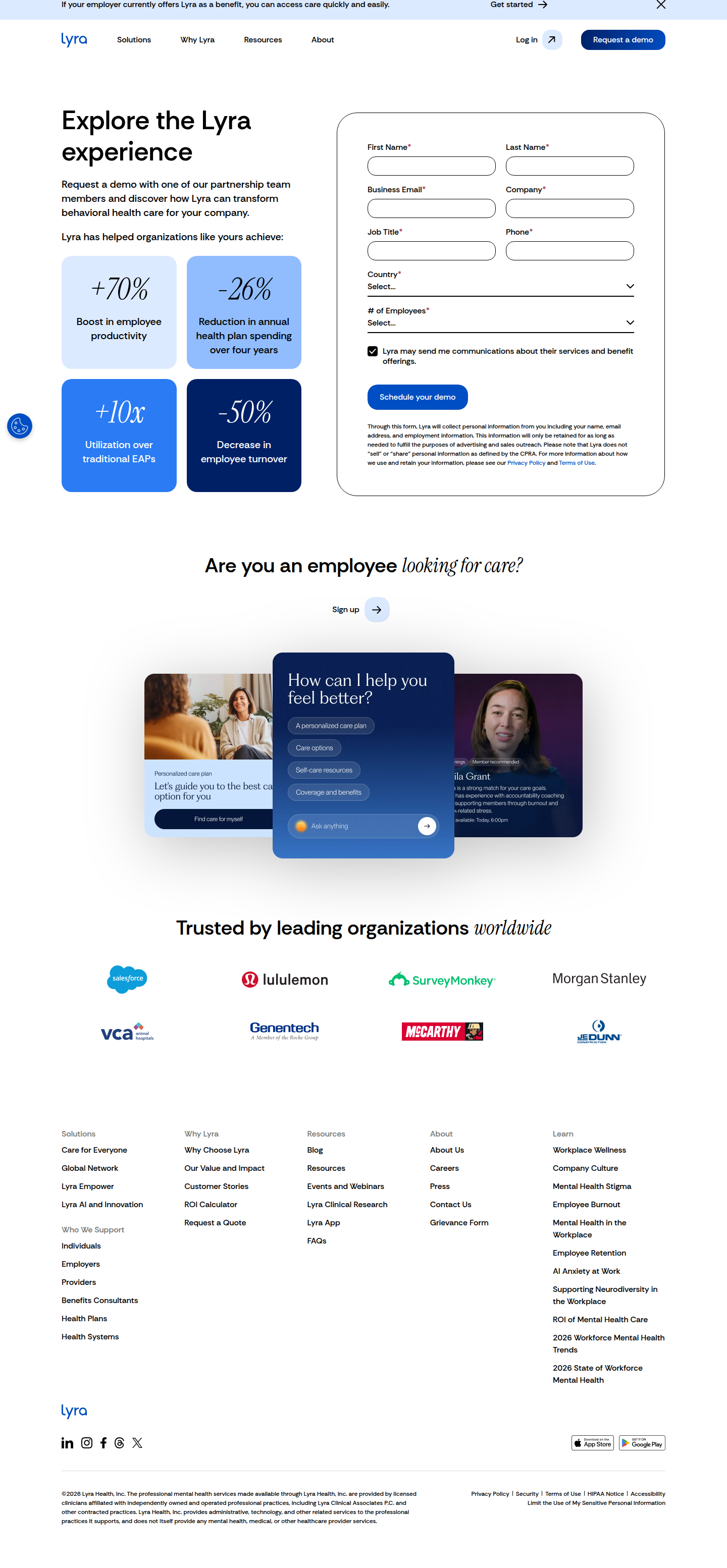
The variant isn't a testimonial carousel. It isn't a logo wall. It's four metric tiles, rendered in large bold type, sitting in the visual field adjacent to the demo request form:
- +70% Boost in employee productivity
- −26% Reduction in annual health plan spending over four years
- +10x Utilization over traditional EAPs
- −50% Decrease in employee turnover
The negatives are doing real work here. "−26% health plan spend" and "−50% turnover" are CFO/CHRO language, not HR-software marketing language. They translate directly into a budget line a buyer controls. The "+10x EAP utilization" addresses the common objection that EAP programs go unused — a credibility gap Lyra's buyers already have in their heads when they land on the page.
Critically, these tiles are positioned beside the form, not below the fold. That placement is the pattern.
Why Placement Adjacent to the Form Is the Real Lever
Most B2B demo pages bury social proof in a testimonials section that sits 800px below the CTA. By the time a skeptical buyer scrolls there, they've already decided not to convert. Lyra inverts this by applying what Apexure calls "proof-near-decision" — placing the strongest proof elements closest to the actual conversion action.
The mechanics make sense from an anxiety-reduction standpoint. A CHRO considering a demo request is implicitly asking: "Is this worth 45 minutes of my calendar?" The stat tiles answer that question in under three seconds, before commitment is required. The form field is no longer a leap of faith; it's a logical next step after a rapid ROI scan.
This matters more at the demo stage than at a free-trial or freemium gate. Demo requests carry higher perceived cost (time, sales follow-up, internal stakeholder buy-in). Higher perceived cost requires stronger pre-conversion justification. Quantified outcomes are a higher-trust proof format than testimonial quotes, because they're falsifiable — a buyer can ask for the methodology in the demo itself, which paradoxically increases demo completion quality, not just volume.
The Segment Math: Who This Converts
Think about the traffic mix hitting a mental health benefits vendor's demo page in 2024. You've got:
- Warm inbound — HR leaders who already Googled "EAP alternatives" and are comparison shopping. They want differentiators. The +10x utilization stat directly addresses the category-level objection.
- Cold paid traffic — CFOs or finance ops retargeted after a conference. They need a cost case before they'll agree to a calendar hold. The −26% health plan spend over four years is the number that makes that case.
- Champion-driven — an HR manager who needs to build an internal business case. The four tiles are essentially a pre-built slide for that deck.
Each segment gets a different hook from the same four tiles. That's efficient social proof design — one placement, multiple buyer jobs done simultaneously. If Lyra is running MQL attribution correctly, I'd expect demo form conversion rate lift to be disproportionately large among finance-adjacent job titles and among visitors with shorter session lengths (the "quick scan and decide" cohort).
Statistical Skepticism: What We Don't Know
I want to flag the selection bias risk here before anyone drops this into their sprint as a guaranteed win. ABWatcher detected this as a live pattern, not a concluded A/B test with a confidence interval attached. A few things to hold:
- We don't have a control. We're observing the variant, not a pre/post or A/B comparison. The lift — if any — is unquantified.
- Novelty effects are plausible. If Lyra recently deployed this, early engagement with the stat tiles may reflect novelty, not durable conversion lift. A 4-week runtime minimum is the floor for a page this low-traffic.
- The metrics themselves carry credibility risk. Bold outcome claims without a source citation can read as marketing fiction to a sophisticated B2B buyer. Lyra should — and may — link these to a published outcomes report. If they don't, a skeptical buyer discounts the number, partially neutralizing the effect.
- Sample size is a concern at demo-page volumes. If Lyra's demo page converts at, say, 8% and receives 2,000 monthly visitors, detecting a 1.5 percentage-point lift (a meaningful 19% relative improvement) requires roughly 6,500 visitors per variant to reach 80% power at 95% confidence. That's over three months of runtime per variant. Short-run tests on low-traffic demo pages routinely produce false positives.
As Unbounce notes in their CRO best practices, not all social proof is created equal — and what works for one audience and offer can flatline for another. Treat this as a strong hypothesis, not a transferable result.
The CFO/CHRO Framing Is the Underrated Insight
Most mental health and HR tech vendors write hero copy for the HR persona: empathy-forward, culture-driven, employee-experience language. Lyra's stat tiles speak CFO. That's a deliberate audience expansion at the hero level.
If you look at the specific metric selection — health plan spend reduction over four years (not one), turnover decrease (a fully-loaded cost most CFOs track) — there's clear intent to arm the champion (HR) with finance-friendly ammunition. The implied message: "You don't have to translate this for the budget holder. We did it for you."
This is a copywriting strategy as much as a CRO strategy. The stat selection signals deep ICP understanding. A competitor running the same tile layout with metrics like "employees feel supported" would get materially different results.
What to Take Into Your Sprint
If you run a B2B demo or consultation landing page, here's the testable hypothesis Lyra's pattern surfaces:
Hypothesis: Placing 3–4 quantified outcome stats in the hero zone adjacent to (not below) the primary CTA form will increase demo/consultation request rate among high-intent visitors, particularly those with finance or operations job titles.
How to test it cleanly:
- Control: current hero layout (likely value proposition headline + subhead + form)
- Variant: same layout with a horizontal or vertical stat tile block occupying the space currently used by a generic subhead or trust logo strip
- Primary metric: form submission rate
- Secondary metric: downstream demo completion rate and SQL rate (to catch cases where volume goes up but quality drops)
- Minimum runtime: until you hit 80% power at 95% confidence — calculate your required sample size before you launch, not after
- Segment cut: break results by job title or company size if your form collects it. The lift may be real but narrow.
One sizing benchmark to anchor the business case: a 1.5pp conversion rate lift on a demo page driving $5M in annual pipeline is roughly $750K in incremental pipeline per year, assuming constant close rates. Run the number for your own funnel before prioritizing, but don't skip the confidence interval before calling it a win.
Lyra's execution is disciplined — specific numbers, negative framing for cost metrics, form-adjacent placement. Copy the principle, not just the layout.
See more like this
ABWatcher catches A/B tests like this every day.
Watch live experiments at 1,000+ high-converting brands, complete with hypothesis and takeaway. Free forever for ten watched companies.