Lever's Demo Form A/B Test: Short vs. Long Lead Qualification
Lever is live-testing a longer demo request form with 4 extra fields against a minimal 4-field version. Here's what the design and conversion tradeoffs look like.
Aiko Tanaka
Design Director · Jun 24, 2026
Lever is running a quiet experiment on what is arguably the most conversion-critical pixel on their entire site: the demo request form at lever.co/demo. ABWatcher caught the split via same-run variance — Edge resolved to lever.co/demo-b, a noticeably heavier form, while Chrome and other visits landed on the lean control. The bucketing is server-side, confirmed by diverging final URLs and separate VWO/ABTasty cookie values. Confidence is sitting at 95%. Let's look at what actually changed and why the design choices here carry real stakes.
What the Two Variants Actually Look Like
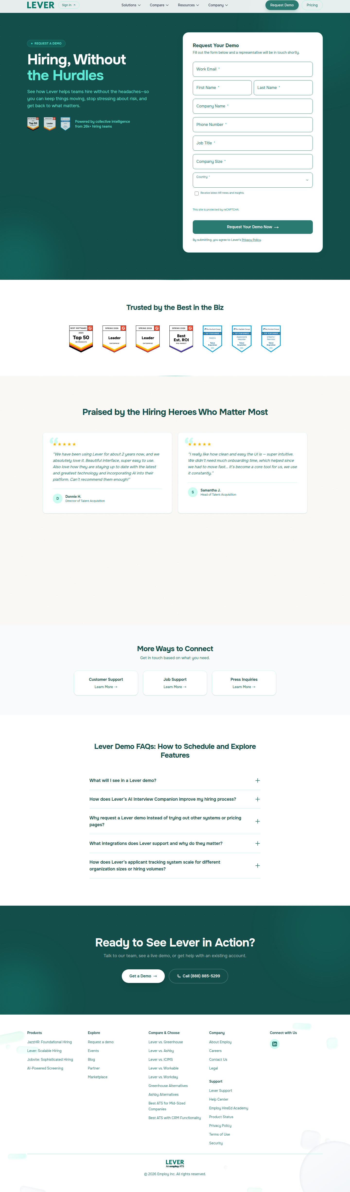
The control is clean. Four fields: Work Email, First Name, Last Name, Company Name. That's it. The visual weight is minimal, the form resolves quickly in the eye, and the CTA sits close to the fold. For a visitor arriving with even modest intent, the friction is low enough that forward momentum carries them through.
The variant adds four fields on top of that baseline: Phone Number, Job Title, Company Size, and Country. Eight fields total. That's a doubling of the visible form surface.
From a pure hierarchy standpoint, this changes the gravity of the page. Where the control's form feels like a handshake, the variant reads more like a questionnaire. The eye now has to travel further before it reaches the submit button — and in an F-pattern reading context, anything below the first two rows of a form starts accumulating drop-off risk with each additional line. The fold weight shifts. Visitors on smaller viewports will almost certainly see the CTA only after scrolling, which introduces a moment of hesitation that the control avoids entirely.
The Hypothesis Behind the Test
Lever's likely bet is straightforward: if the sales team can see Job Title, Company Size, and Country before the first call, they can prioritize, personalize, and route leads more efficiently. Less time wasted on poor-fit prospects. Potentially higher close rates per rep hour.
This is a classic top-of-funnel qualification tradeoff. The hypothesis isn't really "will more people fill out this form" — it almost certainly won't beat the control on raw completion rate. The real question is whether the quality signal from the additional fields generates enough downstream pipeline value to compensate for the leads who abandon.
As FormAssembly notes, segmentation fields like industry or role allow teams to tailor follow-up communication that actually resonates — which can improve post-submission conversion even when top-of-funnel volume dips. That's exactly the math Lever's growth team is trying to run here.
The Design Tension: Perceived Effort vs. Real Effort
There's a Gestalt principle at play that often goes undiscussed in form length debates: common fate and proximity grouping. How the extra fields are visually organized matters as much as how many there are. If Phone, Job Title, Company Size, and Country are stacked as four separate full-width rows, the form feels long. If two fields are placed side by side in a two-column grid (say, First Name / Last Name, or Job Title / Company Size), the vertical height compresses and the perceived effort shrinks — even though the user is still filling in eight values.
Whether Lever's variant uses this technique or goes with a single-column stack is something we can't confirm from URL-level detection alone. But it matters enormously. A two-column layout on a well-spaced form can close a significant portion of the psychological gap between four and eight fields. The contrast between "this will take ten seconds" and "this will take a minute" often lives in layout density, not field count.
CRO best practices consistently reinforce that simplifying user experience is foundational — but "simple" isn't always synonymous with "fewer fields." It's about reducing perceived friction, which is a design problem as much as a product one.
What the Motion and Micro-interaction Layer Could Do Here
This is the detail most teams skip, and it's where I'd push back hardest on Lever's variant if I were reviewing it internally. Eight-field forms benefit enormously from inline validation and progressive disclosure micro-interactions. If Job Title validates with a green checkmark the moment the cursor tabs away, the user feels momentum even as the form grows longer. If Company Size is a segmented button group (1–50 / 51–200 / 201–1,000 / 1,000+) rather than a free-text input or even a dropdown, the interaction takes under a second and reads as lightweight.
None of that visual feedback requires a new design system — it requires someone caring enough to specify it in the component handoff. Without it, the longer form just feels longer. With it, there's a chance the variant holds conversion rate closer to the control than the raw field count would predict.
The Country field is the one I'd watch most carefully. Dropdowns with 195 options are a known conversion killer if they're not pre-populated from IP geolocation. Pre-filling Country = United States (or wherever the visitor is) and letting them override it drops an otherwise tedious field to a single confirmation click.
How to Score This Test Beyond Conversion Rate
This is where most teams mis-analyze form length experiments and declare the control the winner after two weeks. Raw form completion rate is only one metric — and probably not the right primary metric for a B2B demo request flow where the sales cycle is measured in weeks and deal sizes likely run five to six figures.
Lever should be tracking:
- Form completion rate (top-of-funnel, the obvious one)
- Sales-accepted lead (SAL) rate by variant — do variant leads convert to held demos at a higher clip?
- Time-to-first-meeting — does pre-qualification reduce back-and-forth scheduling friction?
- Pipeline-per-visitor — the single number that reconciles volume loss against quality gain
A/B testing done right, as Contentful outlines, means running tests long enough for statistical significance and analyzing effect sizes — not just p-values. For a B2B demo page, "long enough" probably means 4–6 weeks minimum to capture a full sales cycle in the data, not just the click.
If Lever's SAL rate in the variant is 40% higher but top-of-funnel completion drops 20%, the longer form is almost certainly the right call. The math is about pipeline, not page metrics.
What You Can Take Into Your Sprint This Week
If you have a demo or trial request form on your roadmap, here's the move: don't frame the test as "short vs. long." Frame it as qualification threshold vs. pipeline quality. Then instrument accordingly before you launch the test, not after.
Specifically: make sure your CRM or sales tooling is tagging which form variant a lead came from, and build a dashboard that ties variant exposure to downstream funnel stages — not just form submissions. That instrumentation gap is why most form length tests produce inconclusive results or get called for the wrong winner.
On the design side, if you're adding fields, compress the perceived height with a two-column layout where semantically appropriate, pre-fill anything you can from session context (IP geolocation for Country, company data enrichment for Company Size if you have a Clearbit-style integration), and invest thirty minutes in specifying inline validation states before handing off to engineering. Those three things won't guarantee the longer form wins — but they'll give it a fair fight.
Lever's experiment is live. We'll be watching the URL split for resolution signals over the next few weeks.
See more like this
ABWatcher catches A/B tests like this every day.
Watch live experiments at 1,000+ high-converting brands, complete with hypothesis and takeaway. Free forever for ten watched companies.