
Ladder Life Is A/B Testing Whether Height and Weight Need Labels at All
We caught Ladder running a live split test on its life insurance signup form — explicit field labels vs. placeholder-only inputs. Here's the math on what that bet actually costs or earns.
Sam Lee
Data Analyst · Aug 4, 2026
What we caught on ladderlife.com/apply
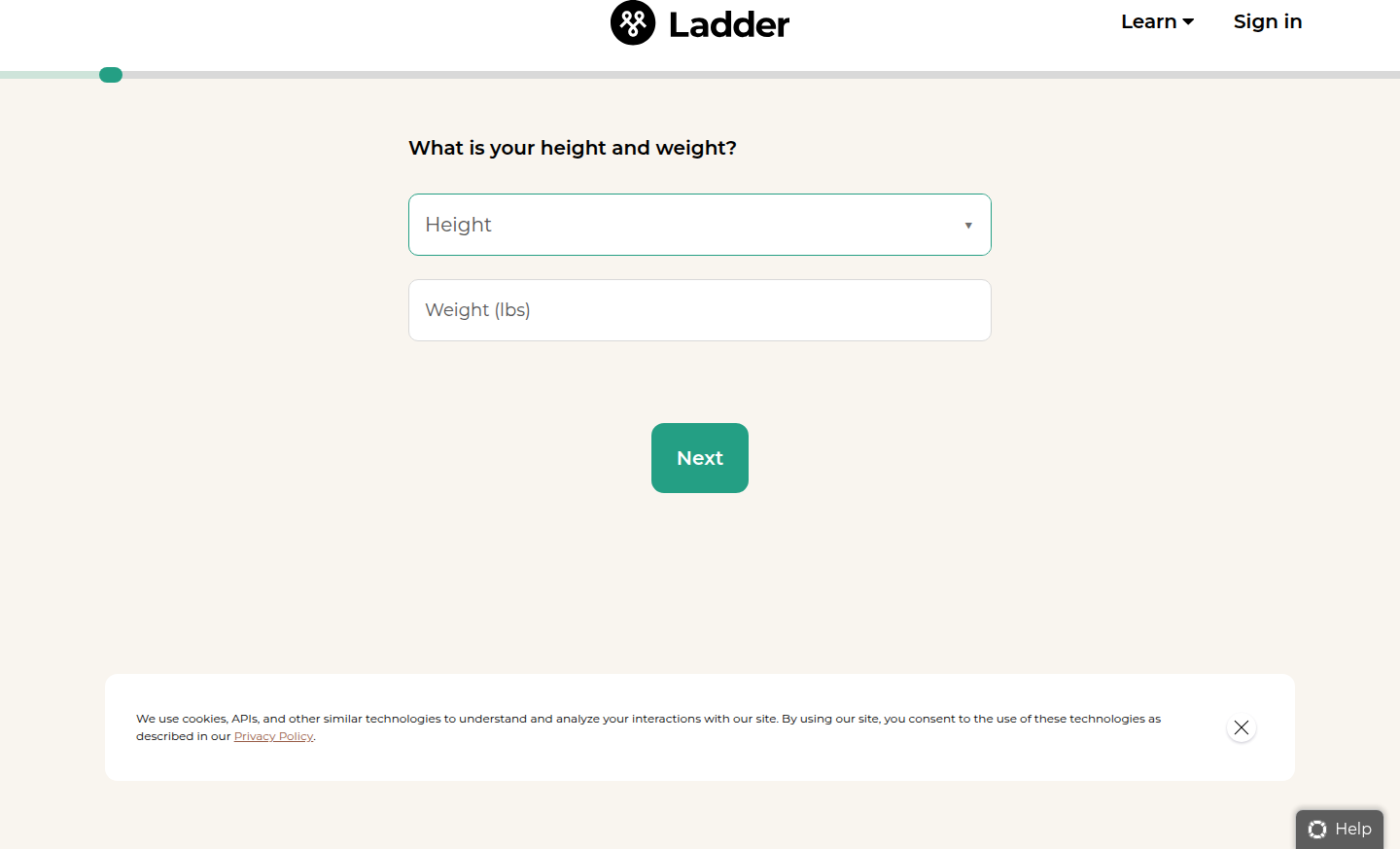
Five crawler visits, one form, two different UIs. On Safari and Edge, the height and weight fields on Ladder's /apply page carry explicit labels: "How tall are you?" and "How much do you weigh?" sitting above the inputs. On Chrome (2x) and Firefox, those labels are gone — the fields rely on placeholder text alone, presumably something like "5'10"" ghosted inside the box.
The tell that this is a real experiment and not a rendering quirk: Edge and Chrome both run on Blink. Same engine, same box model, same font stack — and they still disagree. That rules out a browser-default styling difference. Our vendor-SDK detection flagged an active experimentation tool on the page, and the pattern is a clean two-cell split across sessions. We're at 82% confidence this is a live test, not a staged rollout or a caching artifact, mostly because we'd expect a full rollout to be consistent across all Blink-based sessions within the same crawl window.
The hypothesis: labels as clarity vs. labels as clutter
Ladder's applying a classic form-design tradeoff to a page where the stakes are unusually high. This isn't an email capture field — it's biometric data feeding into an underwriting decision. The variant without labels bets that placeholder text is self-explanatory enough ("in.", "lbs") that a persistent label above the field is redundant weight (pun intended) on a page that already asks a lot of a first-time visitor.
The control — labels present — bets the opposite: that removing them trades a small amount of visual density for a real increase in ambiguity, particularly for a field where unit confusion (cm vs. in, kg vs. lbs) has actual accuracy consequences. Placeholder text disappears the moment a user starts typing, which is a known accessibility and usability failure mode — if someone taps into the field, gets distracted, and comes back, the context is gone. Nielsen Norman's research on placeholder-only inputs and general form-usability literature has flagged this pattern for over a decade, and it's exactly the kind of thing that looks cleaner in a Figma mock than it performs in production.
Why this test matters more than a typical field-count test
Most public form A/B tests are about field count — remove three fields, watch conversion rate lift. That's the popular narrative. But a 500-test analysis of form optimization found the field-reduction heuristic breaks down past a certain point, and sometimes adding structure — including labels — improves both conversion and lead quality simultaneously. That second metric is the one to watch here. Ladder isn't optimizing a lead-gen form; it's collecting data that becomes an underwriting input on a multi-step insurance application. If placeholder-only inputs increase completion rate by helping people move faster through the form, but also increase the rate of transposed height/weight units or garbage entries that later get caught (or worse, don't get caught) in underwriting, the "win" on the top-line completion metric could be a loss on downstream quote accuracy or reissue rate.
That's the metric I'd want isolated before calling this. Completion rate alone isn't enough.
The math Ladder needs before shipping this
Say Ladder's /apply page gets 40,000 sessions a month and converts at a 22% completion rate on the height/weight step specifically — plausible for a mid-funnel step in a multi-page insurance app. That's roughly 8,800 completions/month on that step.
To detect a 3-percentage-point lift (22% → 25%) at 80% power and a 95% confidence level, you're looking at roughly 4,300 sessions per arm for a proportions test at that baseline — call it two to three weeks of traffic in a 50/50 split, faster if Ladder is running more sessions than my estimate. A 1-point lift (22% → 23%) needs closer to 38,000 sessions per arm — over a month, and getting into territory where seasonality and traffic-mix shifts start contaminating the read.
Here's the part that should temper any early enthusiasm: five crawler visits is not sample size, it's discovery. We're flagging that a test exists, not that it's won. If Ladder calls this in under two weeks of traffic, I'd want to see the raw N and the confidence interval before believing a top-of-funnel lift translates to bound policies — the metric that actually matters given underwriting sits downstream.
Novelty effects and the selection bias trap
One more wrinkle specific to insurance applications: this audience skews toward first-time visitors making a single, high-consideration decision. There's no "returning user habituation" curve to worry about the way there is on a SaaS pricing page tested repeatedly on the same cohort. But there is a selection bias risk in the other direction — mobile Safari users and desktop Edge users are not demographically identical to Chrome users. Edge skews toward older, more security-conscious, often enterprise-adjacent users; Safari skews mobile and iOS-first. If Ladder's variant assignment happens to correlate even loosely with device/browser (which our detection literally shows it does, by definition, since the split we caught maps to browser), any completion-rate difference could be confounded with underlying browser-cohort differences in insurance-buying behavior rather than the label treatment itself. That's worth an explicit check: is assignment randomized at the session level regardless of browser, or did our crawl just get unlucky and sample two different bucket cohorts that happen to skew by browser? The Optimizely field guide on split testing is a useful gut-check here — proper random assignment shouldn't correlate with any pre-existing user attribute, including browser choice.
Takeaway for your roadmap this sprint
If you're running a similar labels-vs-placeholder test on a form collecting anything with unit ambiguity (height, weight, currency, date format), don't stop the read at step-completion rate. Instrument the downstream data-quality metric — re-entry rate, support tickets, or in Ladder's case, underwriting flags — before you call a winner. A 3-point lift on a mid-funnel step sounds good in a dashboard; it's only a real win if the units coming out the other end are still correct.
See more like this
ABWatcher catches A/B tests like this every day.
Watch live experiments at 1,000+ high-converting brands, complete with hypothesis and takeaway. Free forever for ten watched companies.