
Discover Tests Reordering Its Homepage "How Can We Help?" Nav
Discover.com is running a live A/B test that swaps the order of Personal Loans and Online Banking in its homepage quick-nav. Here's what it likely signals about the funnel.
Maya Patel
Senior CRO Strategist · Aug 3, 2026
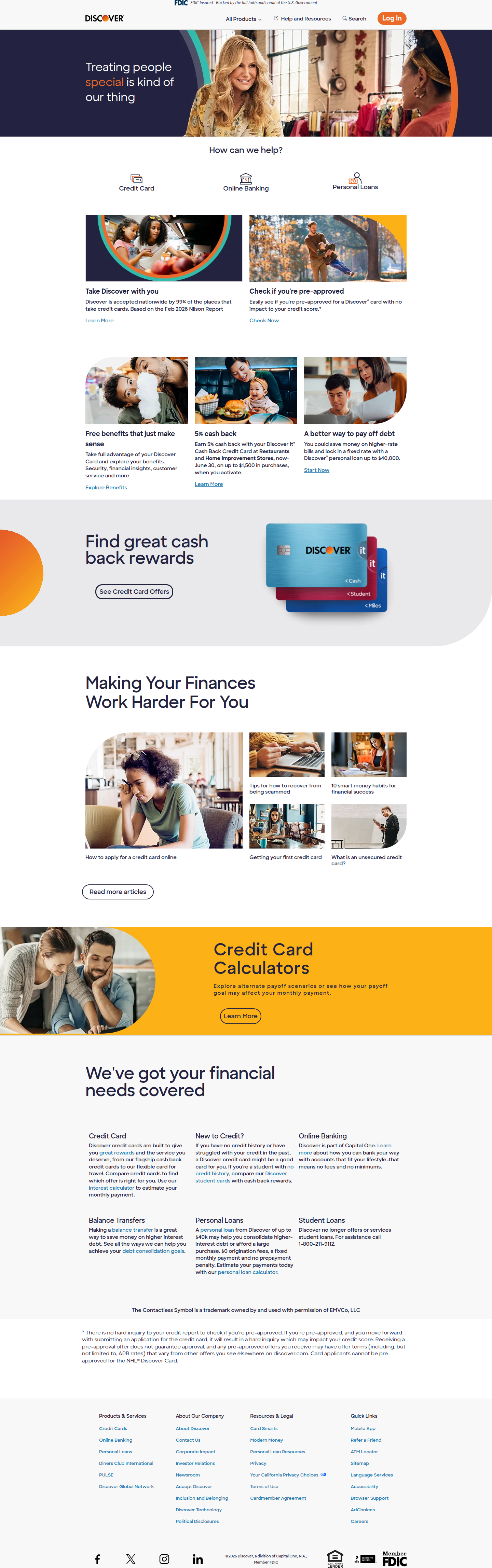
Discover.com is quietly testing something most visitors will never consciously notice: the order of three icons. On the homepage's "How can we help?" utility nav, our vision-AI analyser caught a variant showing Credit Card, Personal Loans, Online Banking — a departure from the default sequence of Credit Card, Online Banking, Personal Loans seen across four other visits. The pattern repeated on a second Chrome visit, which rules out a rendering fluke and points to a real, running experiment (confidence: 82%, vendor_sdk_active).
It's a small surface. But small surfaces on high-traffic homepages are exactly where CRO teams find outsized, cheap wins — and this test is a clean example of how to structure that kind of bet.
What Actually Changed
The test is confined to three product-category shortcuts sitting below Discover's primary hero. In the control, Online Banking sits in the second position, ahead of Personal Loans. In the variant, Personal Loans moves up one slot, ahead of Online Banking. Credit Card holds the top spot in both — unsurprising, given it's Discover's flagship product and the highest-intent entry point for most visitors.
No copy changed. No iconography changed. No layout changed. This is a pure ordering test, which matters for how we should interpret it: any lift or drag observed is attributable almost entirely to position, not to messaging or visual weight.
Why Position Alone Moves Behavior
Serial position effects are well documented in navigation research — users scan left-to-right (or top-to-bottom) and disproportionately engage with the first two or three items before attention decays. Optimizely's field notes on A/B testing call out navigation menu structure specifically as a lever with outsized influence on engagement, precisely because it's the first decision architecture a visitor encounters.
For Discover, that means the current default — Online Banking in slot two — is likely capturing clicks that Personal Loans would otherwise get, purely on the strength of position, not necessarily user intent. If Personal Loans is a strategic growth priority (margin, LTV, or portfolio diversification away from card-only revenue), that's a real opportunity cost worth quantifying.
Running the ICE Math
Framing this with Impact, Confidence, Ease:
- Impact: Moderate. Homepage nav clicks are a top-of-funnel signal, several steps removed from a funded loan. Even a strong CTR lift on the icon needs to survive the loan application flow, credit decisioning, and funding steps before it shows up as revenue. I'd model this as a driver of application starts, not originations, in the first read.
- Confidence: Reasonably high that CTR on Personal Loans will lift when it moves up a slot — serial position effects are one of the more reliable findings in UX research. Lower confidence on whether that CTR lift survives down-funnel, since clicking a nav icon is a much lower-commitment action than clicking a loan CTA.
- Ease: Very high. This is a config change in a nav component, not a redesign. No new content, no engineering lift beyond the test harness itself.
That combination — moderate impact, high confidence on the primary metric, near-zero cost — is why this is exactly the kind of test that should be running constantly on a homepage this size, rather than treated as a one-off. Contentful's framing of CRO as an ongoing comparison discipline rather than a single event applies directly here: the real value isn't this one reorder, it's the cadence of testing nav hierarchy as product priorities shift quarter to quarter.
The Confidence-Lift-Risk Tradeoff
Worth being explicit about what this test can't tell Discover on its own:
- Confidence: High that this is a low-noise, high-signal test given the traffic volume a homepage like discover.com receives. Statistical power shouldn't be the bottleneck.
- Lift: The upside is bounded. Reordering three icons won't meaningfully change how many people arrive already intending to check a card balance versus shop personal loans. This test measures marginal attention capture, not demand creation.
- Risk: Essentially none downside-wise. Worst case, Personal Loans clicks stay flat and Discover reverts. There's no plausible scenario where this reorder meaningfully hurts Credit Card or Online Banking engagement, since Credit Card's position is untouched and Online Banking users are typically high-intent, low-navigation-dependent (they're heading to a login flow they already know).
That asymmetry — capped downside, plausible upside — is the profile of a test that should ship regardless of outcome size, because the cost of running it is near zero.
What to Watch If You're Building the Same Test
If a nav-reorder test is on your roadmap this quarter, a few things I'd insist on before calling it:
- Segment by returning vs. new visitors. Returning users who bank online already know where that icon lives and may click it out of habit regardless of position — muting the apparent effect of the reorder for that segment while overstating it for new visitors.
- Track past the click. Icon CTR is a vanity metric if you don't tie it to application starts and, ideally, funded-loan rate. A test that lifts nav CTR by 15% but shows no downstream funnel movement isn't a win, it's noise with a good story attached.
- Watch for cannibalization. If Personal Loans CTR rises and Online Banking CTR falls by a proportional amount, you haven't grown the pie — you've just reshuffled it. That's still useful information if Personal Loans is the higher-value action, but it's a different result than incremental lift.
Workshop Digital's breakdown of CRO testing makes a similar point: the value of A/B testing isn't the test itself, it's the discipline of tying surface-level changes back to a specific business hypothesis you're willing to be wrong about.
The Takeaway
Nav ordering tests are among the cheapest experiments you can run and among the easiest to mis-scope. Discover's test is well-bounded: three items, no copy or design variables, clear hypothesis. If you're auditing your own utility nav this sprint, don't just ask "what should be first" — ask what metric two slots down the funnel you're willing to hold this test accountable to before you ship the winner.
See more like this
ABWatcher catches A/B tests like this every day.
Watch live experiments at 1,000+ high-converting brands, complete with hypothesis and takeaway. Free forever for ten watched companies.